3 Simple Tips on UX Button Design
Share
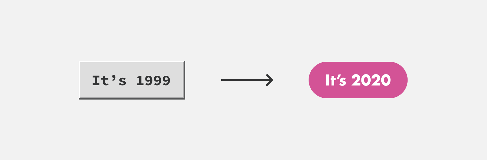
Buttons have come a long way since the early days of the world wide web. We’ve gone from buttons mimicking the Windows operating system circa 1999 to large flat buttons with fully rounded corners we’ve seen increasingly over the past few years. In the example below, we can see how much button design has changed over the years.
In this time, designers and developers have gained greater freedom in the presentation and behavior of buttons. But there are fundamentals to user-centered button design that are consistent despite the ebb and flow of trends.
In the end, it’s about helping users navigate our sites or apps, trigger or complete actions like submitting a contact form, or placing an order as easy as possible. That’s why we’ve put together this guide, as a reminder of best practices and principles so we can all craft better buttons for our users.
To best serve users, we design our buttons by these three design principles:
Principles
- Identifiable
- Findable
- Clear
1. Identifiable
A button should communicate an action to a user. It should appear interactive. On desktop devices, for instance, a button should look ‘clickable.’ Unlike desktop users, mobile users don’t have the opportunity to hover over an element to check for interactivity. Without this affordance, it’s important to make sure buttons appear interactive without requiring the user to do anything.
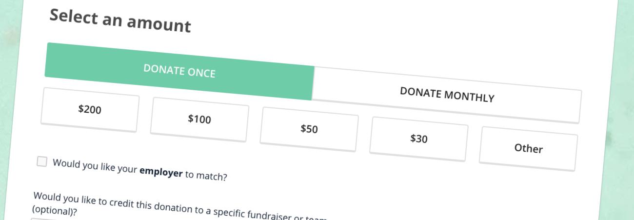
Designing with the mobile phone user in mind should be a priority as over 48 percent of page views worldwide are through mobile devices. Your buttons should be touch-friendly for mobile users and clickable for desktop users.
Size
The size of a button also helps make it identifiable as one. Studies by the MIT Touch Lab suggests that 10mm x 10mm is the best minimum size for buttons due to the average size of fingertips.
Designing buttons must not only be pleasing to the eye, but they also need to make tactile sense for the user. In the example below we can see how much easier it is for users to interact with larger buttons. Therefore, buttons should have a touch target of at least 38px by 38px.
Shape
As stated in the introduction, the shape of buttons has changed over the years, thankfully so. The most popular shape for buttons is square or square with rounded corners. Rounded corners do seem to have an edge over square corners though. Research suggests rounded corners make information easier to process by drawing our attention to the contents of an element.
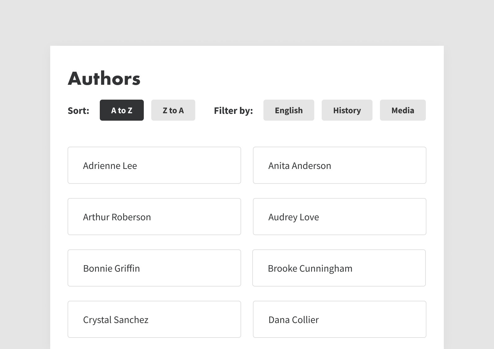
2. Findable
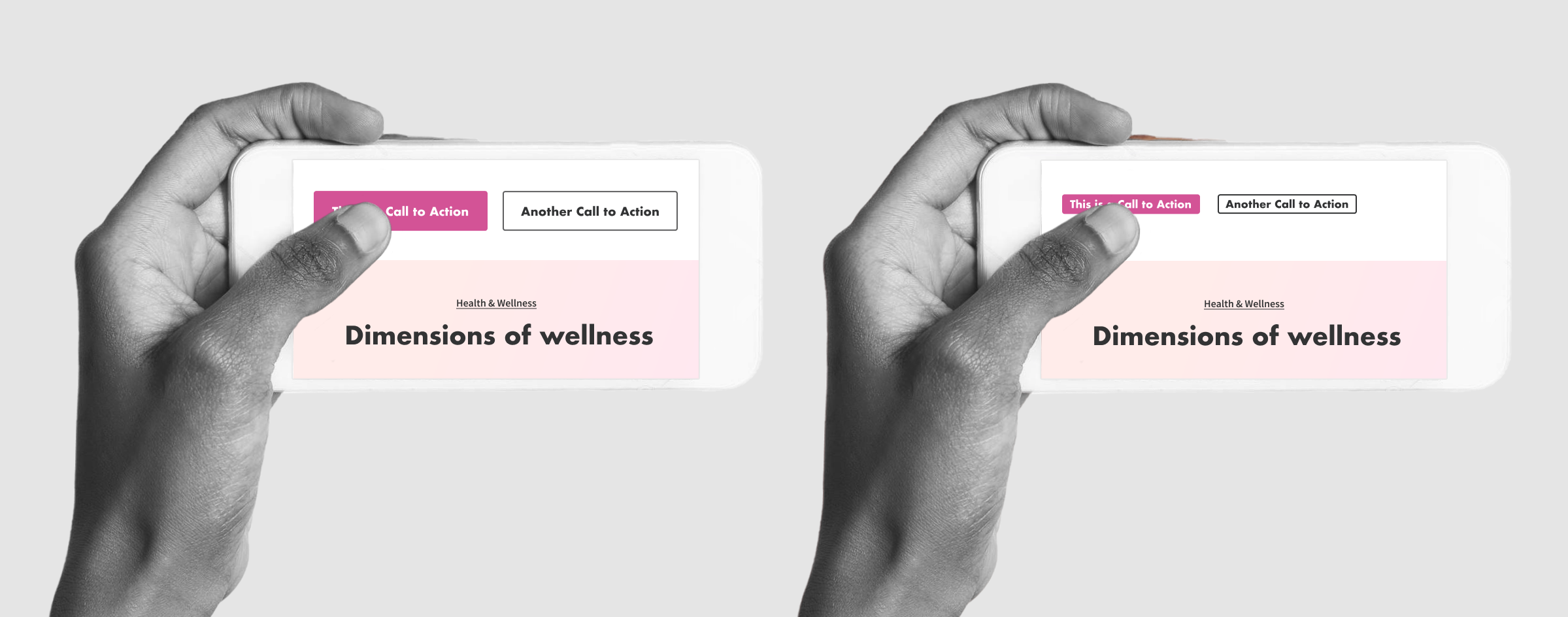
Buttons should be easy for users to find. UX designers agree that you shouldn’t make users hunt for buttons. We can make buttons more discoverable by placing buttons where users expect to find them.
In the examples below, placing the call-to-action flush with the left is more direct and flows better with the layout of inputs. With an emphasis on digital accessibility and user experience, this easy-to-find-buttons pattern was applied when we built the San Jose Water site.
It’s also important to be consistent across your site or app with the placement of buttons. If one form has the primary call-to-action on the right and another on the left, it will confuse users.
3. Clear
When clicking a button, the user should know what action they are taking, meaning a button’s action and state should be clear. These are some design tips and tricks to assist this process:
Color
Certain colors have specific meanings users have become accustomed to seeing. Red, for instance, is typically used to signify errors or destructive actions. Green on the other hand normally signifies successful actions. Using conventions like these make it easier for users to understand the action and state of a button.
Microcopy
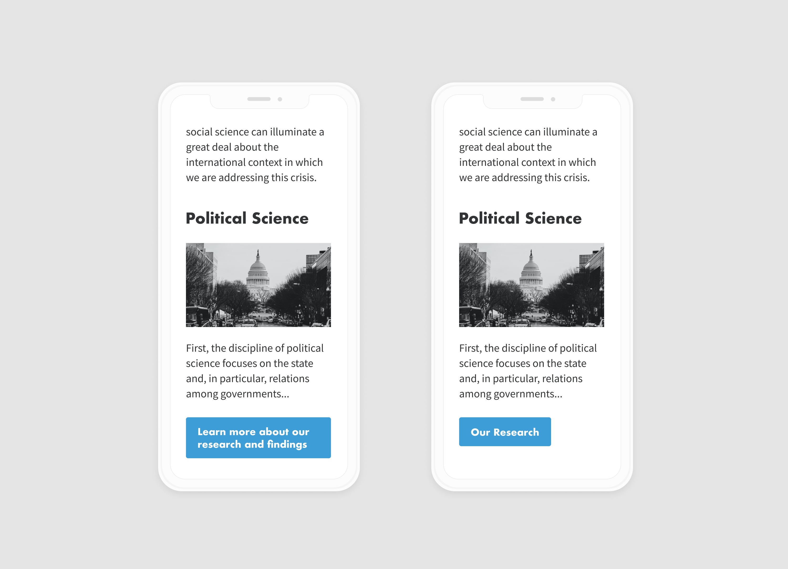
A button’s label should clearly describe what it does. It’s often a clear and quick call-to-action. Ideally, it shouldn’t wrap onto multiple lines. Keeping the label to one line improves legibility.
In the example below we can see, particularly on small viewports, how multiline copy impedes legibility and clarity as the multiline button starts to appear more like a textbox than a button.
Hierarchy
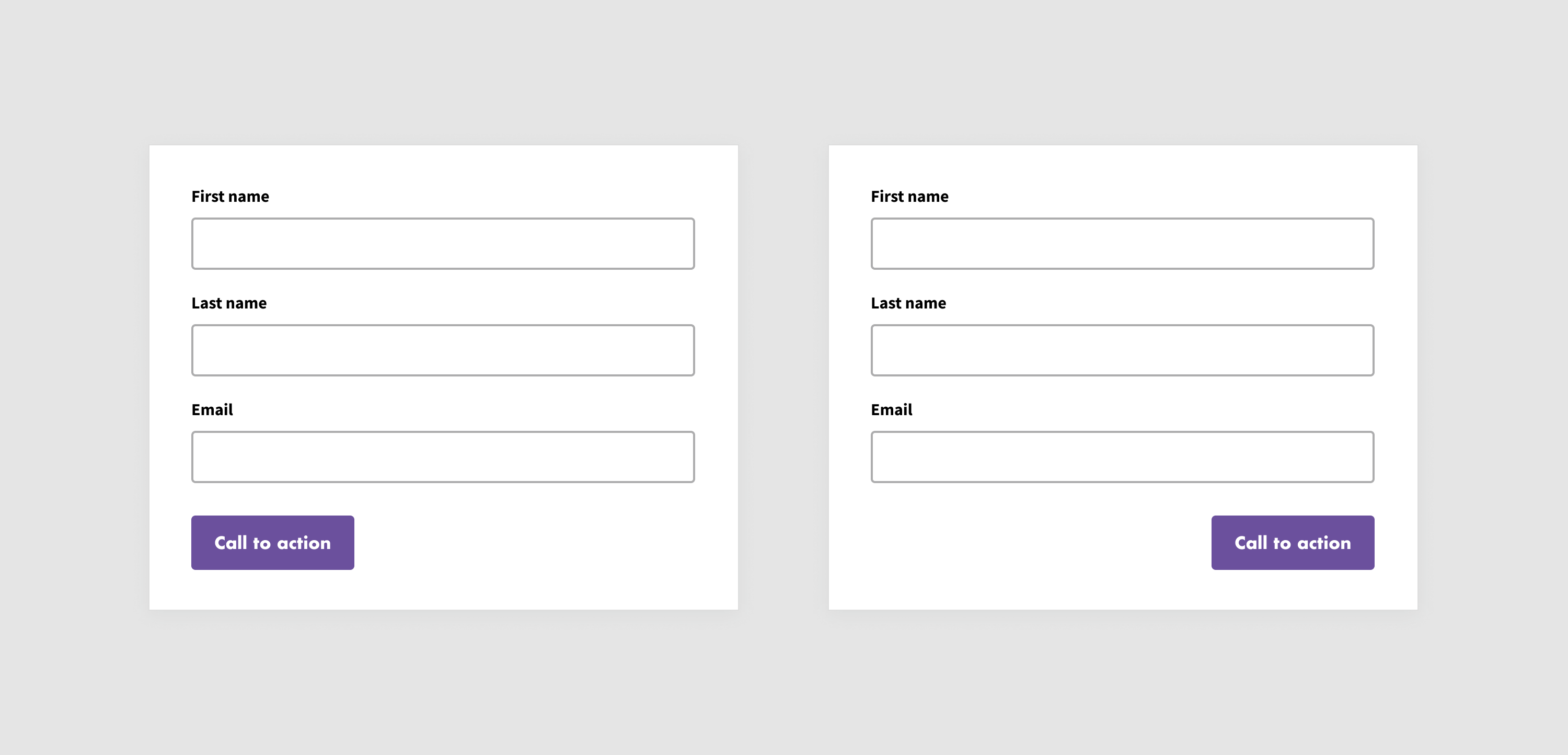
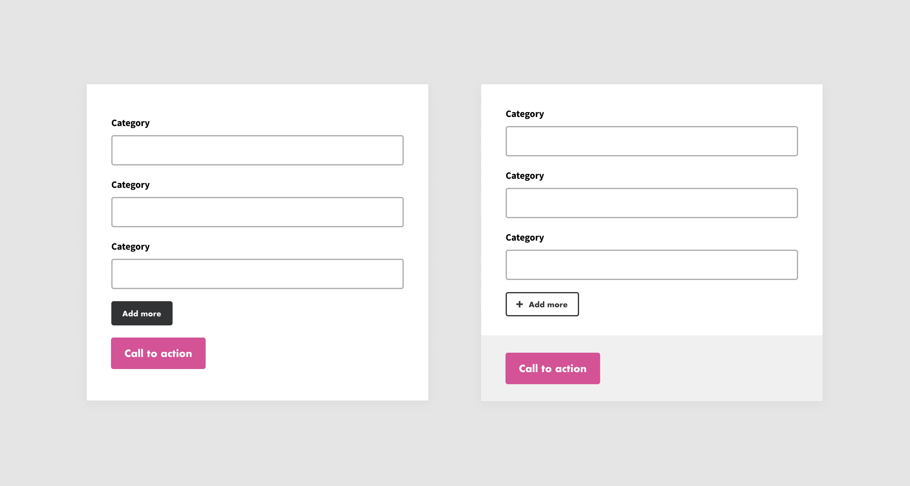
Buttons need to not only be distinguished from other elements on the page but also each other as multiple buttons are often grouped. For instance, a primary action button should be more visually dominant than a secondary or tertiary action button.
In the example below, the Add more and Call to action buttons are similarly styled and close together. This would likely confuse users and result in them selecting the wrong button as they are not visually distinct enough from each other. Changing the secondary Add more button to an outlined style, also known as a “ghost button” with a plus icon and adding a background to the primary Call to action button’s section makes the different functionalities clearer to the user.
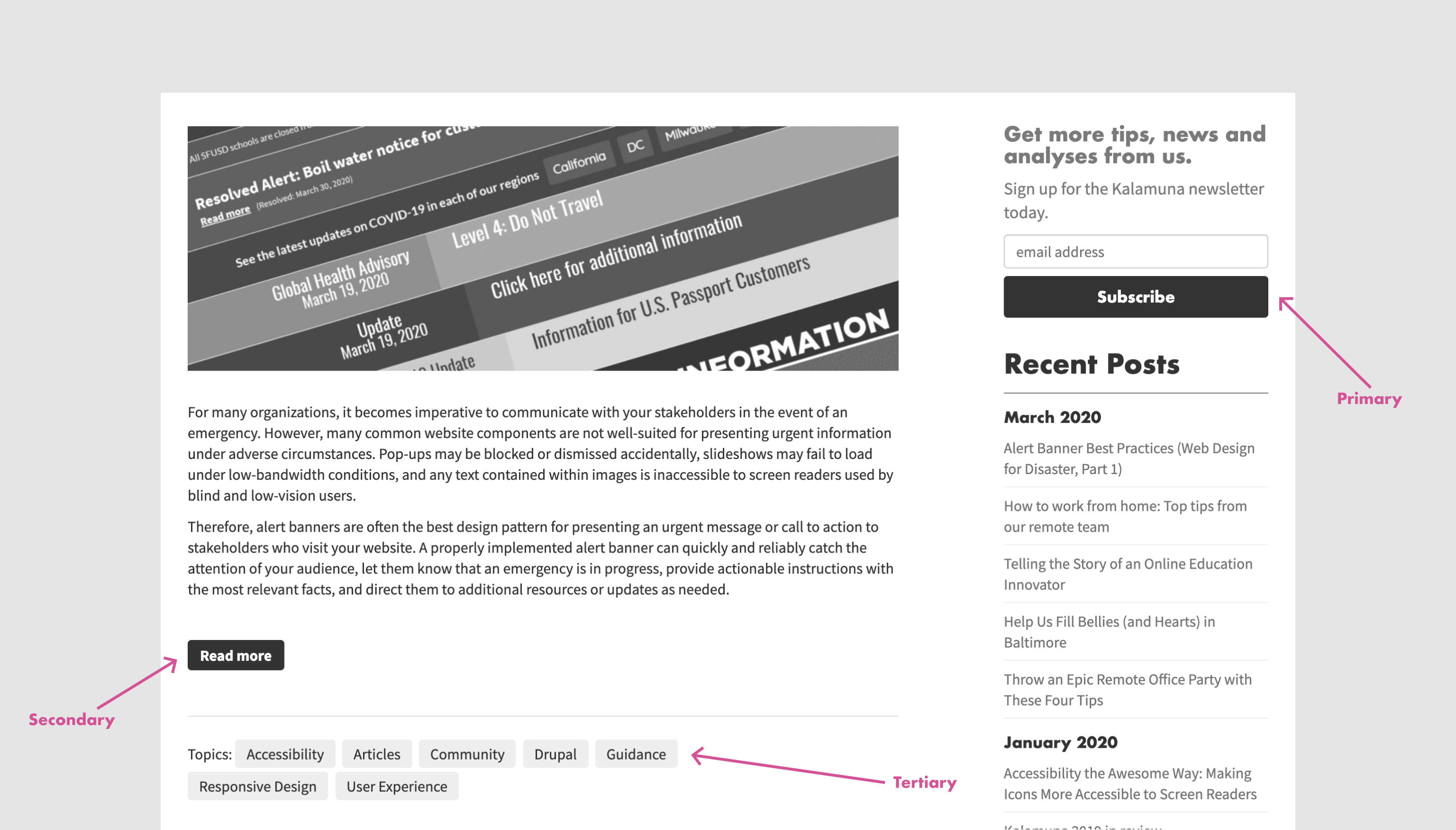
We also see primary, secondary, and tertiary buttons all at work here on Kalamuna’s blog.
Type
The type of button helps indicate its level of importance and therefore functionality. Some examples include text, ghost, toggle, and floating, which we will expand and discuss the benefits of each below.
Text
Text buttons are text labels that describe an action, and usually have a low level of emphasis, and therefore fall outside of the block of text. Text buttons are not to distract from nearby content and should describe the action they take clearly.
Ghost
Outlined buttons, most often known as ghost buttons, should be an outline with no fill surrounding the text. Ghost buttons indicate an important action, but not a primary action.
Toggle
Toggle buttons provide group related options and display a selected action and setting. If you select one option, then you deselect the others. This change in the state indicates an option is active or inactive. Toggle buttons are usually used less often than other buttons.
Floating
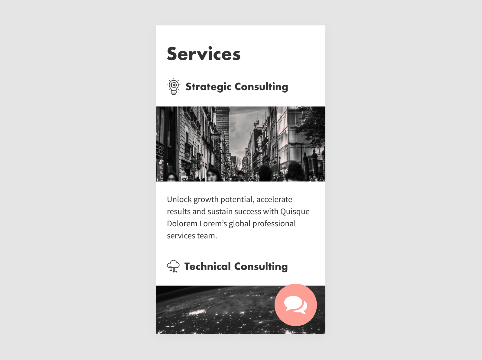
A floating action button (FAB) should be the primary action on a screen and should perform a constructive action. For instance, a chat button is a common example of a FAB. A FAB should provide necessary information that the user would need, such as creating a new page, sharing a post, or exploring services.
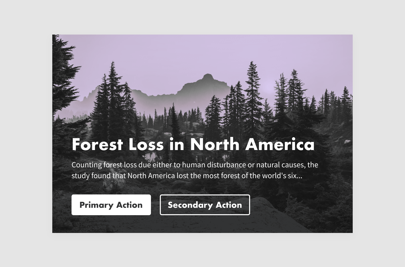
Order
The ordering of buttons is important to achieve visual hierarchy. When making ordering decisions it’s crucial to note that generally users expect content listed first to be a high priority, and content listed last to be a low priority. Generally speaking, the “primary left” rule is a safe bet. In a study on user interaction with web forms, researchers found that participants were less efficient and more error-prone in filling out forms when the primary action button was located to the right.
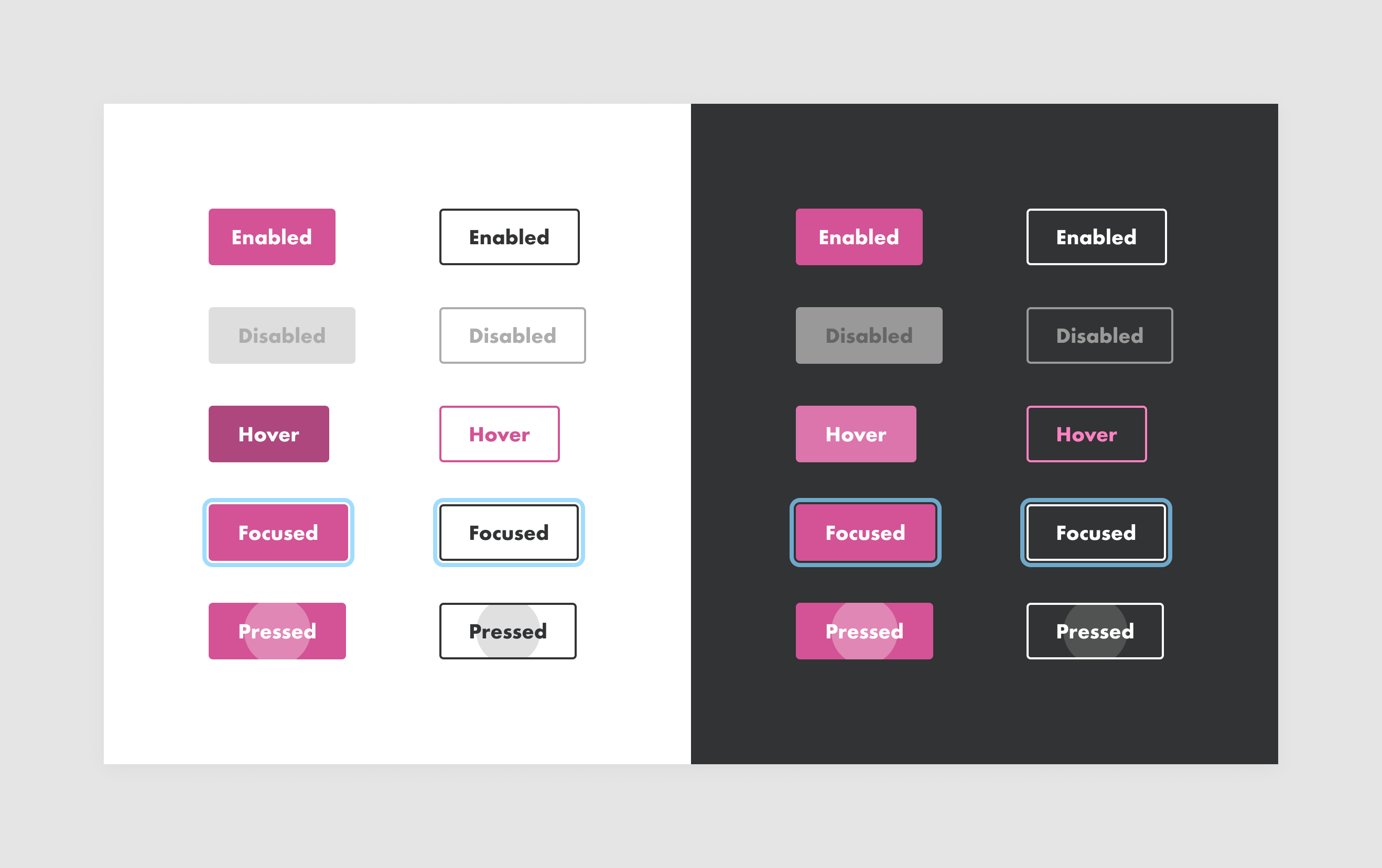
State
Buttons are multi-state elements. It’s important to make these states clear to users. We can do this by sticking to conventions that match user expectations like disabled buttons appearing grayed out and focused elements containing a blue ring.
It’s also a good idea to see how they appear against different backgrounds to ensure legibility and consistency regardless of the background color. These states should also look distinct from each other to avoid confusion.
Feedback
After clicking or tapping on a button, users expect a response in the form of visual or audio feedback, depending on the action.
Design buttons with feedback in mind. If users don’t receive feedback, they’ll likely assume the action didn’t register and the user will repeat this action, which can cause unnecessary operations. Feedback encompasses everything from state changes shown above to behavior like progress or error animations.
The shake on error animation popularized by Apple on iOS devices is a good example of feedback design:
We also see feedback in progress animations applied to file uploads for example. The animation below expands the button to convey this state change to users:
A note on Dark Patterns
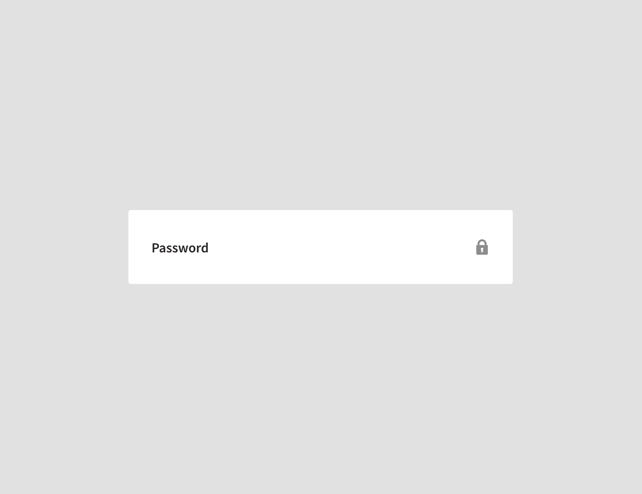
Before wrapping up we want to mention instances where buttons are purposefully not identifiable, findable, or clear. These instances are known as Dark Patterns. Dark Patterns use UI and UX patterns to trick or mislead users, often in the pursuit of profits. One common example is the unsubscribe button in emails. In some emails, they are indistinct from the surrounding text and may not appear clickable like in the example below.
Other dark patterns are much more pernicious, like opt-out buttons that add items to your cart that you had no intention of purchasing. These patterns deserve a blog post of their own. For now, remember to put users first and call out dark patterns when you see them. If you’re on Twitter you can tweet out examples and mention @darkpatterns or use the hashtag #darkpatterns to draw attention to these unethical practices.
Next steps
While we’ve put quite a bit of thought and research into this guide, it is by no means exhaustive. We look to grow this guide as we learn more from our own internal and external design efforts, as well as from you, our lovely readers. So if you have any additional tips we’d love to hear them!
We hope the next time you’re tasked with designing or evaluating buttons in your organization, you’ll keep these principles in mind and, of course, put your users at the center of your design decisions.

Graciela Alaniz
Whether it’s her Instagrammable hand-drawn lettering or delectable handmade tortillas, Graciela creates lovely things. Oh yes, and she also designs websites. As Kalamuna’s UX/UI Designer, she translates our clients’ visions and goals into elegant and graceful designs crafted with users in mind.