Free Figma Plugins for Accessibility Design
Share
Creating a great user experience for everyone who visits your website means it must be as accessible as possible. By ensuring a site is accessible, you also make it easy to use, regardless of your visitor’s physical or mental capabilities. But as anyone who’s had to design or build a website that complies with WCAG 2.1 Level AA guidelines (the common standard for web accessibility) will tell you, it isn’t always easy. But digital product design technologies are rapidly improving, and the leading collaborative design tool, Figma, offers a ton of plugins that aid designers in making their products more accessible. Because we strive to enable everyone to access the internet, we’ve compiled a list of Figma accessibility design plugins for our team, and we’re sharing it here. Throughout this post, we use the numeronym “a11y” to stand for the word “accessibility.” We hope you get a lot out of this compilation of top-notch tools.
A11y Color Contrast Checker
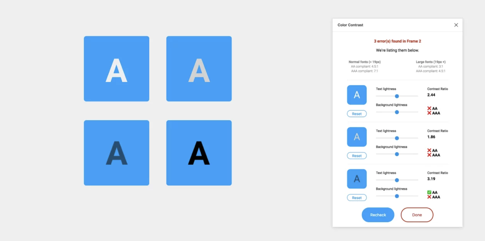
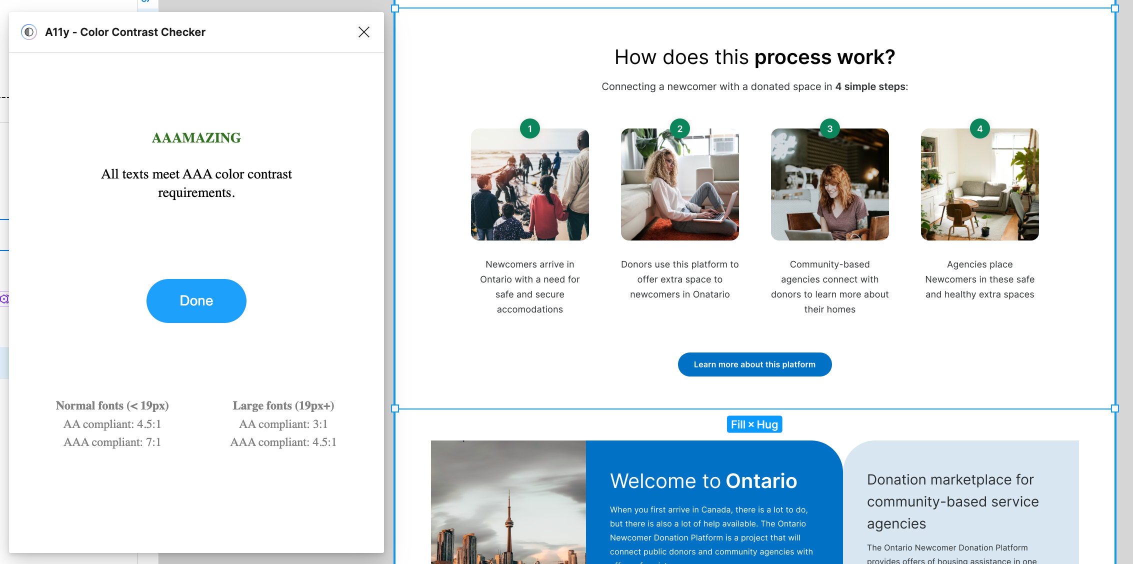
This plugin for Figma stands out as one of the most widely used. It guarantees text legibility for users by following the Web Content Accessibility Guidelines (WCAG).
A11y Color Contrast Checker assesses the color contrast ratio of all visible text within a frame and offers feedback on whether it meets WCAG's AA and/or AAA level compliance. Additionally, it provides color sliders, allowing users to fine-tune colors and observe real-time changes in the corresponding contrast ratio.
PROS: Enables you to evaluate the contrast ratio of your entire Figma artboard. This preview offers insights into how your design will appear on your website or app.
CONS: Depending on how a layer is constructed, this plugin may encounter limitations in accessing all the text, potentially leading to misleading results.
Contrast
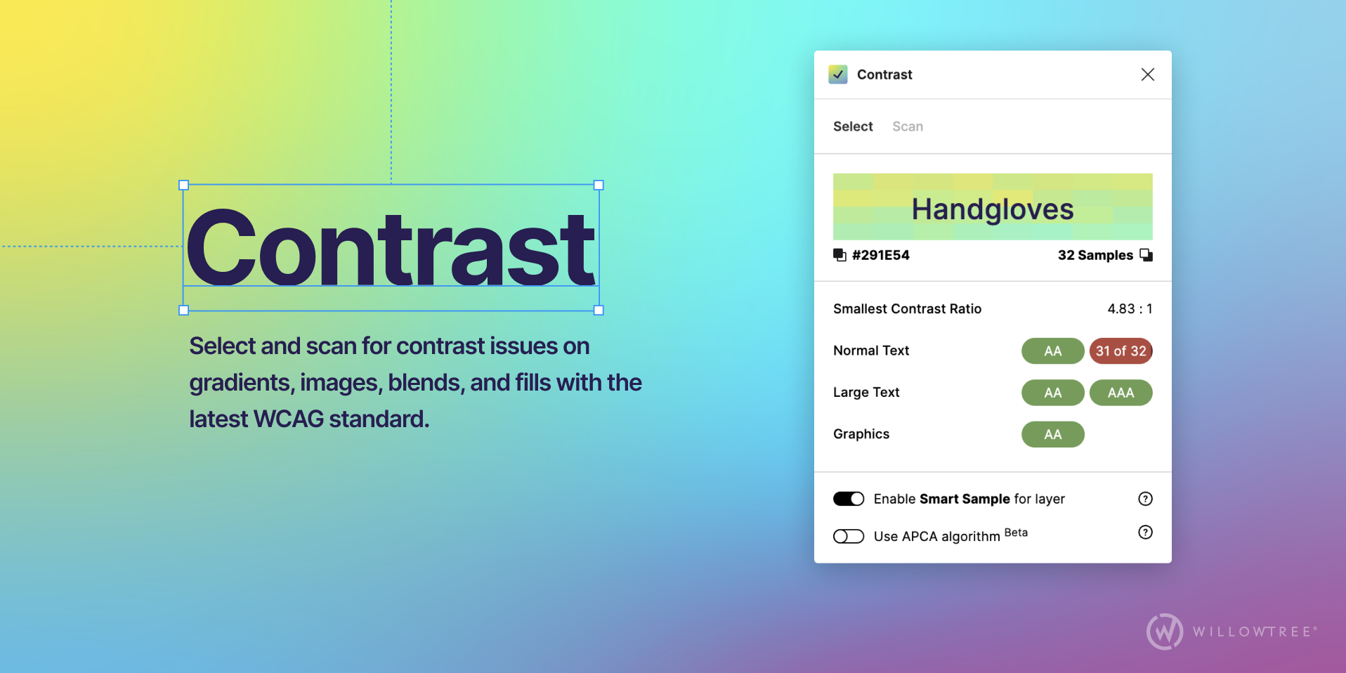
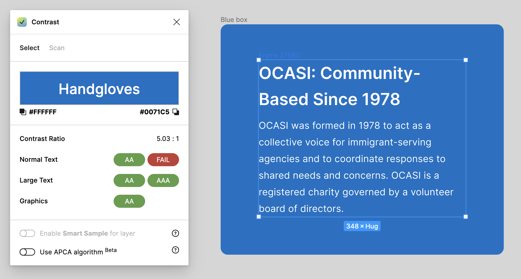
Contrast simplifies the process of verifying color contrast ratios as you work. When you select a layer, Contrast will promptly analyze the color directly behind your selection. It provides you with the contrast ratio and indicates whether it meets the passing or failing levels outlined in the Web Content Accessibility Guidelines (WCAG). In cases where Contrast cannot detect the background color, simply add another layer to your selection, and Contrast will compare them both for you.
PROS: Same as A11y Color Contrast Checker.
CONS: Same as A11y Color Contrast Checker. Depending on how a layer is constructed, you may encounter limitations in accessing all the text.
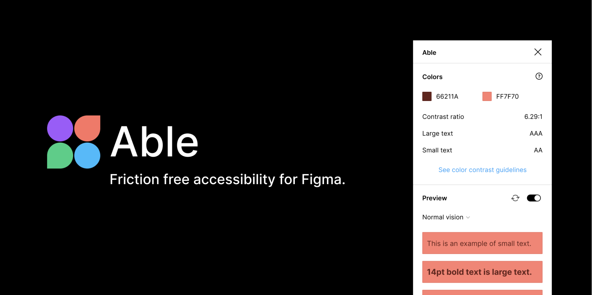
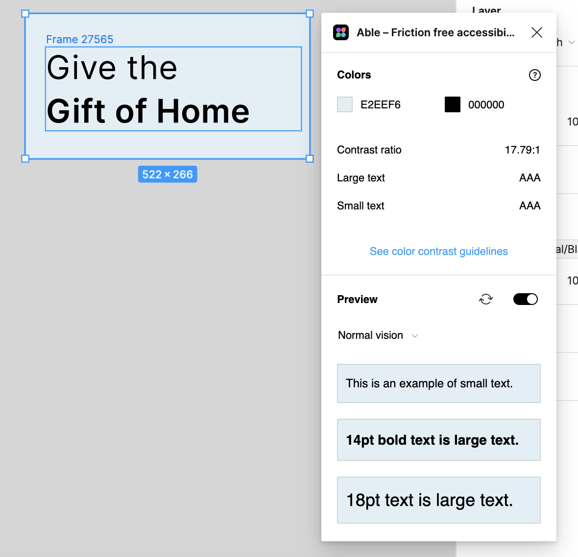
Able
The Able plugin seamlessly integrates color contrast and color blindness considerations into your workflow with minimal effort. When you open Able, it automatically compares the contrast between the two layers you choose. This allows you to keep Able open and easily select layers for comparison without the need to rerun or update the plugin.
PROS: It shows the font size option and links to the color contrast guidelines.
CONS: You can select only two layers rather than the entire artboard.
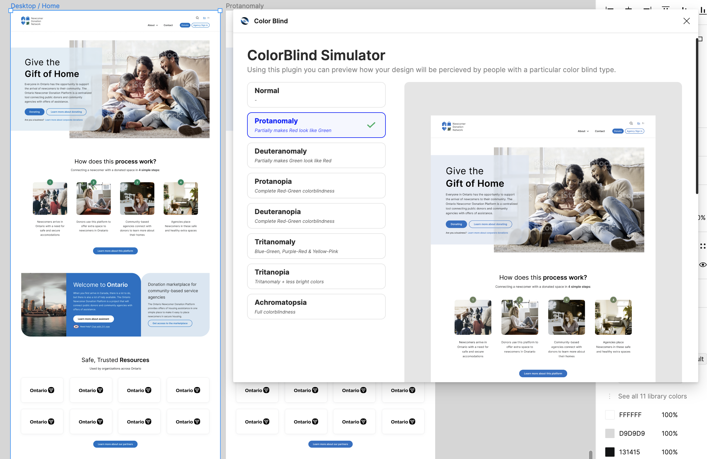
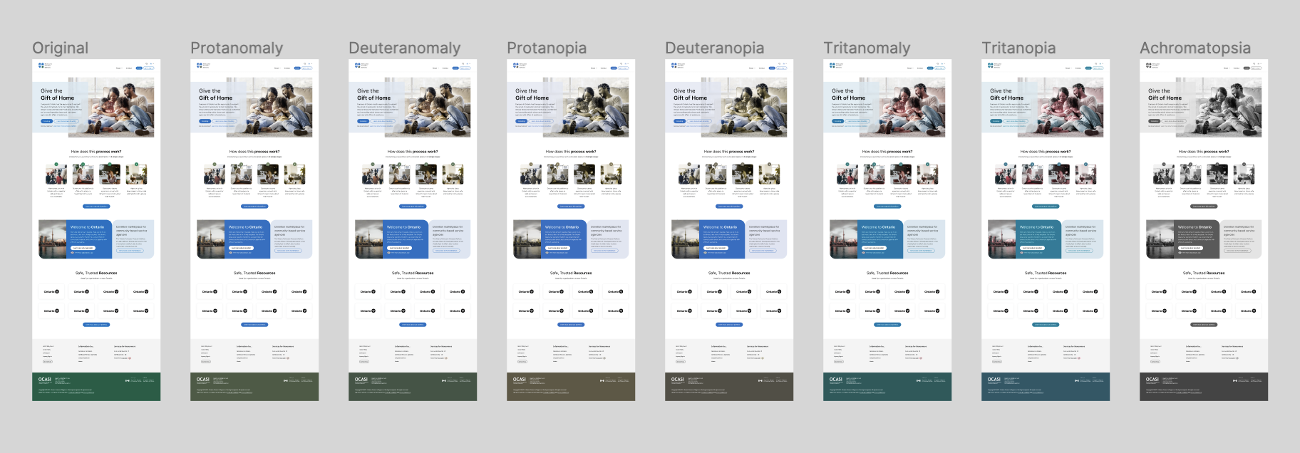
Color Blind
This plugin obtains a precise and real-time simulation of your designs tailored to the specific type of color vision disorder you've chosen.
PROS: You can effortlessly preview and generate images depicting various colorblind versions.
CONS: There are no drawbacks to note. The plugin is user-friendly and provides all the essential options needed for effective use.

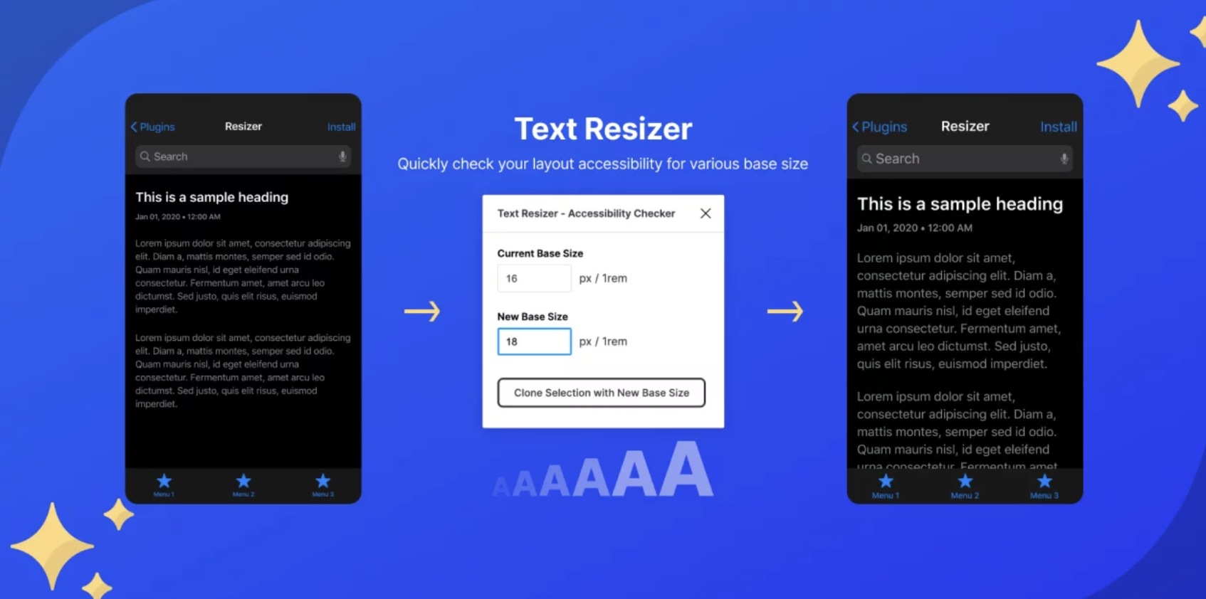
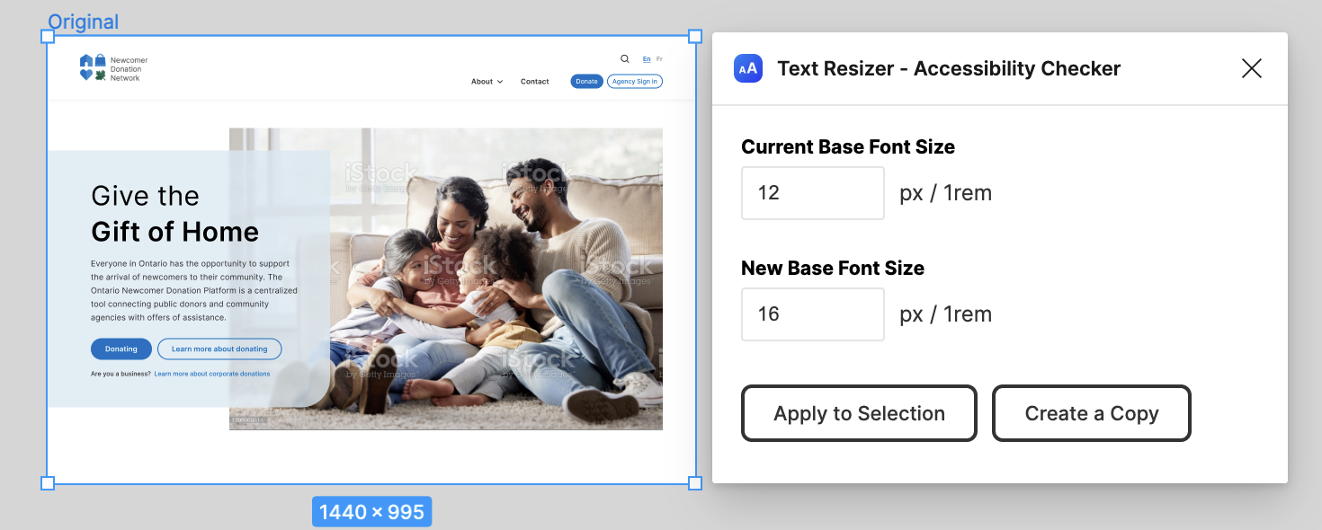
Text Resizer
Text resizer empowers users to tailor text sizes to meet WCAG requirements for text resizing. When implemented correctly, your designs should be compatible across all operating systems and browsers regardless of the user’s text size preference.
Many users, irrespective of visual impairments, prefer to make slight adjustments to text size. Hence, understanding how your design accommodates these changes becomes imperative. This is where Text Resizer excels, providing you with precise insights into this behavior.
PROS: You can conveniently adjust all text sizes at once using the “rem” unit.
CONS: The text resizing function is not compatible with text sizes defined with Variables or Style settings.
Dev note: Don’t use this plugin to change the rem value for your designs. One rem is always 16px in the browser.
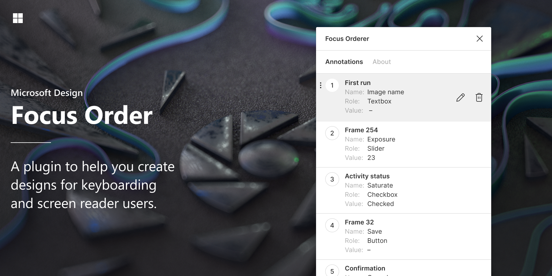
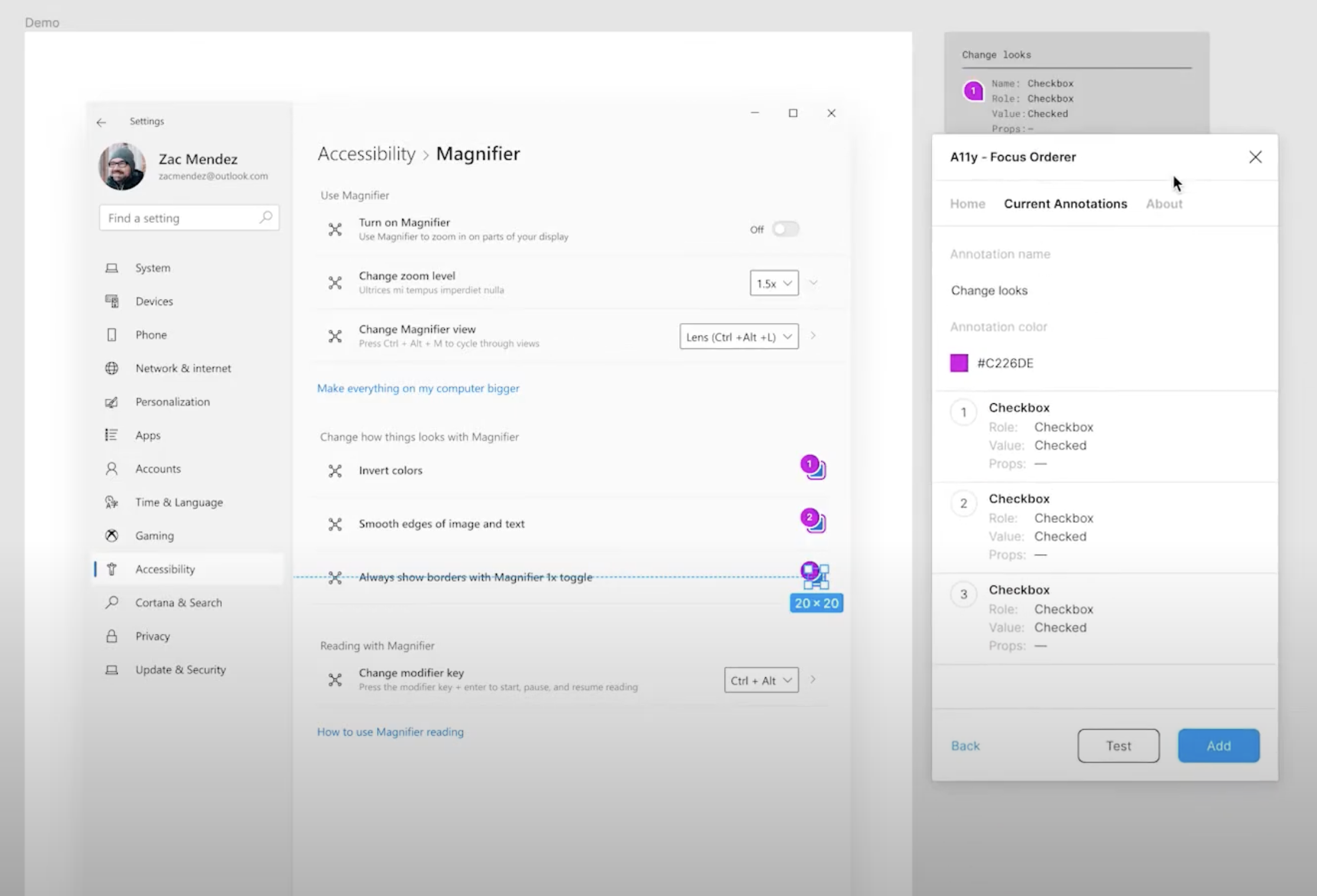
A11y Focus Order
This Microsoft-created plugin ultimately benefits users who rely on a keyboard or other input devices to navigate an application. It specifies the precise order in which elements should receive focus within the browser, enhancing accessibility and user experience. Designers will find that the plugin allows you to:
- Add accessibility annotations to your design.
- Bulk add, remove, reorder, and update your annotations
- Create multiple annotation sets that can be named and styled with a different color
- Store annotations in a single-layer group that can be toggled on / off
Here are more details on how to use the plug-in, as well as a YouTube tutorial.
PROS: This tool is a rare gem tailored for users who depend on the keyboard or other input devices for navigation.
CONS: Unfortunately, project budgets seldom allocate resources for additional features such as this.
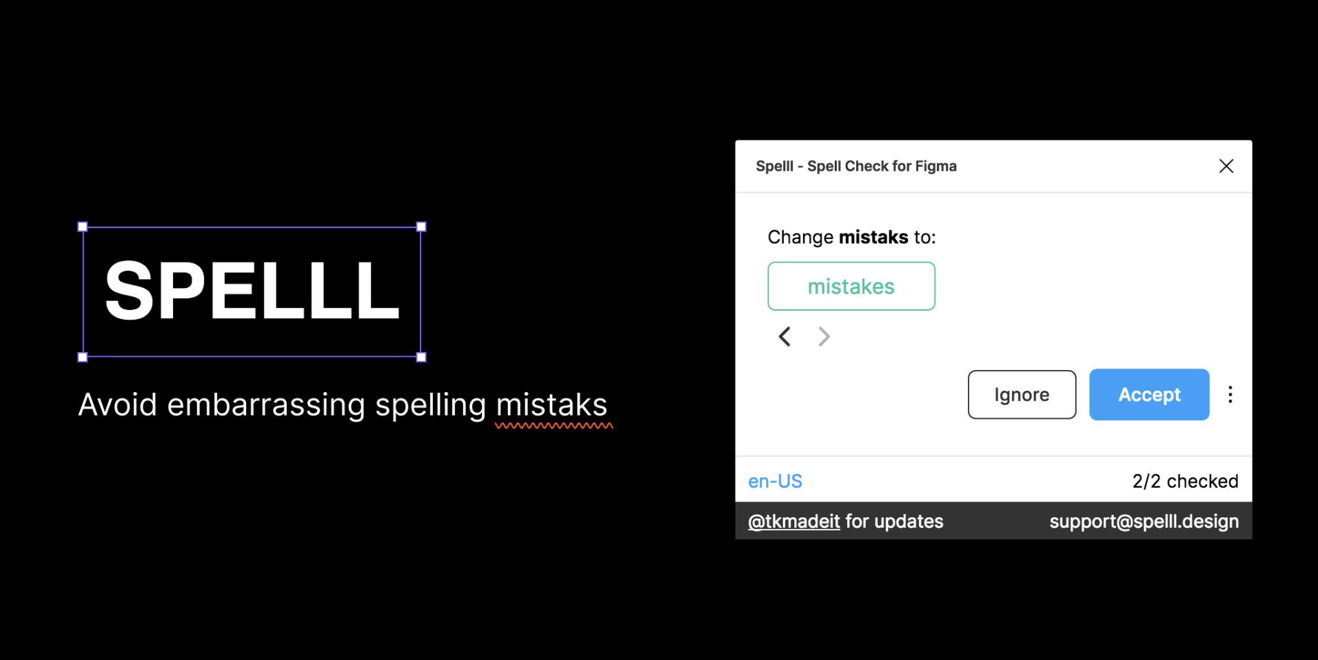
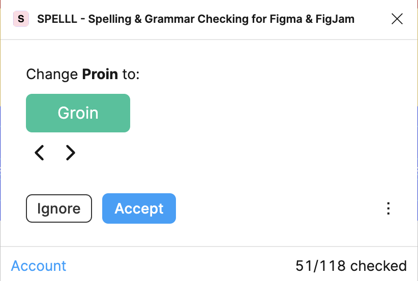
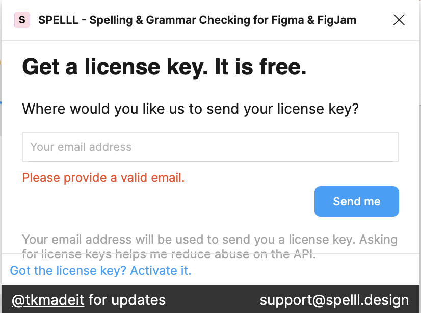
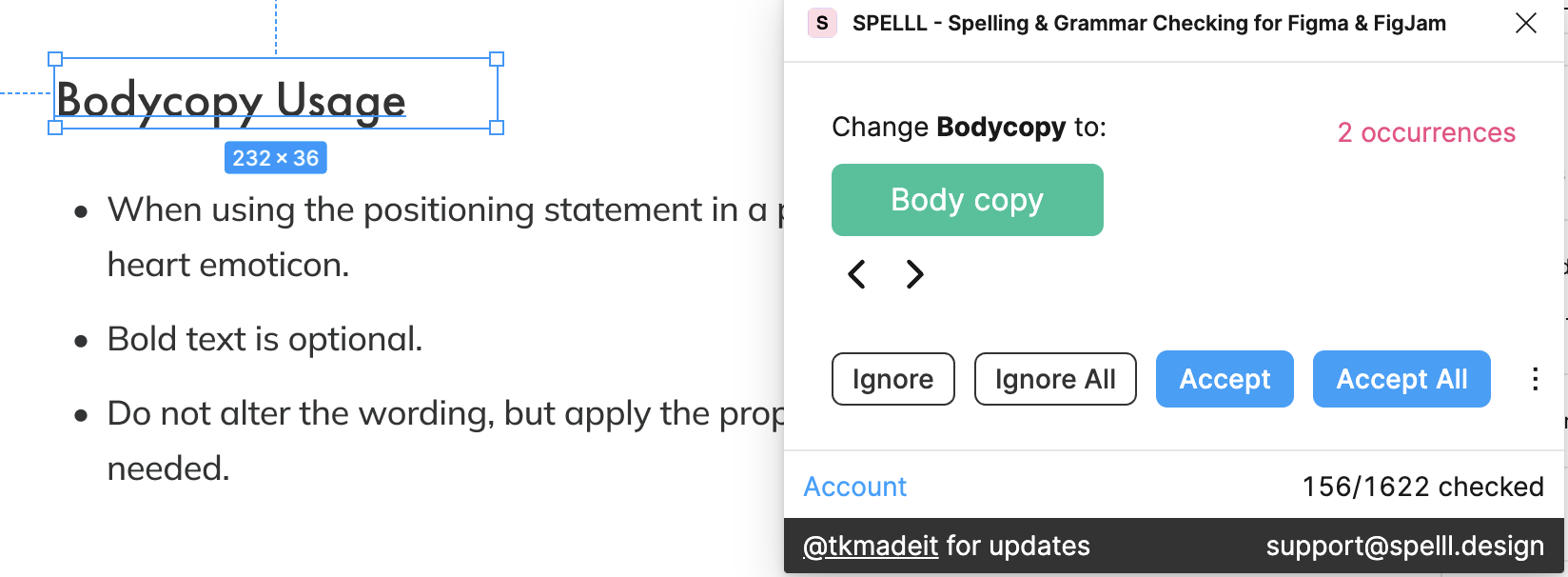
Spelll
This plugin brings a spell-checking feature to Figma and FigJam, similar to the one found in Google Docs. It continuously scans your Figma or FigJam document for spelling errors and offers a convenient one-click solution to correct them.
PROS: It is easy to use.
CONS: You need to get a license key to use the plugin.
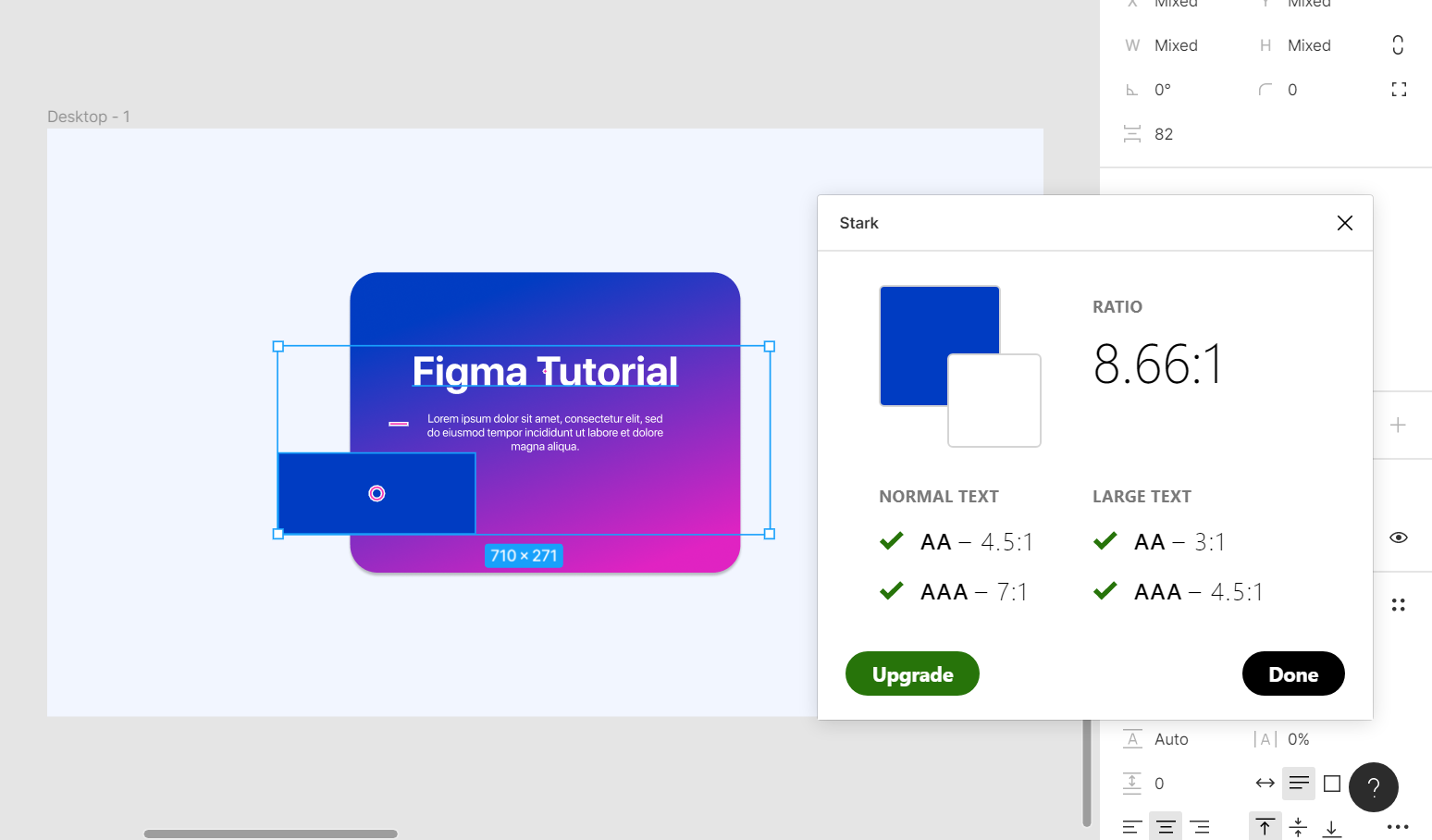
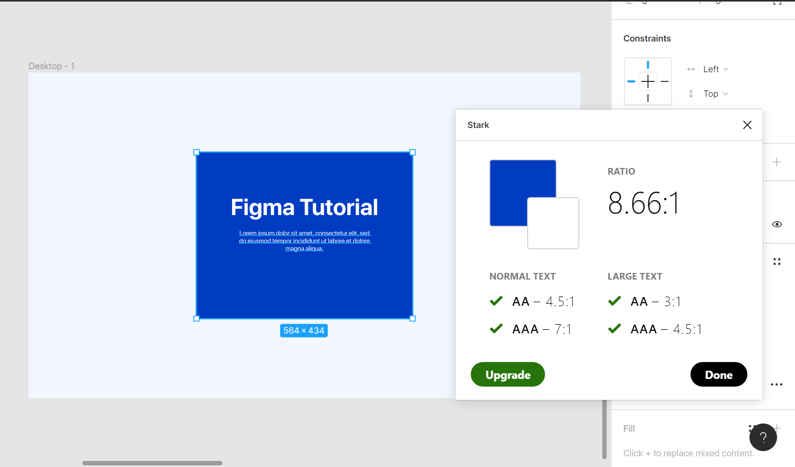
Stark Accessibility Tools (paid)
While it isn’t free, we’re including Stark Accessibility Tools because they’re so useful. With a comprehensive suite of utilities like Contrast Checker, Focus Order, Alt-Text Annotations, Vision Simulator, and more, all conveniently located in one place, it enables designers to easily identify and address accessibility issues in designs before they enter the production phase—or swiftly analyze and rectify those already in progress.
Here's a YouTube tutorial for more details.
PROS: Provides in-depth results for all accessibility options.
CONS: Not free, requires an account.
What are your favorite accessibility plugins?
That’s our round-up. We know other plugins are available, and that the Figma community might surface more. To keep up to date with these helpful apps, check out their community site for these tools.
And, if you know of accessibility design tools that we might find useful, let us know! You can message Crispin and Eugene on LinkedIn.

Crispin Bailey
When website requirements get daunting, Crispin loves to roll up his sleeves and dig in. His overarching goal is to deliver beautiful and accessible websites for our clients and their audiences. As a seasoned digital strategy expert, Crispin oversees Kalamuna’s design and strategy practice, coordinating design and technical efforts throughout the discovery and design phases on projects to build bridges between research, design, and development.