Information Architecture for Everyone: How to Future-Proof Your Website on Campus
Share
“Ok, are you on the homepage? Good. So first, I need you to go up to the search bar…”
This was the third time today, and it was only 10:30am. Jan was on the phone with yet another parent looking for tuition assistance forms on the university’s website. She really liked her job in the university’s financial aid office, but she was finding herself taking more and more calls like this these days.
About three years ago, Jan’s team moved all the scholarship information and paperwork to her department’s website. It had been a productive move and great for parents and students. But now with this new content management system, frustrated parents and students called her nearly everyday, trying to find financial aid information on the school’s website.
After trying to navigate many parents and students through the menu, she gave up and now directs people to just search for it. It’s not the best way, but it works. Jan and her colleagues feel like the important information for students and parents gets lost in the huge menu of the website. In fact, she’s not sure she could even find her department’s page nowadays. When it’s time to update PDFs and information on their page, it takes her a while to figure out exactly where to change what.
Why is Jan in this pickle? Her university upgraded to a new CMS (content management system) and she, along with administrative staff across campus, manage web pages that are difficult to find and update. They were provided no training or documentation. Sound familiar?
Universities pose a unique set of challenges that make designing and building websites complicated. Teams inside the institution must react to organization-wide strategic decisions in which they often aren’t involved. But, if you’re one of these folks, you can be proactive and preempt chaos for when one of these top-down decisions inevitably strikes. How? With a well-structured, user-centered information architecture and content strategy to future-proof your department’s web presence.
After over 15 years of working in-house at universities and non-profit research organizations, I know what it’s like to design and manage websites during institutional change, budget cuts, new brand campaigns, and leadership changes. Now, I’m a Senior User Experience Designer at a web design agency that specializes in working with universities. The phrase “make your own information architecture” may sound intimidating, but you can do it, and in this blog post, I’ll show you how.
Start with 3 things
Future-proofing your department’s website in the uncertainty of university life starts with three questions:
- Who is your website for?
- What are visitors trying to do?
- Does your content meet your visitors' needs?
At Kalamuna, we ask these same questions at the beginning of every project. But you don’t have to be a professional web designer to understand your visitors and your content. Take these questions back to your own team to weather the next big change at your university.
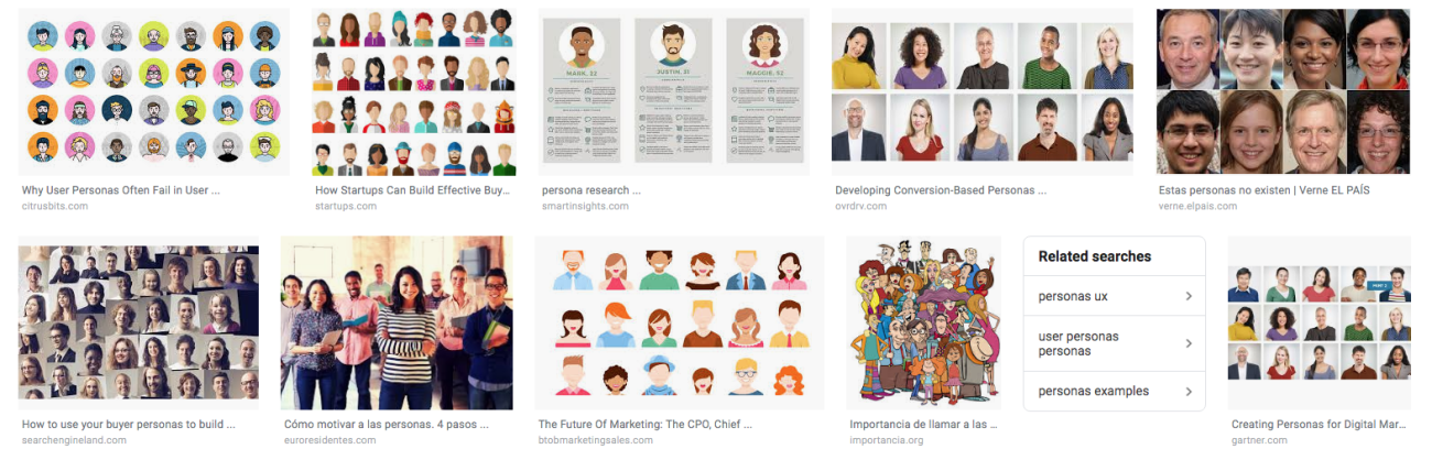
1. Who is your website for? Identify Users
First, sit down and determine who your website exists to serve. This is a great activity as a working group with your executive director, dean, center director, or faculty leadership. This may include audiences or users within your unit, on campus, and off campus. Are they foundational donors, high school students, researchers at other universities, adult learners, remote employees?
For a recent project at Kalamuna, we were working with a research center at a major American university. For this project, we developed a list of users for their website:
Primary user groups
- Decision makers in policy and government
- Donors and funders
Secondary user groups
- Potential collaborators
- Leaders in higher education
- Researchers in training
- General public
- Media
Try to make this list as concise and specific as possible. Talk through it with your unit’s marketing coordinator or public relations manager. Get inspiration from your university’s brand guide or your department’s marketing materials. The more focused your user groups are, the better experience you can create for them. Prioritize your user groups and optionally determine if they should be divided into primary and secondary groups. Share this list with your leadership and stakeholders.
2. What are visitors trying to do? Establish user goals
Now that you know who your site should be for, try to answer the question: what do they want and what do they want to do when they come to your website? Think about what your site can help each user group achieve and what they may expect the website to do for them.
For example, working professionals looking into grad school may want to know about flexible program options and financial aid. The development director at a foundation may want to know what research projects are underway at your center. A campus employee is looking for details about health insurance benefits ahead of open enrollment.
Just as you prioritized your user groups, rank the goals for each group. What’s the most important thing to the user? What’s the least?
As an example, here are the top goals we identified for the Decision Makers group:
- Connect with Center experts and researchers
- Use the Center's research to inform decisions in policy, private industry, government, and nonprofit initiatives
- Get to know more about the Center and future projects
3. Does your content meet your visitors’ needs? Create a content map
Now that you have your list of users and their goals, you can create a content map to understand if users can find what they’re looking for on your website. It can come in many forms, but we use a bubble or spider web map to figure out the structure of our site. In other words, if our website is a house, we create the blueprint. As you move through each page on your site, you should be able to identify how each user goal can be met with the content on your site. Here, we’re building a house with the right floor plan.

For example, a goal I have at my house is to binge watch Netflix. Should I do that in the pantry? No, because there’s nowhere to sit and no TV. I want to do that on a couch with a TV. Do I have room for that in my office closet? No, the best place for me to accomplish that goal is on a couch in my living room with a TV (and snacks). Knowing my goal and what “content” is in my house, I’ve now discovered the relationship between my couch, TV, and my goal of binge watching Schitt’s Creek again. See? Highly theoretical.
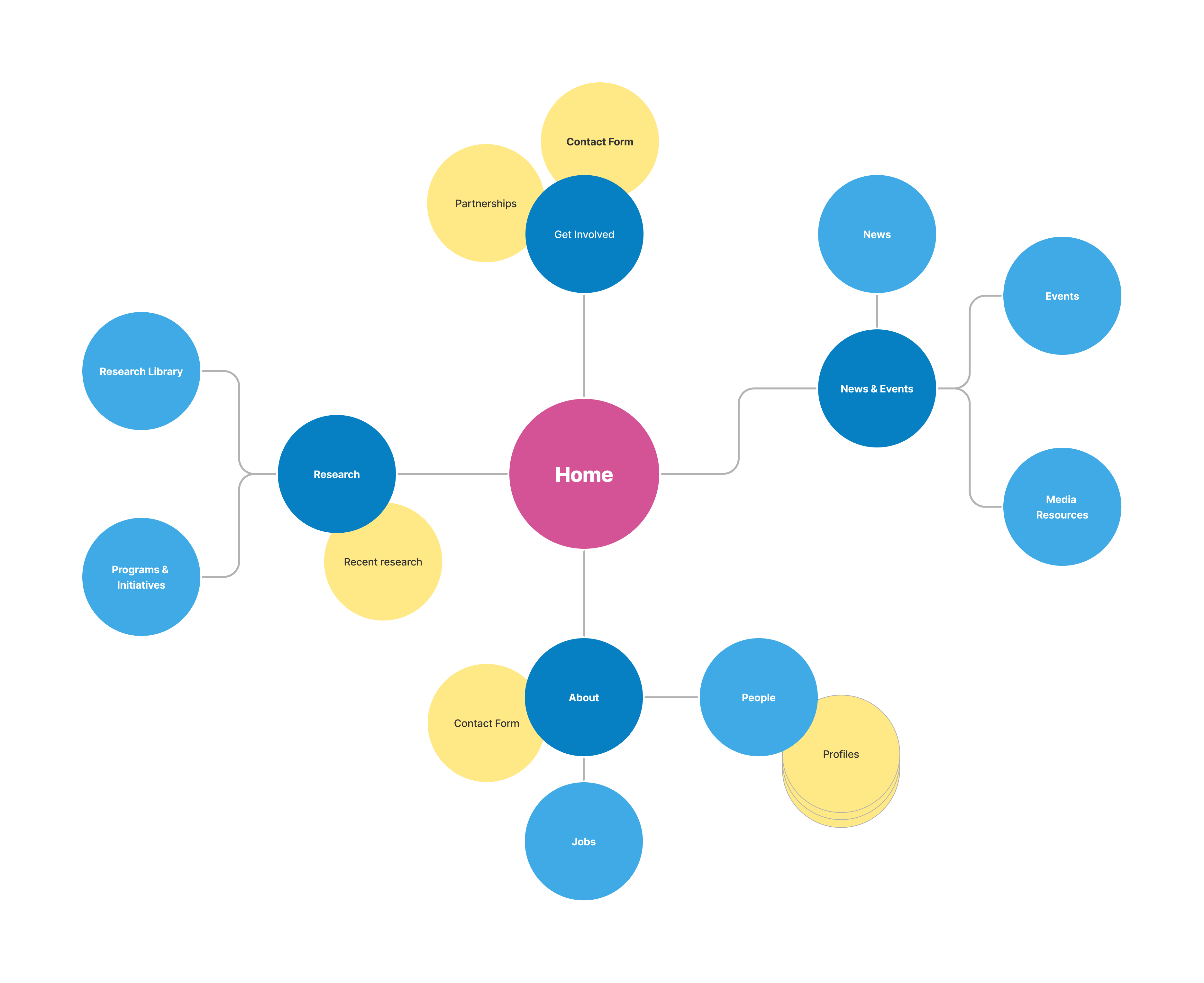
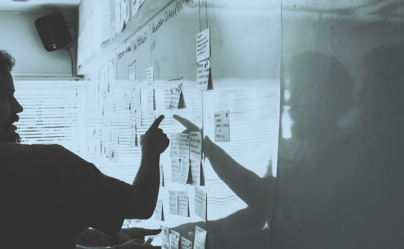
Now, onto making your content map. This is a tool to visualize and evaluate content relationships, and it’s the backbone of a site’s organization. Here’s how to make one:
- Start with the current site structure, focusing on your main navigation items. These are like the rooms in your house: bedroom, office, kitchen, laundry room. They end up with titles such as “About us,” “Publications,” “Faculty,” etc.
- Using a mind map, pop bubbles onto FigJam, a white board, post-its, or whatever you want to use, to show where everything currently lives. Where’s the toaster? It’s in the kitchen. Where’s your winter boots? They’re in the primary bedroom closet. Similarly: Where’s the contact info for your faculty? Under “About Us.” Where are the updates on your outreach activities? Under “News.”
- Review. Looking back at your user goals, ask: does this structure clearly help users accomplish these goals? Is it easy for them to find the things they need? You might understand that different internships come under specific majors, but do your incoming freshmen?
- Validate. Mark on your content map where these goals are met. Are any goals missing from the map?
- Revise. Here’s the fun part. Now you’ll edit the map based on your review and validation. Move bubbles around so that their relationships make sense to one another, create new bubbles, establish clearer relationships between content. For example: I know my reusable grocery bags could go in the pantry with the plastic bags to also reuse, but they’re easier to find in the hall closet by the front door.
- Align and test. Again, get project stakeholders involved. Shop around your map to make sure it makes sense to people with different perspectives and areas of expertise.
You’ll likely make revisions to your map and your user goals as time goes on—these are living documents. Take a look at your map about once a year to see if it still makes sense.
There are so many more activities to help with this effort, like looking at your website’s analytics, conducting audience surveys, or doing user testing, etc. Our team at Kalamuna includes many of these activities in UX research phases in projects for higher ed clients. But answering these basic questions and getting a solid understanding of your web content will give you a good start.
Change is a constant
Universities are complex, and change from above can seem to temporarily muck things up for the folks actually keeping the organization running. Institutional branding will change; one day, everyone is supposed to use blue, and the next day everything needs to be orange. The university will pay for a new CMS, and everyone will have to switch to Wordpress. It may seem like you’ll have to react to these inevitable changes, but you can be proactive. If your information architecture has good bones, you’ll have a good foundation of content to serve your audiences no matter what style or CMS your webpages have to be in.
If you’re interested in this topic and happen to be attending the 2023 HigherEdWeb Conference online and in Buffalo, NY, I’ll be giving an in-depth talk on this subject on October 9th at 10:45AM ET. Come say hello!

Jessica Schillinger
Jessica likes to make things, from hand-knit sweaters to fresh-baked bread. For over 14 years, she’s been helping higher education institutions and nonprofits engage audiences through data visualization and web design. She joined the Kalamuna team to continue fusing her maker spirit with her altruistic calling.