Emergency Landing Page Best Practices (Web Design for Disaster, Part 2)
Share
As the world experiences an unprecedented series of natural disasters, pandemics, and social upheaval, it is a good time to consider how well your website or application might perform in unexpected situations, and to discover new ways to ensure accessibility and improve communication during a crisis.
The team at Kalamuna has helped many organizations prepare for and respond to emergencies. In this series of posts, we share research and lessons from our previous projects and the best practices we are now recommending to our clients.
Web Design for Disaster:
Part 1 - Alert Banner Best Practices
Part 2 - Emergency Landing Page Best Practices
Part 3 - Accessibility Challenges in an Emergency
Why create an emergency landing page?
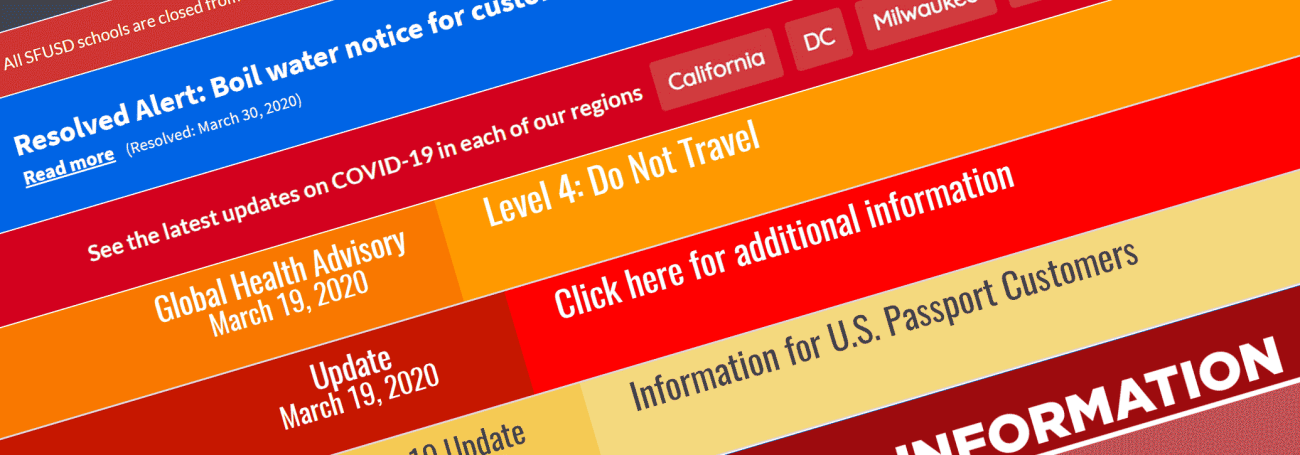
When a natural disaster or other crisis arises, many organizations suddenly need to use their website to convey urgent new information to their stakeholders. Sometimes, posting a brief message in a well-designed alert banner may suffice, but often an emergency situation is complex, rapidly evolving, and requires robust crisis response communications.
While you might try to publish urgent information using the existing features on your website, you may soon find that components and layouts designed for marketing, fundraising, or other day-to-day activities are ill-suited for use in a crisis.
Implementing a dedicated emergency landing page may be the best way to ensure that visitors will find the crucial information they need, while keeping them from being obstructed, distracted, or confused by content that isn't relevant to the current situation.
Before starting any design or development project, Kalamuna recommends conducting a thoughtful discovery process to research the specific needs of your users and to select an appropriate strategy for your organization. Solutions that have worked well for others might not be the best choice for your particular circumstances. If you’re not sure where to start, we can help!
What types of emergency landing pages are there?
There are three common types of emergency landing pages that we have designed and implemented for our clients, each having advantages and drawbacks. The choice of which to use for your website will depend on the situation, the amount of information that you are looking to present, and the resources available for design and implementation.
Option 1: Internal landing page
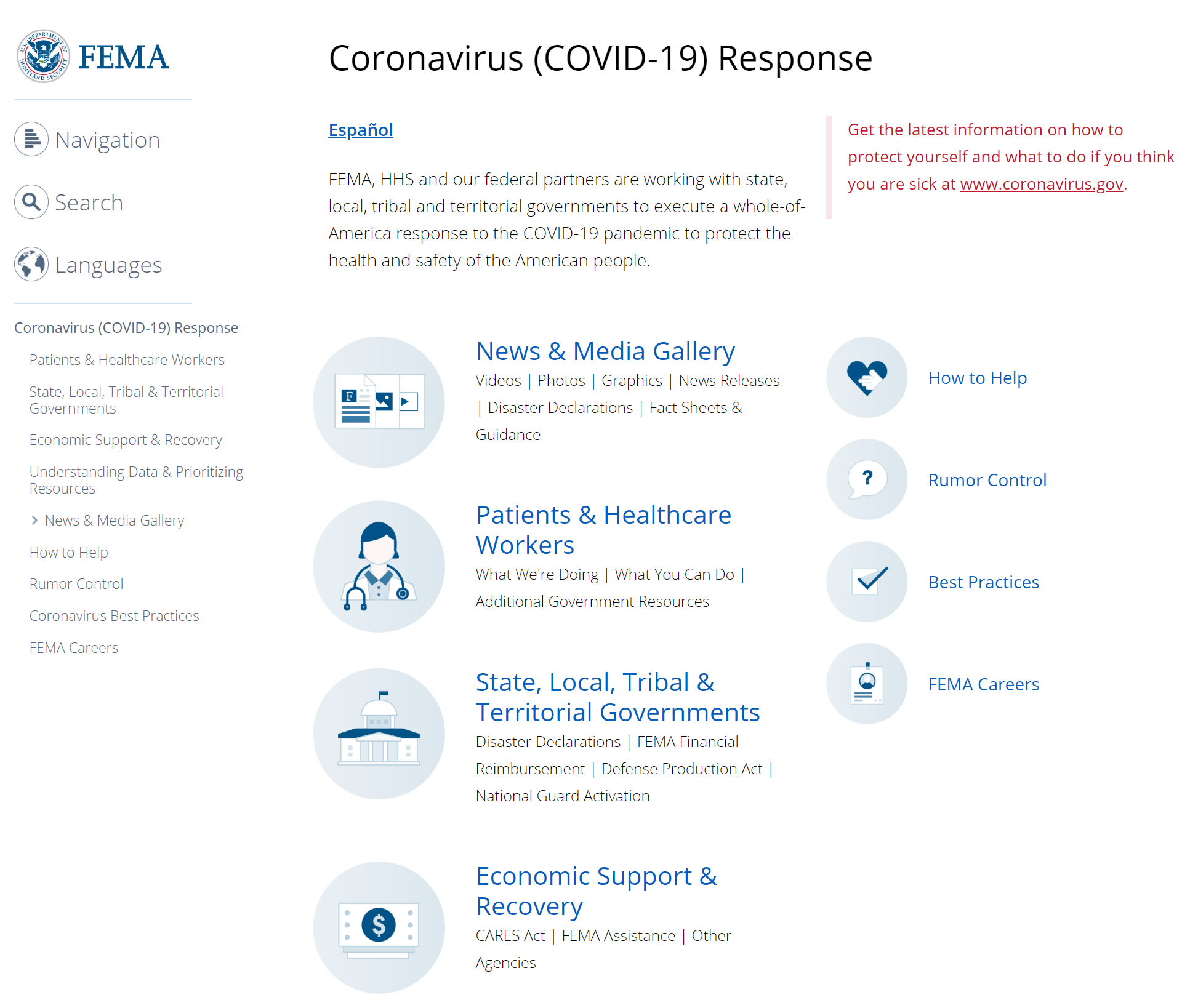
The simplest and most common design is the internal landing page, which is a page or section of pages within your site dedicated to providing information about an emergency. While this is the easiest to implement, and may even be created using an existing template, your ability to customize the structure and design of the page may be limited, and you will need to figure out how to reliably direct users to it from your homepage.
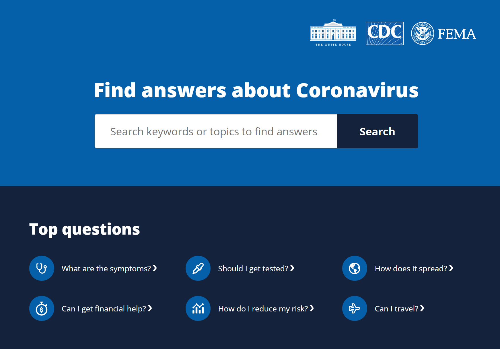
Option 2: Homepage takeover
If you want to display urgent information as quickly and prominently as possible, we recommend creating a homepage takeover, where your existing homepage is unpublished and replaced by content that strictly focuses on the emergency. This is the most reliable way to get important information in front of your audience while minimizing distractions, but it is more complicated to implement and may interfere with users not affected by the crisis who are looking for unrelated information.
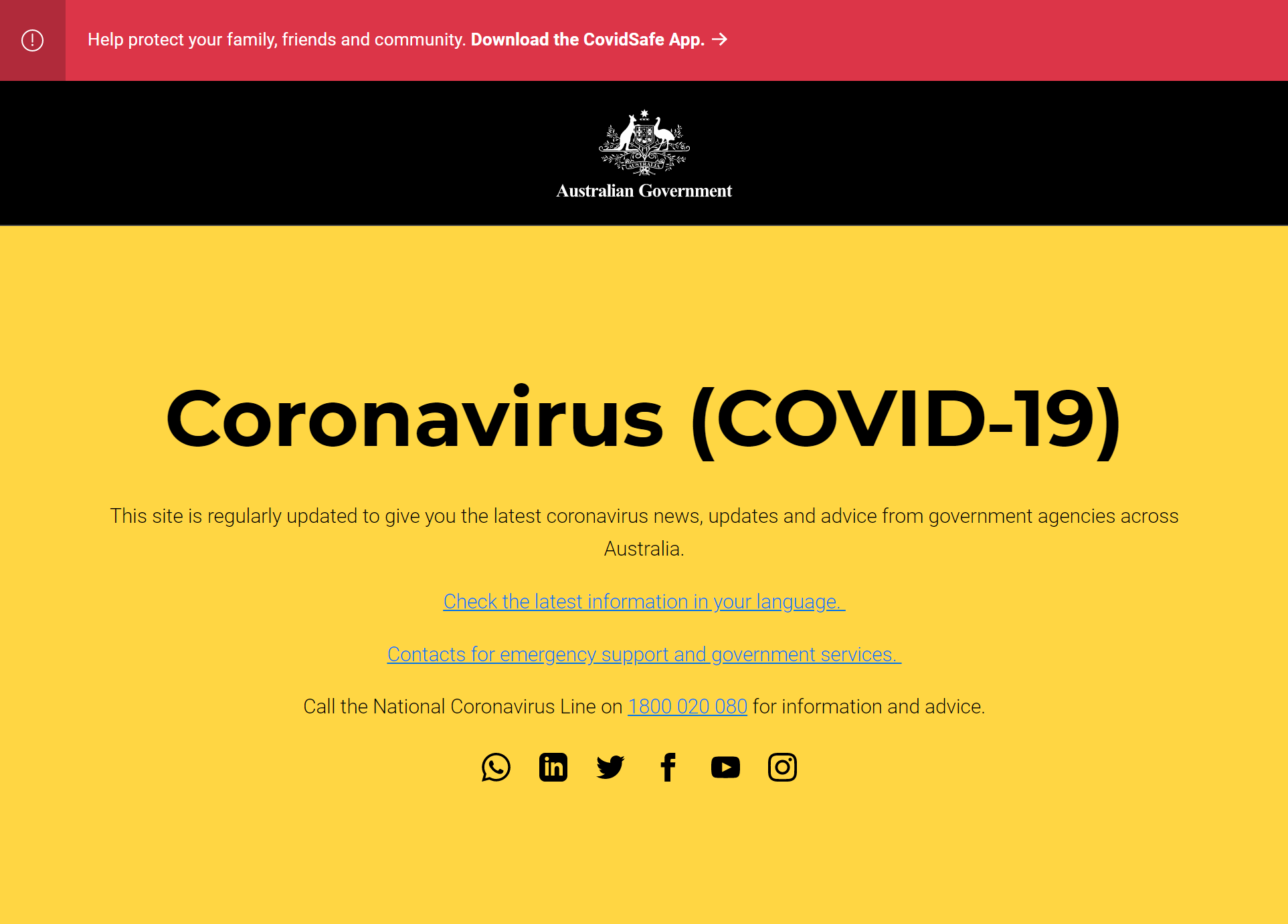
The Australian government has replaced its main government homepage with a landing page of resources about the coronavirus epidemic.
Option 3: Independent emergency site
If you want to provide an experience that can be highly customized and can deliver a lot of information over multiple pages or sections, you might create an independent emergency site, located at a separate domain or subdomain. This option gives you the most flexibility in terms of design and structure, but it could be the most expensive to implement and maintain, and might be difficult for your stakeholders to find.
Our friends at Pantheon have created a free pre-built response communications site for organizations on the COVID-19 response front-line to use built on WordPress. Find out more about how to use the project template and its feature set.
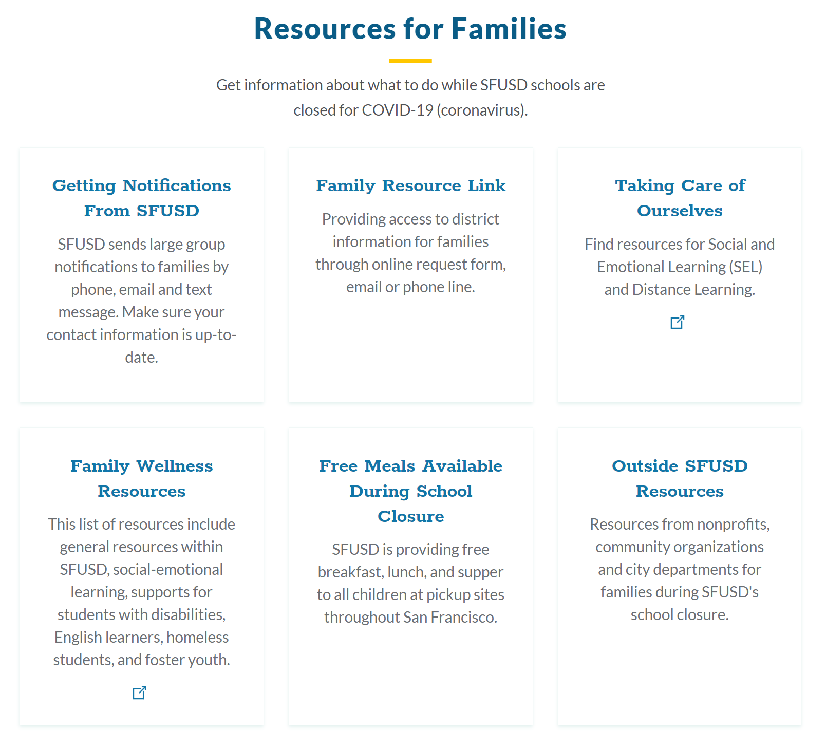
What should be included on an emergency landing page?
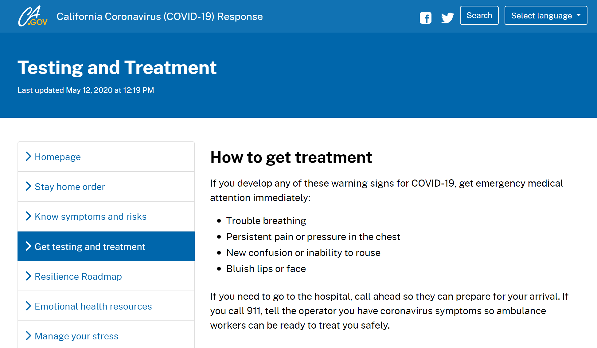
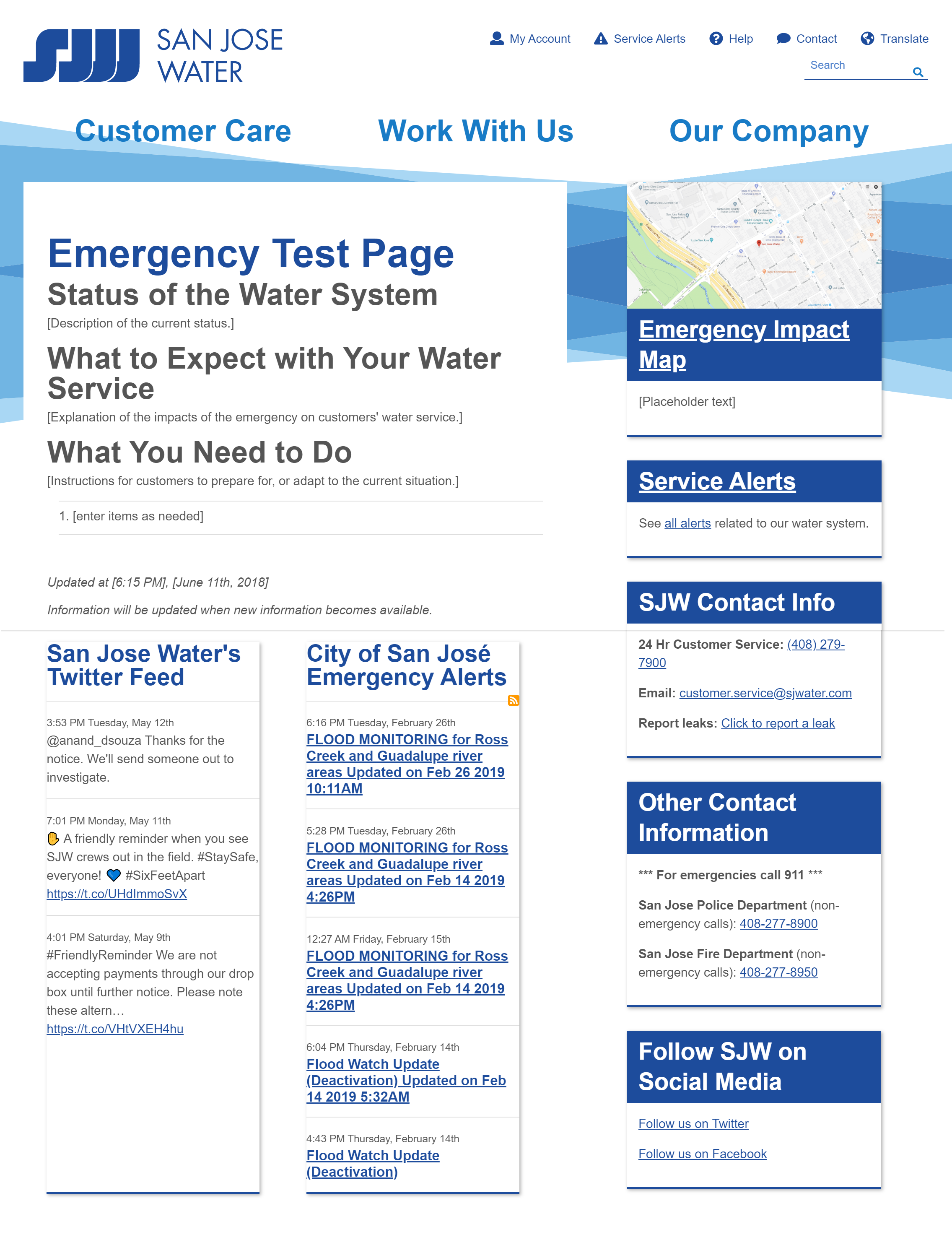
One of the most useful things for visitors to see when they arrive is a brief summary of the situation. Quickly state that there is a crisis in progress, specify who may be impacted, and list any urgent actions that need to be taken. Determine what is most important to communicate to someone who is just learning about the situation and only has time to read a few sentences.
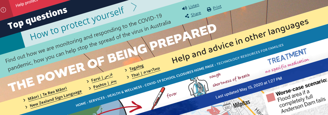
If a situation is out-of-the-ordinary, or if the problem is technical, you may need to provide background information to help people understand what is happening and why the situation should be given the appropriate level of concern. The danger may not be immediately apparent, or popular perception may be wildly different than how things unfold in real life. Try to keep your explanation to one or two paragraphs, consider showing a video or diagram, and then provide a link to additional details.
The coronavirus landing page for the government of Barbados highlights a WHO video to provide background information to their citizens.
Many visitors may return to your site to see the latest announcements during a crisis. Displaying that content prominently can allow your audience to quickly see what has changed, but be careful not to overshadow the summary or important links that you want visitors to see as soon as they arrive.
To keep people informed without needing to revisit your website, you may provide ways for them to subscribe to updates. That might entail a signup form for email or SMS notifications, or links to social media accounts where you plan to post additional information as it becomes available.
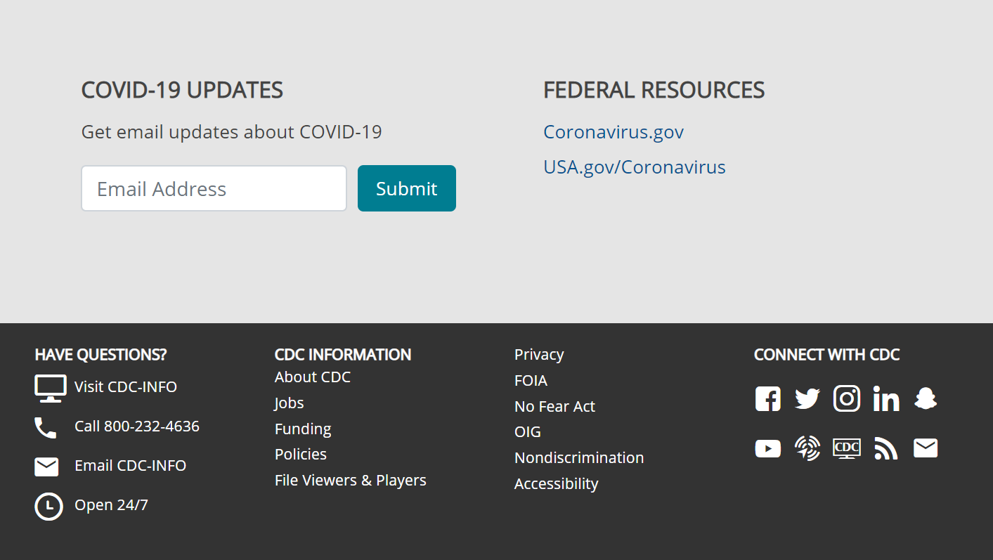
Some visitors may need help beyond the information provided on your website, so consider displaying contact information for your organization. If you are unable to provide urgent assistance, provide the contact details for emergency services that can help. Make sure to place telephone numbers in a tel: link and email addresses in a mailto: link, so users can easily reach out with a single click.
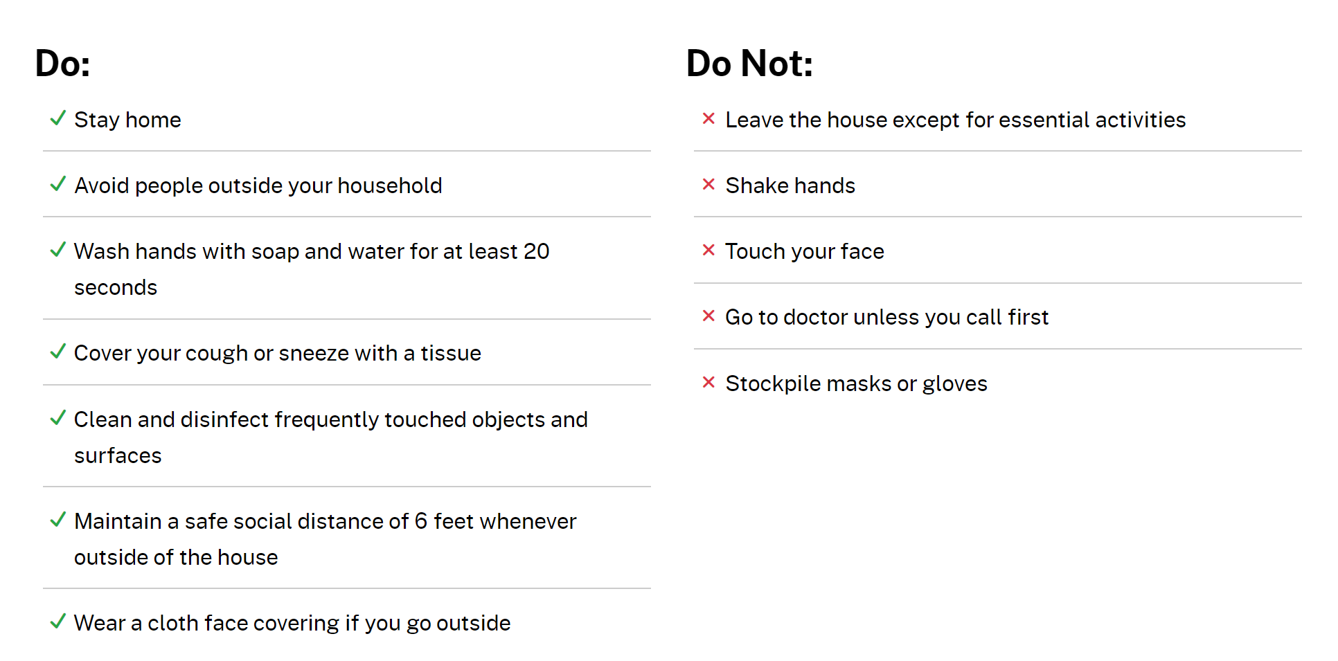
If there are specific tasks that your stakeholders must take in response to the emergency, provide a clear list of action items. If the items aren’t immediately applicable to everyone, clarify who your audience may be and the relevant instructions.
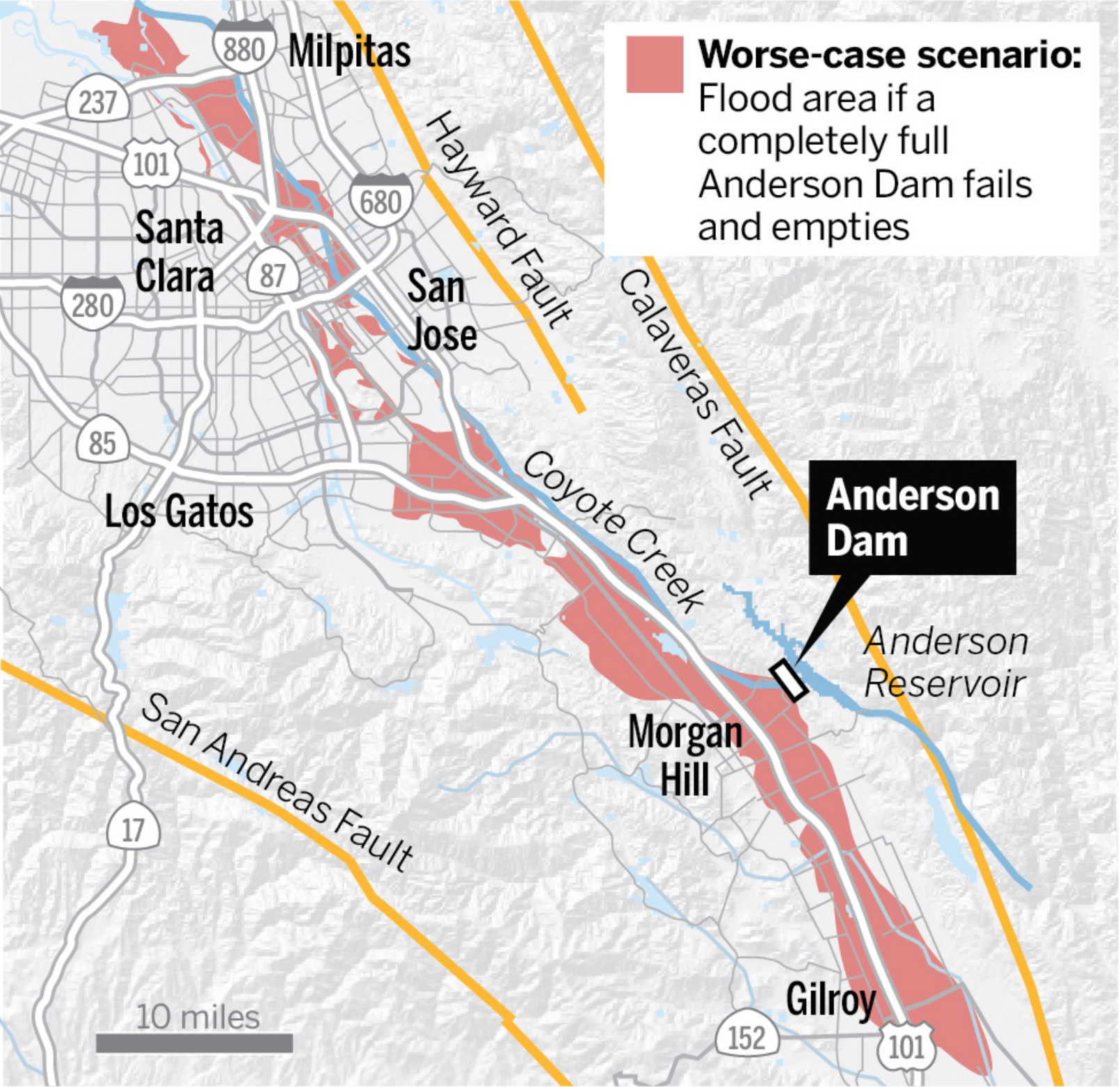
If the effects of a crisis vary based on geographic location, make sure to include an overview map of the situation. Clearly mark areas where residents may need to evacuate or be prepared to take action. For detailed instructions, you may also need to provide an interactive map, high-resolution download, or address lookup tool, but try to start with a static graphic that can be quickly and reliably loaded on all devices, and is potentially printer-friendly as cell service can become unreliable in disaster scenarios.
If there are common concerns that you anticipate your audience to have, or if they have contacted you for clarification after the landing page was first published, consider adding a section that answers their frequently asked questions.
There may be additional resources that can provide details or updates about the crisis, including expert sources, news outlets, and government authorities. Compile a list of links to helpful information, and try to clearly mark any external destinations with an accessible icon so users know they will be leaving your site.
If the amount of content you need to provide is substantial, you will need to create supplementary pages on your site. Additional navigational elements will be required, such as a special menu to travel between relevant pages, and a return link to help users return to the main landing page.
Since the content on your emergency pages will certainly change as the situation progresses, display the updated date and time for each resource, so people know they are receiving the most recent and accurate information. Also indicate when planned updates will happen (e.g. 6:00 p.m. every day) so people know when they can expect new information.
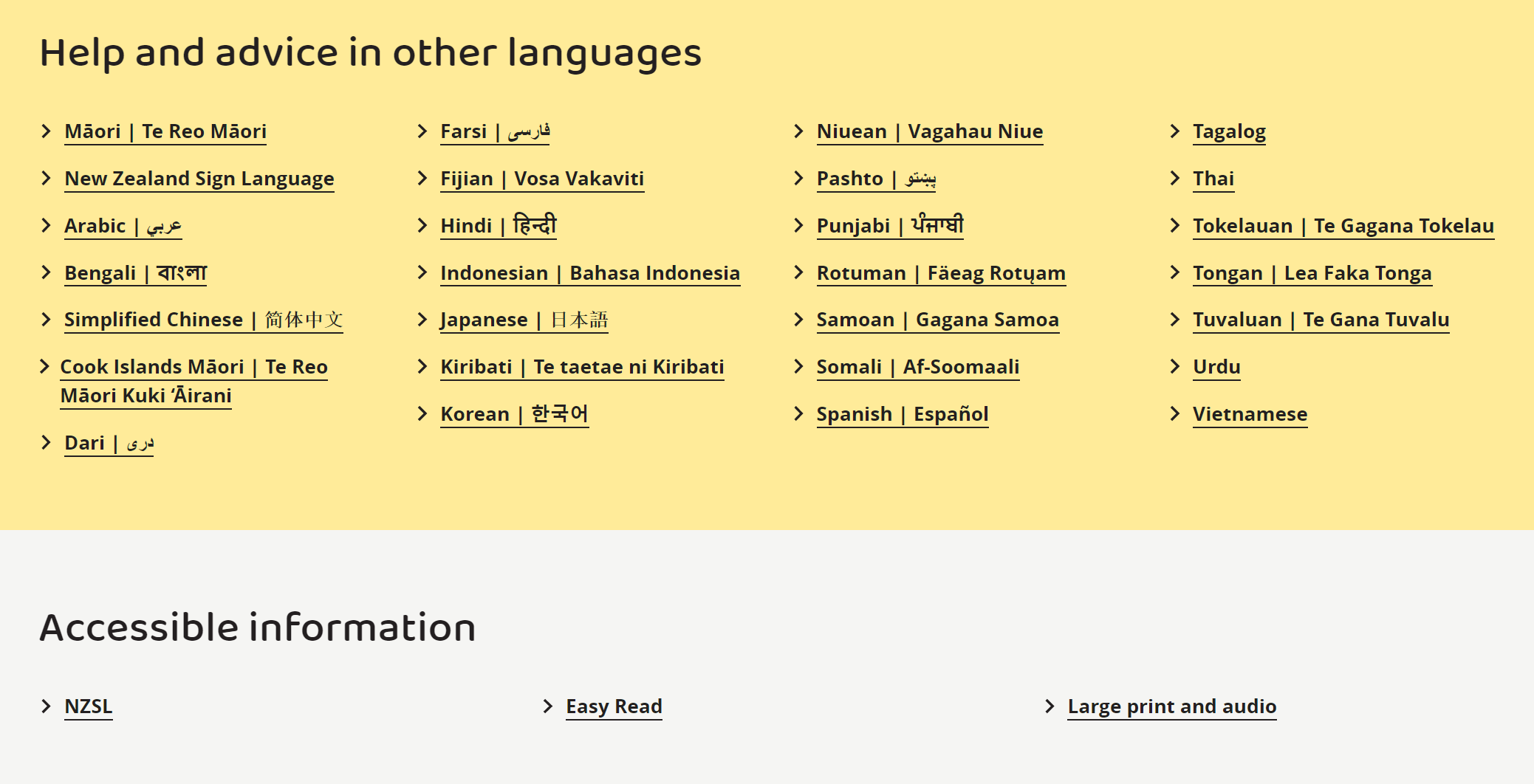
Not everyone coming to your site will be able to read English fluently, so it is important to provide ways to read the urgent information in alternate languages. If you don’t have the resources to manually translate the content, tools such as Google Translate are available to provide an automatic translation.
How should you prepare in advance?
Since emergency landing pages look and function differently than other pages on your site, and will have a different structure and components, it is important to prepare a system to deploy them well in advance of a crisis. And in addition to the design and technical details, we recommend considering the content itself that will be contained within your landing pages.
Before you start implementation, research best practices for emergency communication strategies. Collaborate with stakeholders who were trained and are responsible for emergency procedures as well as communications for your organization.
Consider a process of contingency planning in response to a scenario plan. You can start drafting messages, compiling helpful resources, and generating graphics and maps that would be needed.
Ideally, you can create the landing page itself as an unpublished draft within your CMS, so that your staff can collaborate on content and see how things will look and function before it is deployed. You may even create several different draft landing pages for various potential situations, so when a crisis occurs, you will be able to add the situation-specific details to one template, and quickly publish it.
Just like with alert banners, make sure you have tested components in advance, made clear who is responsible for deploying the page, and created an interface that minimized the risk of accidental activation. We will provide additional tips on ensuring accessibility in an emergency and organizational planning with future posts in this series.
Hopefully, this post has helped you determine whether an emergency landing page might be a good solution for your organization, and what information your stakeholders might find most useful in a crisis. If so, consider reading the additional installments of our Web Design for Disaster series:
Alert Banner Best Practices (Web Design for Disaster, Part 1) - Alert banners are often the best way to quickly and reliably catch the attention of visitors, let them know that an emergency is in progress, and direct them to additional instructions, resources, or updates.
Accessibility Challenges in an Emergency (Web Design for Disaster, Part 3) - During a natural disaster or public emergency, conditions may change dramatically for your users, while it could be more important than ever for your system to remain accessible.

Mike McCaffrey
The Internet of the future could be made of stardust or the usual cats, but either way it will work simply and powerfully because Mike will have made it. Whether he’s thinking strategically about business requirements, tracking and prioritizing user stories, solving complicated design problems, analyzing metrics or releasing new features, he finds the most straightforward and efficient means to pave our path into the 4th dimension.