Design Inspiration: From the Obvious to São Paulo's Urban Centers and Fundamental Physics
Share
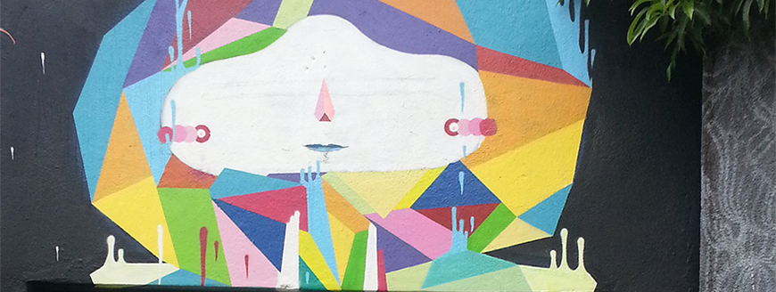
São Paulos Batman's Alley hosts an ever-changing tapestry of works from local street artists
At Kalamuna, we aim to design functional, user-centered experiences, but we also look to impress and delight when we can. Making something usable is a noble task, and one we take seriously, but just as chefs don’t aspire to make food that is merely edible, we aim to communicate our client’s visions and brands in evocative ways, connect to users emotionally, and do so with a certain sheen and polish. The task of translating all these considerations into visual design and interactions falls to me, Kalamuna’s Senior Designer. As 2017 came to a close, I sat to assess the influences and inspiration that guide my work, be it influential 20th century designers or some recent outcomes of fundamental physics research.
Other Designers
Any list of design influences might as well start with great designers. I’m listing a smattering of well known late 20th century design icons, unsung heroes of the digital transition, among others.
Herb Lubalin is responsible for a slew of recognizable brands, such as the Bible and PBS, among others. But his work with Ralph Ginzburg in the 60’s on Fact, Avant Garde, and Eros Magazines are what earned him his status a a “the designer’s designer” and flung him into the free speech and anti-censorship movements of the 60s.
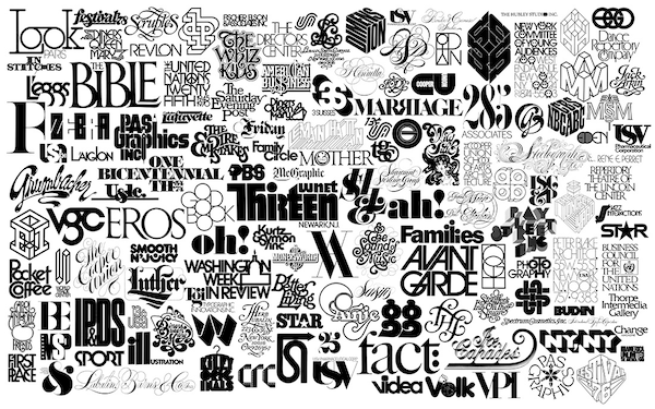
Herb Lubalin’s notable and prolific logomark output.
Muriel Cooper was a pioneer whose career spanned two main phases: as art director of MIT’s Media Lab, and then as the founder of MIT’s Visible Language Workshop (VLW.) Her work at the VLW pioneered dynamic interfaces, the display of complex information on the budding medium of computer displays, and interaction design. Once asked to provide her biography in 250 words or less, she summarized her career in the following 65: “Her concerns have always been with beginnings and process. More with change and technology and their meanings to human communication than with rigorous graphic design theory and style.” Later, as professor at the Media Lab, she would go on to train future luminaries such as Lisa Strausfeld, and John Maeda.
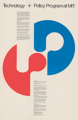


Works by Muriel Cooper from throughout her career.
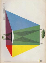
Rudolph de Harak was responsible for the wonderful design output of Westminster Records, injecting some refreshing whimsy into modernism.
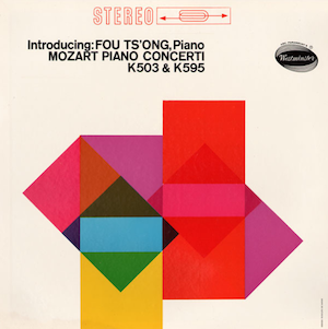
A broad sampling of de Harak’s work.
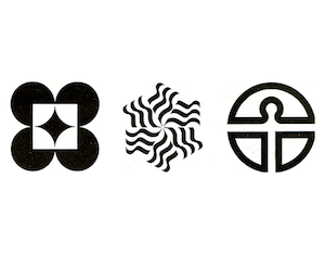
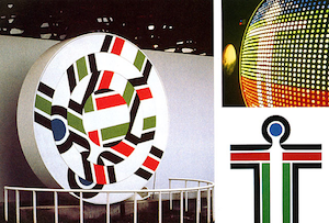
Erik Nitsche is most known for his posters for General Dynamics, where his unique blend of Swiss design orderliness and French magazine illustrations come together in lovely evocative illustrations.
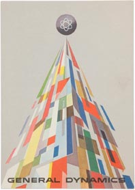
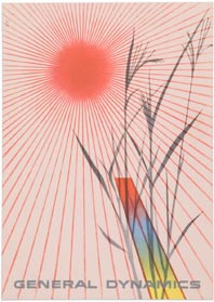
Work by Erik Nitsche
Marco Moretti - A master of our craft, Marco is perhaps the closest thing I’ve ever had to a mentor. The precisely appropriate outcomes of his projects belie the rigueur, consideration and meticulousness of process that goes in to his work.
Pablo Ferro - If Saul Bass is the master of the Hollywood title sequence, Cuban born Pablo Ferro bears the torch. He is most renowned for his work for the title sequence to Dr. Strangelove and Clockwork Orange. He is still working at the age of 83.
Other Undeniable Influences
Otl Aicher - Responsible for the iconic design of the 1972 Munich Olympic games.
Saul Bass - Timeless film title designer.
Paula Scher - Well known for her type heavy compositions, and partner at one of the world's most well-known agencies.
The Design Vernacular of Urban Spaces
Everything is designed. Sometimes quite by accident, or through evolutionary forces, great design is achieved and regional styles develop in store signage, restaurant awnings, road signs, etc. The mundane harbors a world of visual richness to draw from.
Vernaculartypography.com curates a pretty good blog of images of “Lettering in the Urban Environment.”
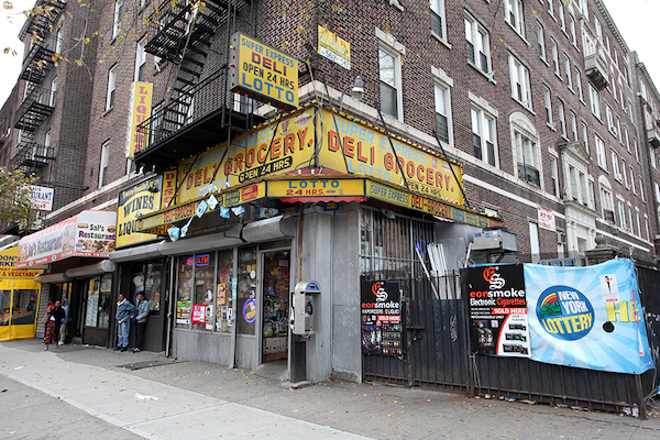
An example of a typical bodega awning in Brooklyn where I live and work.
I make my way to São Paulo, Brazil, with some occasion (I was born nearby;) the city's letterpress posters advertising popular events (the “Lambe Lambe” which translates to “Lick Lick”) and street art/graffiti both play prominent roles in the visual environment.
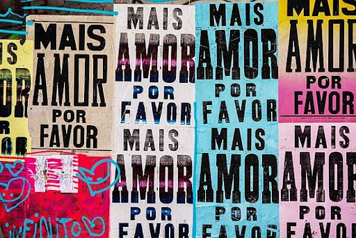
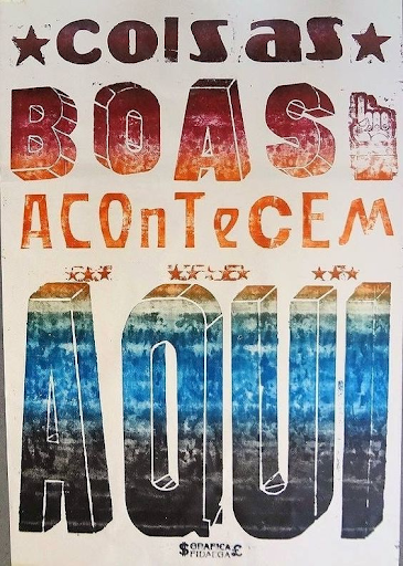
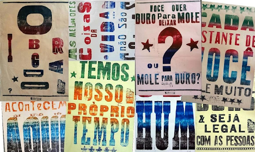
São Paulo's traditional letterpress posters have made a popular comeback, particularly after political unrest fueled massive street posters starting in 2013.
And here are some galleries of São Paulo Street Art I've documented:
And Rio, of course, does not disappoint (never does.)
Web Design and UX
A List Apart “explores the design, development, and meaning of web content, with a special focus on web standards and best practices.” (Quote from their site.) The granddaddy of web design blogs, founded by Jeffrey Zeldman of Happy Cog all the way back in 1998, it has become an authority where influential thinkers on web design theory, practice, and user experience muse often in long form. It’s an excellent learning resource for the veteran or initiate web designer alike.
Donna Lichaw - A friend of many, many years, Donna turned her focus towards how the user experience needs a good story. And with her background in film, and years as a UX practitioner, she’s recently refocused to help other practitioners integrate narrative into their user-centered design practice, ensuring the user’s journey is rewarding rather than merely usable.
Design as Activism
Social Design Notes introduced me to the notion that design can be used towards social utility, activism and change. It’s simple and understated, and updates are sporadic, but a worthy read.
Indie Record Covers of the 90s and Beyond
Thrill Jockey Records
There are many designers to credit here, but imagine just as my design interest was piquing, coming across these design gems, often involving hand printing, silk screening, uncoated cardboard (this was a big deal for a suburban kid in the 90s) and abstract photography. Thrill Jockey records out of Chicago cared nearly as much about its record covers and presentation, as it did it’s high calibre artists… a tip of the hat.
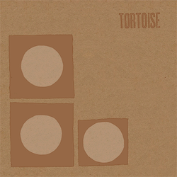
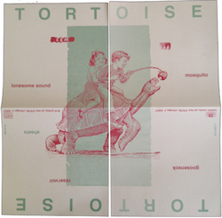
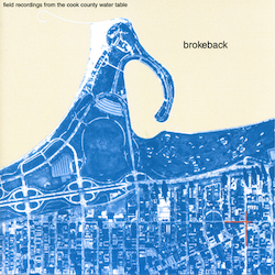
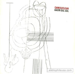
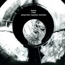
Thrill Jockey Records’ album covers.
Fundamental Physics
Like good design systems, or anything, nature is an emergent system comprised of a few—simple—basic rules. Parsimony is the rule: economize energy, keep the number of elementary rules small.
On design, Antoine de Saint-Exupery (perhaps one of the earliest graphic designers) writes:
“Perfection is achieved, not when there is nothing more to add, but when there is nothing left to take away.”
Einstein has been attributed as saying:
"Everything should be made as simple as possible, but not simpler.”
These similar sentiments are what has me occasionally looking to theoretical physics for inspiration, both conceptual and visual:
Symmetry Mag’s Etymology of Particle Physics or: All of everything, emerges from a simple set or elemental particles, and a few unbroken rules.
Sometimes, things get weird(er): Like maybe we're both encoded information on the inner surface of the universe at n-1 dimensions, and the 3+Time dimensional projection thereof, at the same time and there's no difference between them.
And sometimes it produces direct design inspiration:

The amplituhedron, a higher dimensional shape described mathematically in 2013 that allows calculations regarding particle interactions to be greatly simplified, influenced the design of Kalamuna’s logo and brand-identity.
Revisiting my design influences and taking a closer look at my work to extrapolate other influences has been a fruitful bit of year-end reflection. It’s helped me think about how my point of view contributes to projects, and my engagement with them. I hope that my humble review can provide material for others’ exploration or, at the very least, prompt a similar reflection.
Thiago de Mello Bueno
When the gods of user experience, front-end development, and graphic design collided in a passionate night that rocked the world, Thiago de Mello Bueno was conceived. His mastery of problem solving and cutting-edge design enables Kalamuna to create the hottest, most revolutionary web solutions for our clients who, like us, give a damn.


