Create Content-managed, Full-Width Background Images in Drupal
Share
“Jimmy’s mom lets him have full-width background images. You’re THE WORST.”
Sometimes Drupal feels like an overbearing mother who won’t let us out of the house wearing ripped jeans and that fake nose ring. Just like every well-meaning parent, Drupal does a good job of managing our content, but when it comes to doing what the cool kids are doing it can sometimes be a struggle. Such is the case when we want to use full-width background images. In this article, I show you how to create them in Drupal— and empower users to manage them— so you can join the nose-ringed rebels.
Now Picture This...
The go-to solution for responsive images in Drupal is a combination of the Breakpoints and Picture modules. With these modules we can define custom breakpoints and serve different image styles at these various breakpoints. For the purposes of this article I’m going to assume you already know how to configure these modules. But if you don’t, check out these resources.
Now, if we just wanted to serve up inline images we could configure these two modules and then go listen to some Sonic Youth—because we’d be done for the day. But we’ve got peers to impress clients to please and they’re not going to be happy until they can manage their full-width background image hawtness. So this is where it get’s fun.
Setting the Scene
In the example I’m going to show you we’re utilizing Panopoly and Kalatheme to build a Panel page where each pane stretches the full width of the browser. These panes will be the target for our background images. Note that you don’t have to use panels to achieve a similar result; you could easily apply the technique to divs in a page.tpl.php or some other incarnation.
All Teh Codez
When I first sat down to tackle this problem I starting digging into the code for the Breakpoints and Picture modules. I noticed that it was easy to get my hands on the picture mappings and breakpoints, like so:
  $picture_mapping = picture_mapping_load('name_of_picture_mapping');
  $breakpoints = picture_get_mapping_breakpoints($picture_mapping);
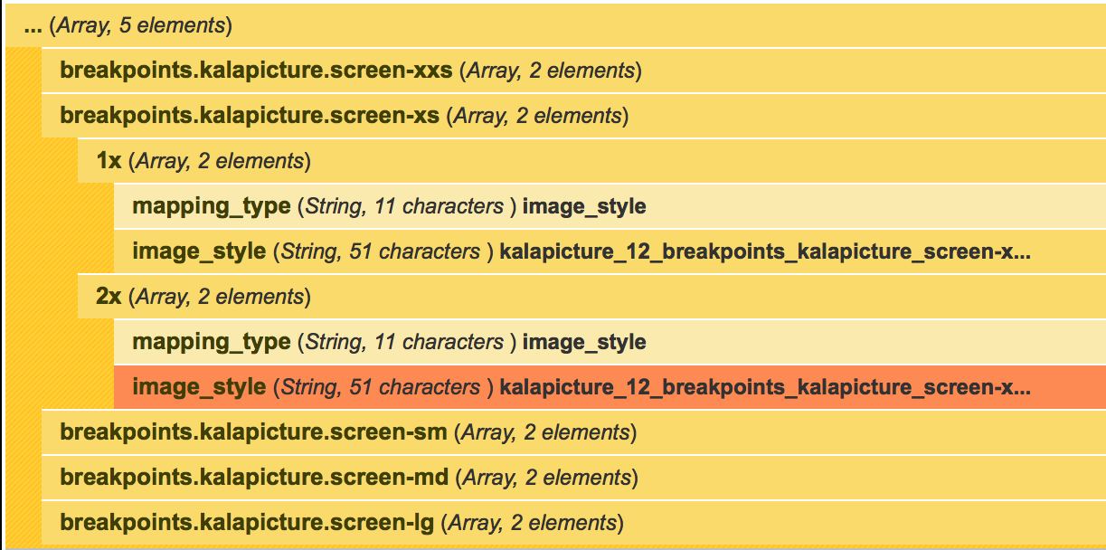
Inspecting $breakpoints with Krumo showed me something like this:
Then my mind started to wander: “Maybe I could use these arrays to add some CSS to the style attribute on each pane div?” I started some ways down this road before I realised that I was going to need media queries, and these don’t work in inline style attributes. “Oh the humanity! These images aren’t going to be responsive!” I was about to throw in the towel and tell the client that, instead of managing these images themselves, they were going to have to rely on us and burn through their support hours whenever they decided they wanted to change the images on their site. Then it struck me: maybe I could just build up a string of CSS inside of <style> tags and print it on the page. Now, obviously, keeping your styles in CSS files and referencing them from the <head> is best practice, but this is the Wild (Drupal) West, man, and sometimes you gotta bend the rules a little to come up with a useful solution. Besides, TECHNICALLY we’re not doing anything wrong. What could it hurt?
First up, we want to get our hands on the file, the picture mapping, and the breakpoints. Note that my example is all going down inside a hook_panels_pane but this same code can apply to wherever you can get your hands on an image URI from a filefield. Note we are also making a class that is unique to the given pane. This $pane_class variable will also be used later when we’re building our final string of CSS.
function themename_preprocess_panels_pane_hot_primary_tout(&$variables){
  // Grab the filename, the picture mapping and breakpoints for the
  // image.
  $file_path = $variables['content']['field_hot_primary_tout_image'][0]['#item']['uri'];
  $picture_mapping = picture_mapping_load('kalapicture_12');
  $breakpoints = picture_get_mapping_breakpoints($picture_mapping);

  // Make a unique class for this pane as well as a generic one so we
  // can style all panes with bg images.
  $pane_class = 'fpid-' . $variables['content']['#element']->fpid;
  $variables['classes_array'][] = $pane_class;
  $variables['classes_array'][] = 'has-image';
...
Once we have these three arrays we are going to loop through the breakpoints to build up our style for each one.
  // Go through all the breakpoints to build the media queries.
  $media_queries = array();
  foreach ($breakpoints as $machine_name => $multiplier) {
    $bp = breakpoints_breakpoint_load_by_fullkey($machine_name);
    $bp_string = $bp->breakpoint;
...
Once we are inside the loop we are loading the breakpoint object with ‘breakpoints_breakpoint_load_by_fullkey($machine name)’. This gives us a fully loaded breakpoint object, inside which we have access to the breakpoint string that we can build our media query with e.g. (max-width: 479px) or only screen and (min-width: 50em). These strings are set in the Breakpoint configuration page at admin/config/media/breakpoints.
At each breakpoint we potentially have a number of $multipliers which are set in the Breakpoint config to allow us to use a different image style for high-density screens. Thus, we also need to loop through these multipliers and build the CSS for 1x as well as 2x screens if the breakpoint is configured to handle them.
foreach ($multiplier as $x => $settings) {
  // Manually build a url to the image style.
  $img_url = image_style_url($settings['image_style'], $file_path);

  // Add an extra condition if we're dealing with the retina image.
  $retina = '';
  if ($x == '2x') {
    $retina = 'and (-webkit-min-device-pixel-ratio: 2)';
  }

  // Build the media query string and add it to the array.
  $media_queries[] = "@media
                        only screen and $min_max $retina {
                          .$pane_class {
                            background-image: url($img_url);
                          }
                        }";
}
...
This is really the meat of it. First, we’re grabbing the path to the image. Note that this isn’t the original image attached to the filefield, it is the dynamically generated image that Drupal has created for the image style associated with this breakpoint. Secondly, we’re checking the screen density multiplier. If it’s a ‘2x’ then we need to add 'and (-webkit-min-device-pixel-ratio: 2)'. We’re then making an array of CSS strings, ready for printing on the page.
The last step is to join the strings together and put them inside <style> tags so the browser knows to interpret it as CSS.
  // Add a style tag with our css inside.
  $variables['content']['bg_style'] = array(
    '#theme' => 'html_tag',
    '#tag' => 'style',
    '#value' => implode('', $media_queries),
  );
I’ve chosen to use a render array because I know that this panel pane will end up being run through render() at some point later in execution. You can of course just implode $media_queries and wrap it in style tags yourself and stick it on the page as it suits your circumstance.
To wrap up, I will show you the code in its entirety as well as the CSS that it produces.
Teh Codez
/**
 * Implements hook_preprocess_panels_pane.
 */
function themename_preprocess_panels_pane(&$variables) {
  // Grab the filename, the picture mapping and breakpoints for the
  // image.
  $file_path = $variables['content']['field_hot_primary_tout_image'][0]['#item']['uri'];
  $picture_mapping = picture_mapping_load('kalapicture_12');
  $breakpoints = picture_get_mapping_breakpoints($picture_mapping);

  // Make a unique class for this pane as well as a generic one so we
  // can style all panes with bg images.
  $pane_class = 'fpid-' . $variables['content']['#element']->fpid;
  $variables['classes_array'][] = $pane_class;
  $variables['classes_array'][] = 'has-image';


  // Go through all the breakpoints to build the media queries.
  $media_queries = array();
  foreach ($breakpoints as $machine_name => $multiplier) {
    $bp = breakpoints_breakpoint_load_by_fullkey($machine_name);
    $bp_string = $bp->breakpoint;
    foreach ($multiplier as $x => $settings) {
      // Manually build a url to the image style.
      $img_url = image_style_url($settings['image_style'], $file_path);

      // Add an extra condition if we're dealing with the retina image.
      $retina = $x == '2x' ? 'and (-webkit-min-device-pixel-ratio: 2)' : '';

      // Build the media query string and add it to the array.
      $media_queries[] = "@media
                            only screen and $bp_string $retina {
                              .$pane_class {
                                background-image: url($img_url);
                              }
                            }";
    }
  }

  // Add a style tag with our css inside.
  $variables['content']['bg_style'] = array(
    '#theme' => 'html_tag',
    '#tag' => 'style',
    '#value' => implode('', $media_queries),
  );
}
The CSS
<style type="text/css" media="screen">
  @media only screen and (max-width: 479px)  {
    .fpid-9 {
      background-image: url(http://localhost/sites/all/files/styles/kalapicture_12_breakpoints_kalapicture_screen-xxs_1x/public/eecs_tout_hero/unknown-1.jpeg?itok=5jNt1UW7);
    }
  }

  @media only screen and (max-width: 479px) and (-webkit-min-device-pixel-ratio: 2) {
    .fpid-9 {
      background-image: url(http://localhost/sites/all/files/styles/kalapicture_12_breakpoints_kalapicture_screen-xxs_2x/public/eecs_tout_hero/unknown-1.jpeg?itok=05oFQm2G);
    }
  }

  @media only screen and (min-width: 480px)and (max-width: 767px)  {
    .fpid-9 {
      background-image: url(http://localhost/sites/all/files/styles/kalapicture_12_breakpoints_kalapicture_screen-xs_1x/public/eecs_tout_hero/unknown-1.jpeg?itok=TuArvdo3);
    }
  }

  @media only screen and (min-width: 480px)and (max-width: 767px) and (-webkit-min-device-pixel-ratio: 2) {
    .fpid-9 {
      background-image: url(http://localhost/sites/all/files/styles/kalapicture_12_breakpoints_kalapicture_screen-xs_2x/public/eecs_tout_hero/unknown-1.jpeg?itok=Z_3IZJZt);
    }
  }

  @media only screen and (min-width: 768px) and (max-width: 991px)  {
    .fpid-9 {
      background-image: url(http://localhost/sites/all/files/styles/kalapicture_12_breakpoints_kalapicture_screen-sm_1x/public/eecs_tout_hero/unknown-1.jpeg?itok=_iu3tMVR);
    }
  }

  @media only screen and (min-width: 768px) and (max-width: 991px) and (-webkit-min-device-pixel-ratio: 2) {
    .fpid-9 {
      background-image: url(http://localhost/sites/all/files/styles/kalapicture_12_breakpoints_kalapicture_screen-sm_2x/public/eecs_tout_hero/unknown-1.jpeg?itok=S8KkvrPA);
    }
  }

  @media only screen and (min-width: 992px) and (max-width: 1199px)  {
    .fpid-9 {
      background-image: url(http://localhost/sites/all/files/styles/kalapicture_12_breakpoints_kalapicture_screen-md_1x/public/eecs_tout_hero/unknown-1.jpeg?itok=GBAqhO_b);
    }
  }

  @media only screen and (min-width: 992px) and (max-width: 1199px) and (-webkit-min-device-pixel-ratio: 2) {
    .fpid-9 {
      background-image: url(http://localhost/sites/all/files/styles/kalapicture_12_breakpoints_kalapicture_screen-md_2x/public/eecs_tout_hero/unknown-1.jpeg?itok=9PBs9wb_);
    }
  }

  @media only screen and (min-width: 1200px)  {
    .fpid-9 {
      background-image: url(http://localhost/sites/all/files/styles/kalapicture_12_breakpoints_kalapicture_screen-lg_1x/public/eecs_tout_hero/unknown-1.jpeg?itok=kBQBOv2y);
    }
  }

  @media only screen and (min-width: 1200px) and (-webkit-min-device-pixel-ratio: 2) {
    .fpid-9 {
      background-image: url(http://localhost/sites/all/files/styles/kalapicture_12_breakpoints_kalapicture_screen-lg_2x/public/eecs_tout_hero/unknown-1.jpeg?itok=tMHIgdpR);
    }
  }
</style>
The only thing left to do is apply background-size: cover to the elements with background images. This is the little bit of magic that makes the image span the full width of the element, maintaining its aspect ratio and cropping horizontally, according to the height of the element. In our example it would look something like this:
.pane.has-image {
    width: 100%; /* Make element stretch to the edge of the browser */
    background-size: cover;
}
I hope this helped you to add some full-width radness to your site while still empowering your users to manage the images themselves and generally win at Drupal and life. If you’ve got questions, comments or want to brag about your elite collection of barrel-aged imperial stouts, don’t hesitate to ping me on the Twitters.

Josh Walker
In an e-land of hackery and villany, Kalamuna developer Josh Walker is humanity’s one true hope. When Josh steps onto the scene, the Drupal bandits run and cower in fear. After inceptioning the code to believe what he and he alone wants, Josh celebrates by crafting up a delicious beer. In addition to being rockstar programmer, he’s also a rockstar dad of two boys.