In-Browser Prototypes, Style Guides, and You
Share
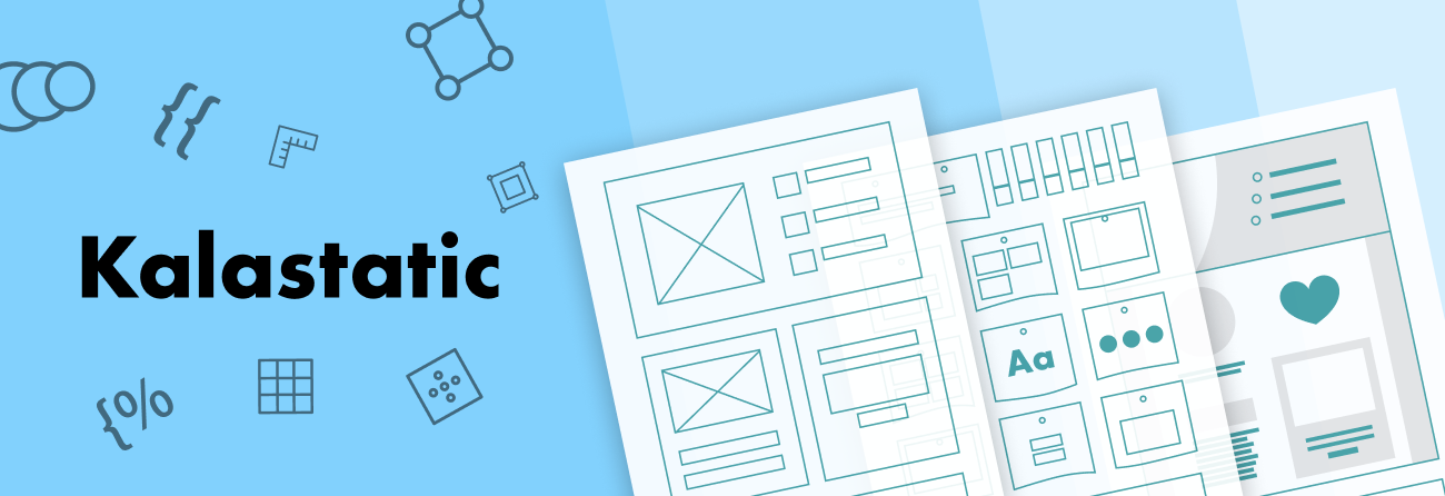
A prototype is an early iteration of a product that can be used to acquire feedback to ensure you’re heading in the right direction. When done right, refining and retesting prototypes can dramatically increase the effectiveness of a design’s outcomes. Industrial designers know this well, but many web designers are still catching up to this trend. Kalamuna began tackling this problem back in 2015 with our prototype, style guide and static site generator named Kalastatic.
Kalastatic serves as a point of convergence between front-end development, back-end development, and content strategy. It facilitates code conversations across our team, and promotes substantive feedback from our clients earlier in the process, before data models are in the CMS and less economical to change.
Component-based design is a methodology that helps speed up the prototyping process. Choosing pre-existing components defined in a style guide – otherwise known as a pattern library – provides a jumping-off point when starting up a new project. For example, most websites need a logo, header, footer, and calls-to-action.A library of components that you can reuse and build upon speeds up the prototyping process.
The result is a frontend framework that can integrate with other systems and also provides a digital style guide. Kalastatic’s full potential is exemplified by our work with the American Foundation for the Blind in this Case Study

Getting Started with Kalastatic
This section outlines how to get set up with Kalastatic and use it as a prototyping tool, leveraging the style guide to enable component-based design.
Prototype
Files in the src directory represent all content presented in a Kalastatic prototyped site. How the content are rendered depends on three things:
- File Extensions
- Content
- Metadata
The file extension determines the template engine that’s used for the content. Kalastatic supports Markdown, Twig, and SASS out of the box, but you can add more languages. When the file extension is ".twig," it will use Twig to render the content. When it’s ".md," it will render the content with Markdown. In the boilerplate example, we have an "index.md" file, which means it will take the content, render it with Markdown, and output it to "index.html."
The template engines that are used can be queued through multiple file extensions. Consider the following:
mypage.html.twig.md
The above example would render the content through Markdown, then Twig, and then output to a mypage.html file.
The content defines what should be rendered through the selected template engine. For our "index.md" file, it is Markdown that ends up being rendered to HTML.
# Hello, World!

This is a simple Hello World example of KalaStatic. In it, you see use of:

- Markdown
- Twig
- [Layouts](/resources)
- [Components](/about)
- [style guide](/style guide)

See `kalastatic.yaml` for more configuration options.
The metadata is optional information associated with the content to determine how Kalastatic should handle the content. This could be letting Kalastatic know which layout to wrap the content in, local variables that Twig could use in its templating, or defining a collection that shows in a list.
The metadata that’s represented in our Boilerplate “index.md” example are defined in YAML format and looks like this:
---
layout: layouts/html.twig
title: KalaStatic Demo
description: This is a Hello World demonstration of using KalaStatic.
---
The title and description properties are used for the page title and page descriptions. The template file Kalastatic will use to wrap the content is defined by the layout property.
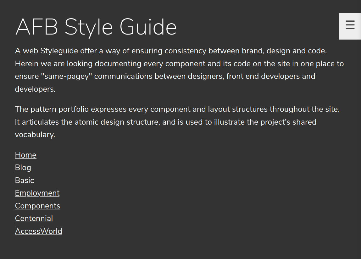
Style guide
In addition to the prototype that Kalastatic provides, it comes with a built-in web style guide. A style guide offers a way of ensuring consistency between brand, design, and code. Documenting every layout structure, component, and its code on the site in one place ensures designers, frontend and backend developers are all on the same page.
Website style guides serve as a pattern library and a digital brand style guide, to ensure consistency and conformity in the use of brand assets online. The style guide ensures that new frontend development can follow established patterns and facilitates the creation of on-brand ancillary digital properties. Its compiled CSS and JS assets can be referenced and consumed by third-party services to create harmonious expressions across multiple systems.
To review the style guide is a Kalastatic application, once the web service is running, you will visit /styleguide .
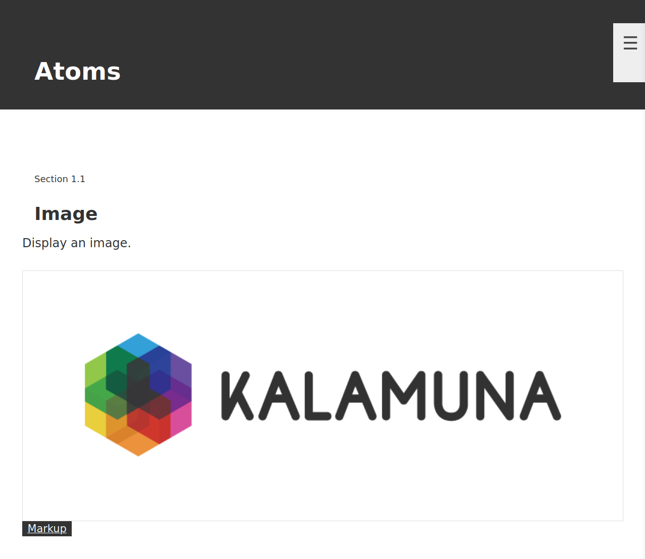
To define a component in the style guide, you’ll add some documentation to your SCSS files. The above example shows an Image component, so let’s look at its source at /components/atoms/image. Each component can have styles in an SCSS file, a Twig template file, and associated meta-data in a JSON file. Let’s consider the SCSS file first:
/*
Image
Display an image.
Markup: _image.twig
style guide Atoms.Image
*/

img {
  border: 3px solid skyblue;
}
The first line represents the title of the component; the second is a description of it. The Markup tells the style guide system which template to use for the component, and the style guide definition indicates where the component will appear in the style guide.
The Twig template file is used when rendering the component. In our Image example, we have a Twig template to render an image tag, along with accompanying attributes:
<img
  src="{{ src }}"
  {{ class ? 'class="' ~ class ~ '"' }}
  {{ alt ? 'alt="' ~ alt ~ '"' }}
  {{ width ? 'width="' ~ width ~ '"' }}
  {{ height ? 'height="' ~ height ~ '"' }}
  {{ attributes }}
>
The last piece of the puzzle is the optional component metadata described in _image.json:
{
  "src": "/images/logo.png"
}
The component metadata provides defaults for the component when it’s rendering. In this case, if the “src” is not provided during the render process, then it will default to /images/logo.png.
Kalastatic is not opinionated as to how you structure your components. While this example uses the atoms/organisms/molecules pattern, you could place your components in any folder hierarchy that satisfies your development philosophy.
Integrations
Since Kalastatic’s minimalistic focus is simply on building a prototype and a style guide, it can be used with external solutions. We’ll focus here on its integration with Drupal and GatherContent.
Drupal
Drupal is an open source content management system that powers simple sites like blogs, or large government websites. Since Drupal uses Twig as its templating engine, it is possible to create components in Kalastatic and expose them to the Drupal templating system by using Twig’s include function. If you had a “button.twig” defined in Kalastatic, which took a URL, and text, you could include it in one of your Drupal templates, mapping the variables.
Consider in node--teaser.html.twig the following:
```
{% include “path/to/kalastatic/src/components/button/button.twig” with
  {
    ‘url’: url,
    ‘text’: label
  }
%}
```
With the Components module, you’re able to simplify the include statement even further by defining your own @kalastatic namespace.
```
{% include “@kalastatic/components/button/button.twig” %}
```
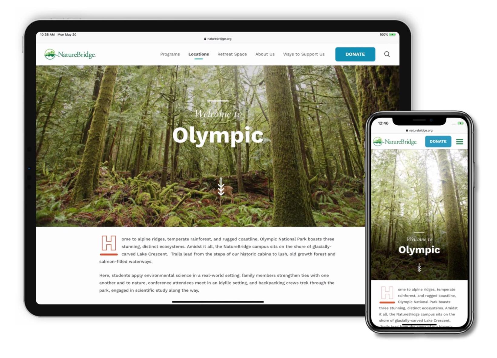
NatureBridge is an example site we worked on that leveraged the power of Kalastatic’s integrated styleguide and prototyping toolsHaving these available even before the Drupal development process allowed for rapid iteration, and testing in the browser, and increased stakeholder confidence through the approval process.
GatherContent
GatherContent is a third-party service that can manage content operations effectively at scale. It allows editors to edit content directly on an external tool and then leverage that content where it is needed. The separation of content and application allows for big changes to happen on both the content and application front. You’re able to work on a new platform while using the existing content without worrying about a content migration path.
The Fine Arts Museum of San Francisco (FAMSF) approached us to build a unique storytelling experience for their users. We thought it would be an excellent opportunity to empower the FAMSF content editors with a third-party service to handle their content and integrate it seamlessly with Kalastatic for a strong frontend experience.

The GatherContent API is well documented and allowed us to queue into it to download content during the Kalastatic build process. For this, we extended the hithercontent Node.js package, and created a GatherContent Metalsmith plugin.
As the output was a static website, we published it using Netlify. Netlify’s solid continuous integration platform, CDN capabilities, and great tooling allowed for quick deployments. Tying into GatherContent’s content moderation capabilities, we provided the FAMSF team with different build preview environments based on moderation status. They were able to build content using various components that we had defined in Kalastatic, and provide that unique visiting experience for their users. You can read more about this project in our case study.
The Future Web
Prototyping and Component-based design have come a long way since Kalastatic’s inception back in 2015. Many solutions that have popped up over the past six years of its existence. Kalastatic filled a need to provide a style guide, a static site, and use Twig to allow for easy Drupal integration. But where does that leave it today?
We’ve been actively improving its integration points by bringing Gatsby into the mix. Gatsby is a frontend framework for building fast websites and apps built upon React. How will this tie into Kalastatic? Stay tuned and see, but rest assured, it will continue to bridge the gap between content and component-based design.

Andrew Mallis
If you’ve encountered Kalamuna, you’ve likely experienced genuine care and expert guidance that starts with our thoughtful CEO and cofounder, Andrew. Along with an infinite stockpile of dad jokes, he brings his background in visual arts and activism to his work – leading us to drive great missions further.

Rob Loach
When web projects get tough, the one and only Rob Loach just gets more emboldened. As a Assoc. Director of Research and Innovation with a keen interest in project management, he's an unstoppable double-threat who eviscerates all obstacles. Whether architecting complex web applications or leading a team scrum, Rob is always on the front-lines at Kalamuna.