Why Accessibility is the Future of Higher Ed Marketing: Takeaways from the 2025 Accessibility Summit
Share
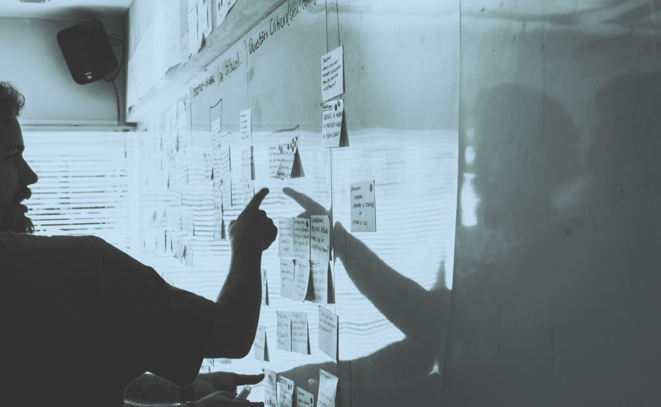
The 2025 Digital Collegium Accessibility Summit spotlighted a growing trend: accessibility is no longer a compliance checkbox. It's emerging as a core part of how higher education institutions design, communicate, and connect with their audiences online.
This post distills key ideas from the summit into actionable themes. While the topics ranged widely, from AI to design systems, the consistent message was clear: accessibility is strategic, scalable, and foundational to user experience.
Design AI interfaces with inclusion in mind
AI is becoming a frequently used technology across higher ed websites, from chatbots to content recommendations. As Niki Ramesh (Senior Manager of Product Accessibility and Equity at CBC) shared, without intentional design, it can unintentionally exclude users who rely on assistive technologies or have different ways of processing information.
Takeaways:
- Validate AI-generated content before publishing, and don’t assume outputs are accurate or appropriate for all users.
- Offer accessible alternatives to AI-based experiences, such as static content or human contact options.
- Build AI experiences in collaboration with people who use assistive tech and follow published accessibility guidelines like WCAG.
- Involve impacted users when defining problems and solutions, especially those with disabilities.
Digital maps can reflect institutional values
Interactive campus maps are often a prospective student’s first experience with navigating your campus virtually. As Julianna Goldring (Concept3D) and Joe Marley (Idaho State University) found, if interactive maps are hard to use or inaccessible, it sends a message about how inclusive your institution really is.
Takeaways:
- Replace traditional GIS maps with interactive formats that meet accessibility guidelines such as those supporting keyboard navigation and screen reader compatibility.
- Include filters for accessible features like restrooms, entrances, and elevators.
- Consider adding alerts for construction or route disruptions and use clear iconography to show accessibility levels.
- Collaborate across departments such as facilities, disability services, and communications to ensure accuracy and relevance.
Designing for neurodivergence improves UX for everyone
Neurodivergent users, including those with ADHD, autism, and other cognitive differences, often face digital barriers related to ambiguity, overload, and unclear expectations. As Doug Gruse (Empire State University), Elizabeth Lowe and Jeremy Perkins (iFactory) found, designing for these needs enhances the experience for all users. By applying universal design principles when designing for cognitive accessibility, we become proactive rather than reactive according to Rajveer Kaur (College of the Rockies).
Takeaways:
- Respect reduced motion settings and offer a prominent toggle for motion control.
- Replace vague CTAs (e.g. “Connect Me”) with clear action labels like “Submit” or “Request Info.”
- For live presentations, share the slides in advance, provide transcripts and recordings afterward, and share contact info for any further questions or clarification.
- Give users multiple ways to engage with your content, such as reading, watching, and listening.
Rethink PDF dependence for core content
Syd Hunsinger (Sandstorm Design) and Dr. Tonishea Terry Jackson (University of Chicago) noted how PDFs are common in higher ed, but they often present accessibility and usability challenges, especially for screen reader users and mobile audiences. Transitioning to accessible HTML benefits both users and search engines.
Takeaways:
- Move key content like curriculum maps, brochures, and event guides into accessible HTML.
- Use print-specific CSS to support printable formats without relying on PDFs.
- Retain PDFs only when print-first use is necessary and ensure they meet accessibility guidelines if used.
- Always test content with screen readers and color contrast tools to catch hidden issues.
Make accessibility part of your systems—not just your intentions
Ad hoc fixes don’t scale. As Richard Clinch and Janell Sims (Harvard) shared, embedding accessibility into design systems and team workflows ensures that inclusion becomes part of the default, not an afterthought.
Takeaways:
- Include accessibility guidance in your design system and document even the “obvious” practices.
- Avoid UI patterns that confuse screen readers, such as repeated link text (e.g. dozens of “Read more” links).
- Don’t auto-apply filters or interactive changes. Rather, let users opt in with a clear “Apply” or “Submit” action.
- Align teams across content, design, and development to share ownership of accessibility goals.
Inclusion is long-term strategy
Accessibility is not about checking a box—it’s about building digital spaces that reflect your institution’s values, increase trust, and support a broader range of users. From early recruitment touchpoints to daily interactions with current students, accessible design enhances the experience for everyone.
As tools and expectations evolve, so too must our approach. Institutions that prioritize accessibility today are positioning themselves not just as compliant, but as welcoming, future-ready, and truly student-centered.
To learn more about how to incorporate accessibility into your website, contact Kalamuna.

Michelle Balge
First and foremost, Michelle lives an ethically-aligned life. From being an outspoken mental health advocate to working at a cause-driven agency, she’s here to make the world a better place. As our UX/UI designer, she translates our clients’ visions and goals into great user experiences.