Designing Through a Neurodivergent Lens: The 7 Pillars of Emotionally Safe UX
Share


Digital design isn’t just about how things work. It’s about how people feel when they use them. A website can meet every accessibility guideline and still leave someone feeling confused or overwhelmed. These emotional reactions matter because they influence whether people feel supported and confident, or anxious and ready to give up.
As a neurodivergent autistic designer and mental health advocate, I’ve experienced how design choices can either help people feel at ease or add to their stress. Over the past year, I’ve been refining and defining what emotionally safe design for neurodiversity really means, identifying the specific points that most influence how people feel while interacting with digital experiences. That process led to the creation of the 7 Pillars of Emotionally Safe UX, a framework for designing with intention, empathy, and emotional awareness.
This framework blends principles from accessibility, cognitive psychology, trauma-informed design, and psychological safety to help create digital experiences that reduce friction and foster trust, confidence, and belonging.
What it Means to Design for Neurodiversity
Neurodiversity recognizes that there is no single way to think, learn, or experience the world. Neurodivergent people, including those who are autistic, have ADHD, dyslexia, or other neurological differences, experience and process information in ways that fall outside dominant social norms. Neurotypical people process information in ways society considers standard.
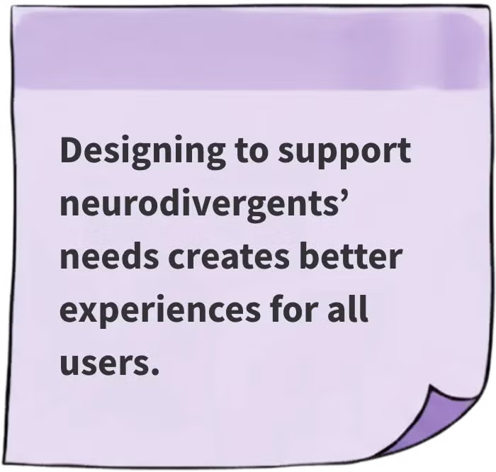
Designing for neurodiversity means designing for variety, recognizing that people process information, interact, and respond emotionally in different ways. When we intentionally design to reduce cognitive load and emotional friction for those who are neurodiverse, we make digital spaces better for everyone.
From Emotional Friction to Emotional Safety
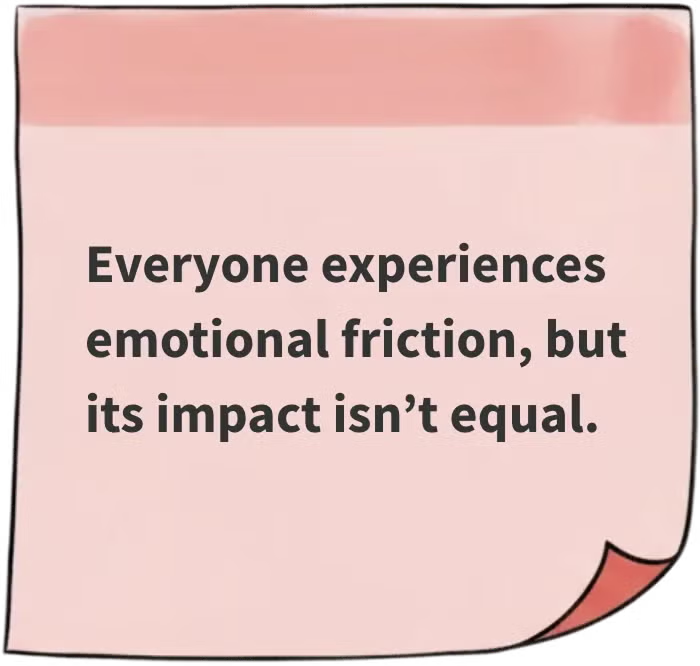
We have all felt emotional friction while using a website or app. It’s that feeling of tension or discomfort that comes from confusion, frustration, or distrust. These feelings arise not because there is anything wrong with how the user interacted with the site, but because differing experiences and feelings haven’t been taken into account when it was designed.
Emotional safety is the opposite. It is the feeling of calm, trust, and confidence that comes when interactions are clear, supportive, and predictable. Emotionally safe designs help users stay grounded and focused rather than feel stressed and overwhelmed. For mission-driven organizations, emotional safety strengthens the bond between people and purpose.
The 7 Pillars of Emotionally Safe UX serve as a guide for designing toward that feeling of emotional safety.
Introducing the 7 Pillars of Emotionally Safe UX
These 7 Pillars are designed to help us recognize and intentionally shape how users feel as they interact with digital experiences. Each pillar represents a specific aspect of emotional safety. In practice, these pillars often overlap. A single moment in a user journey, like submitting a form or navigating an error message, might surface several pillars at once. They are distinct enough to explore individually, but together they form a cohesive framework that works in unison to create emotionally safe experiences.
The examples that follow illustrate how design choices can create emotional friction or safety. Each impact and fix represents a range of what people might feel: from mild discomfort to overwhelm. Not everyone will experience every effect, and emotional responses vary by person and context. The goal is to recognize these possibilities and design in ways that minimize friction and increase emotional safety.
At their core, the 7 Pillars focus on the emotional quality of interaction by designing for calm, clarity, and reassurance in every step so users feel grounded and cared for while they engage.

Overview
Here’s a quick look at the 7 Pillars before we explore each in depth:
- Transparency → I know what’s happening.
- Predictability → I can rely on this.
- Clarity → I understand this.
- Feedback → I’m supported and acknowledged.
- Autonomy → I’m in control of my experience.
- Pacing → I’m calm and able to focus.
- Belonging → I’m included and valued.
1. Transparency
When a design has transparency, it gives users a sense of “I know what’s happening.”
Transparency builds trust through honesty and clear intent. Be upfront and open about what’s happening, why it’s happening, and what users can expect.
Scenario
A user tries to cancel a subscription but faces hidden steps, guilt-inducing messages, or unclear outcomes.


Impacts
- Loss of trust: Hidden or manipulative patterns can make the organization feel dishonest or exploitative.
- Confusion and anxiety: Users may worry they’ve missed something or made a mistake.
- Frustration and overwhelm: Users may feel worn down by the effort required to complete a simple task, leading to irritation and fatigue.
- Abandonment: Users with less energy or time may give up completely, or seek workarounds like canceling through their bank.
Fixes
- Design for honesty: Clearly state what will happen next. Show steps or timelines before the user begins an action.
- Use plain, non-pressuring language: Avoid guilt cues or emotional manipulation.
- Provide confirmation and reassurance: Summarize actions taken and their outcomes (e.g., email confirmation).
2. Predictability
When a design has predictability, it gives users a sense of “I can rely on this.”
Predictability builds security through consistency and reliability. It helps users feel secure by ensuring the site and its information are consistent, reliable, and accurate.
Scenario
A user checks a university’s admissions site for application deadlines and requirements, but it lists conflicting information across different pages.

Impacts
- Loss of trust: Inconsistencies may make the organization seem disorganized or unreliable.
Confusion and anxiety: Users may question which information is correct and worry they’ll make a mistake. - Frustration and overwhelm: Users may feel exasperated by the inconsistency, forced to piece together answers that should have been clear.
- Abandonment: Users might delay or abandon applications altogether to avoid submitting the wrong materials.
Fixes
- Have one source of truth: Centralize and update key dates, requirements, and criteria in one authoritative source.
- Ensure consistency: Mirror the same verified content across all related pages and documents.
- Reinforce reliability: Add “Last updated” timestamps or confirmation language to build confidence in accuracy.
3. Clarity
When a design has clarity, it gives users a sense of “I understand this.”
Clarity builds confidence through structure and plain language. Use clear hierarchy, logical organization, and plain language so information is easy to follow and act on.
Scenario
A user visits an animal shelter’s site hoping to adopt a dog. The page has dense text, inconsistent formatting, and there’s no button to adopt.

Impacts
- Loss of confidence: The lack of clear direction can make users doubt their ability to complete the task and the organization’s credibility.
- Confusion and anxiety: Unclear structure may leave users unsure whether they’re in the right place or missing essential details.
- Frustration and overwhelm: Dense content and inconsistent formatting can exhaust users as they struggle to focus or find what matters.
- Abandonment: Some users may leave the site or choose to call instead, bypassing an online process that feels unnecessarily difficult.
Fixes
- Simplify and structure content: Use clear headings, short paragraphs, and bullet points for easy scanning.
- Guide attention: Create a clear visual hierarchy with whitespace, consistent typography, and an obvious call-to-action.
- Clear next steps: Use a prominent button or message like “Start Your Adoption Application.”
4. Feedback
When a design has feedback, it gives users a sense of “I’m supported and acknowledged.”
Feedback builds reassurance through timely, meaningful responses. Use clear, timely cues to confirm success, explain errors, and guide next steps.
Scenario
A user clicks “Submit” after filling out a donation form. The page reloads without a clear confirmation.

Impacts
- Uncertainty and anxiety: The lack of feedback can leave users uneasy about whether their submission went through, prompting second-guessing or self-blame.
- Frustration and overwhelm: Some users respond by clicking repeatedly or refreshing the page, creating stress and risking duplicate submissions.
- Erosion of trust: The absence of feedback can undermine confidence in the site’s reliability, making users reluctant to donate or engage online again.
- Abandonment: Users may stop trying altogether, fearing they’ve made a mistake or lost money.
Fixes
- Provide clear confirmation: Provide clear, timely confirmation with language like “Your donation was successful.”
- Clarify next steps: Let users know what happens now, e.g., “You’ll receive a confirmation email shortly.”
- Express gratitude: A short, warm thank-you builds emotional closure and reinforces positive engagement.
5. Autonomy
When a design allows for autonomy, it gives users a sense of “I’m in control of my experience.”
Autonomy builds comfort through choice and self-direction. Let users make choices and control how they engage. Communicate options clearly and respect boundaries.
Scenario
A user fills out a form to request more information, but they aren’t told whether they’ll be contacted by phone, text, or email.

Impacts
- Discomfort and hesitation: Users may second-guess or decide not to submit because the next step feels uncertain. The lack of clarity raises concerns about being contacted in unwanted or intrusive ways.
- Loss of agency: The process might feel one-sided, leaving users without control over how or when the organization will respond.
- Abandonment: Some users provide incomplete or inaccurate information, while others leave the form altogether. Even those who continue may feel uneasy about future interactions with the organization.
Fixes
- Communicate clearly: Tell users when and how they’ll be contacted to reduce uncertainty and restore confidence. Better yet, give them the choice.
- Empower choice: Let users select their preferred contact method before submission.
- Acknowledge privacy: Reassure them their info will only be used as they’ve agreed.
6. Pacing
When a design has pacing, it gives users a sense of “I’m calm and able to focus.”
Pacing builds calm through flow that supports focus and sensory ease. Manage motion, information, and interaction speed to prevent overload and support focus.
Scenario
A user arrives on a site with a carousel that autoplays. There’s no progress indicator or controls.

Impacts
- Stress and distraction: Uncontrolled motion can heighten sensory and cognitive stress, making users feel tense, overstimulated, and unable to focus on the content.
- Loss of control: Users can’t pause or review what they missed, leaving them feeling rushed or powerless.
- Confusion and frustration: Lacking a progress indicator, users can’t tell how much content there is or when it repeats. The movement turns into noise instead of guidance, eroding trust and interest.
- Abandonment: The fast pacing can make the experience feel chaotic and uninviting, leading users to scroll past or leave the page.
Fixes
- Don’t autoplay: Let users choose when to start moving through content. Include clear buttons to play or pause, go back, or advance at their own speed.
- Add progress indicators: Help users understand where they are and how much content remains.
- Use movement sparingly: Use gentle transitions and stable layouts to create a relaxed, user-led flow.
7. Belonging
When a design is considerate of belonging, it gives users a sense of “I’m included and valued.”
Belonging builds connection through inclusion and representation. Design with care and representation so every user feels respected, included, and never left out of the experience.
Scenario
A user is on a workout program’s site that highlights people’s success stories, but all feature similar backgrounds and experiences.

Impacts
- Emotional disconnect: Users may feel unseen or excluded when they don’t see people like themselves represented in stories or imagery.
- Discomfort and self-doubt: Users may question whether they belong or if their experiences are valued, leading to hesitation or uncertainty about engaging.
- Abandonment: Some leave the site early, sensing it wasn’t created with them in mind.
Fixes
- Show representation: Use imagery, stories, and examples that reflect the full diversity of your audience so everyone can see themselves as part of the community.
- Use inclusive language: Avoid assumptions about experience, background, or ability, and write in ways that welcome a broad range of identities.
- Acknowledge different perspectives: Communicate with warmth, understanding and respect of people’s different lived realities.
Rethinking Design Through Emotional Safety
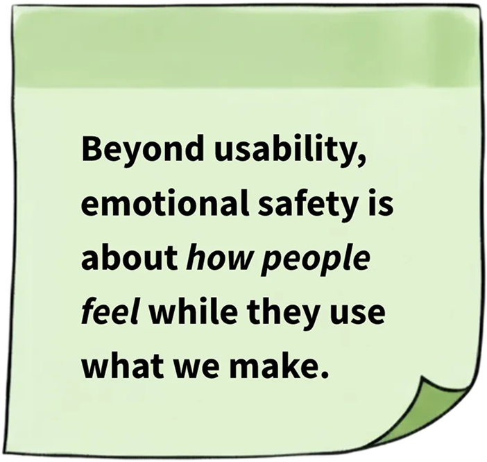
Designing with neurodiversity and emotional safety in mind helps us move beyond accessibility checklists to create digital experiences that support how people feel.
In recent 2026 design trend reports, designing for neurodiversity has emerged as a theme. It’s encouraging to see the field moving in this direction, but this work goes beyond being a trend. As someone who experiences the web through a neurodivergent lens, I’ve seen how emotional safety is a design need. Designing for neurodiversity and emotional safety is about fundamentally rethinking how we design digital experiences to support people and their feelings.
The 7 Pillars of Emotionally Safe UX are a reminder that people remember not just what they did on a site, but how it made them feel.
Bringing Emotional Safety Into Practice
If you want to bring these ideas into your own work:
- See through a new lens: Designing with neurodiversity in mind reveals points of friction that impact everyone.
- Prioritize emotional safety: Go beyond usability to consider how your designs make people feel.
- Apply the 7 Pillars: Use this framework as a guide for fostering emotional safety.
- Turn insight into action: Translate emotional and behavioral cues into design decisions that truly support users.
I explore these ideas further in my Southwestern Ontario DrupalCamp 2025 talk, “What Neurodivergence Taught Me About UX and Emotional Safety” on YouTube. In it, I share how my experiences shaped the 7 Pillars, how UX research methods can uncover where emotional friction and safety appear, and how to put those findings into practice.
Other Talks About Neurodiversity
A couple other people who have recently given talks about neurodiversity are:
- Vera Herzmann was the keynote speaker at DrupalCon Vienna in 2025 with her talk “Neurodiversity: An Underrated Superpower in Business” on YouTube. This encompasses neurodiversity as a whole, understanding it, and valuing its strengths.
- Katrin Suetterlin gave a master class on “How to Design for Neurodiversity: Inclusive Content and UX” through the Interaction Design Foundation (paid, not affiliated). This is more from an ADHD perspective, with real life scenarios of websites creating friction for those who are neurodiverse.
Let's Chat
At Kalamuna, we partner with mission-driven organizations to create digital experiences that care for users as much as they inform and inspire. Reach out to our team to explore how emotionally safe design can strengthen your organization’s impact!

Michelle Balge
First and foremost, Michelle lives an ethically-aligned life. From being an outspoken mental health advocate to working at a cause-driven agency, she’s here to make the world a better place. As our UX/UI designer, she translates our clients’ visions and goals into great user experiences.