Donation Page Best Practices
Share
We’ve recently had the opportunity to streamline the donation page and form UX for a client. There’s a good amount of information out there on how to do it well, but a lot of it is scattered, and one often has to sleuth up chains of citations to get to the source material. As is to be expected, applying general UX best practices and basic heuristics to any user flow gets us a good part of the way there, but the donation process—an important conversion for any organization looking to receive funds online— has some unique particulars, some of which might even be counter-intuitive.
Whatever you do, answer these questions for your users: What are you trying to achieve? How will you spend my money?
According to a study conducted by the Nielsen Norman Group, one of the biggest barriers for new users attempting to give money to a charity was related to users not finding enough information about what the organization does, and how they will spend the donated money.
“…an organization's mission, goals, objectives, and work was by far the most important [factor in determining whether or not to give]…”
In their analysis, they concluded that of all the factors, clarity and well-written copy was most impactful: “To improve fundraising, speak plainly and answer donors' main questions, and money will flow your way.”
In another article, Ritu Sharma suggests getting specific and avoiding open-ended situations with default donation levels. She also emphasizes mapping donations to impact.
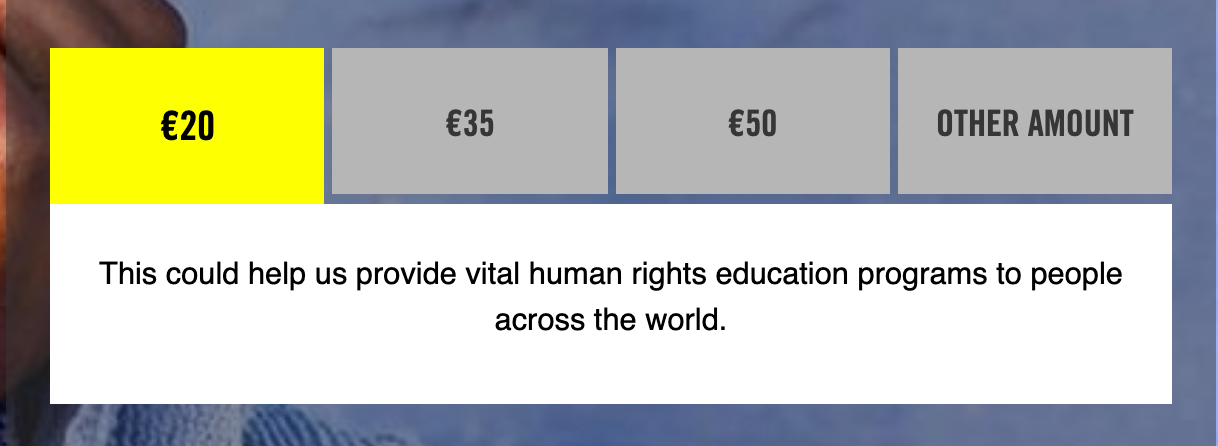
In this example from Human Rights International, the buttons for default donation levels explain the impact for each size of the donation.
Keep it Simple
Donation workflows ought to parallel eCommerce checkout processes whenever possible and stick to familiar, comfortable flows and conventions.
To support other ways of giving, separate them out from donation flows. Fork any user paths such that by the time a user chooses to donate, they don’t see other appeals, links, or language that will deter them from completing the task.
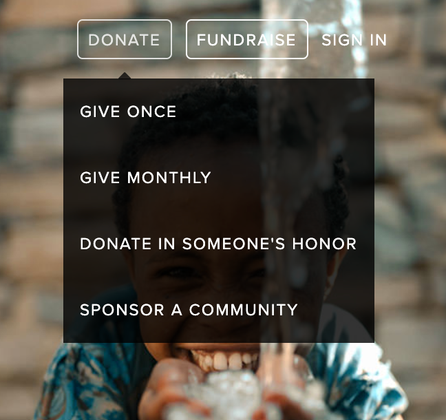
This detail from the hover state of the charity:water website shows a nicely segmented set of links that can streamline the subsequent flows.
Make it Obvious
Always include strong calls to action using full sentences wherever you can. Consider “click trigger” copy above buttons, a short line compelling the user to action.
According to an excellent infographic by GuideStar you should aim to keep the donation form on one page, except for mobile, where they strongly suggest showing progress so users know how many steps are left. They also recommend reducing the number of fields wherever possible, like combining “first name, last name” into a single field. Parsing should be done on the backend if it’s needed at all. In addition to other good recommendations they also emphasize offering multiple common payment methods, so folks don’t drop off because they’re frustrated that there isn’t a payment option they’re comfortable with. And always offer a thank you page, which is a great opportunity to make follow-up requests, etc. Most of all, make it easy!
Isolate
Once the user has chosen to give, we should remove barriers wherever we can, and stand aside when appropriate.
Consider removing navigation, avoid extraneous social media links and any other content that can compete or distract from the task at hand. At first, this may feel to many UX practitioners like a “dark pattern” (a UX pattern specifically designed to trick users into doing something they don’t want to do) since in most situations offering clear and accessible navigation is paramount to our discipline, but once the user has elected to donate, helping them to stay focused on this task can only help them on their user journey.
Remember, there are many opportunities for additional user engagement, further steps, wayfinding, and the fulfillment of other user-goals on the “thank you” page after the actual donation has occurred.
Once the user has chosen to give, we should remove barriers wherever we can, and stand aside when appropriate.
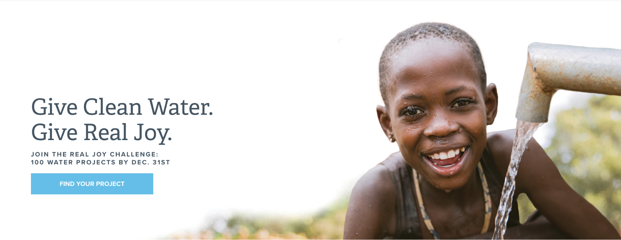
Make it Evocative
Illustrate your impact on people through your use of imagery.
Conclusion
While the donation experience presents a few domain-specific challenges, best practices seem to follow the recommendations of good user experience design and content strategy:
- Offer considered interaction design, with writing that supports the user journey.
- Address user concerns around fulfilling their objectives (“What are you trying to achieve?” “How will you spend my money?”).
- Reduce friction and any distractions the user may encounter during the donation flow.
- Reduce cognitive load with discrete donation levels and an essentialist approach to forms and information intake.
- Use imagery that shows your impact.
- We hope that this collation of prior art and analysis of our practices helps you keep your users focused, and keeps your organization in the black.

The Kalamuna Team
Kalamuna partners with socially impactful institutions, associations, agencies, and governments to help them solve today’s most pressing problems. We do this by empowering them with the research, strategy, design, and technology that will transform their organizations so they can better serve the needs of their audiences and communities.