Back-End Developer Essential Guide To Front-End Browser Testing and Debugging
Share
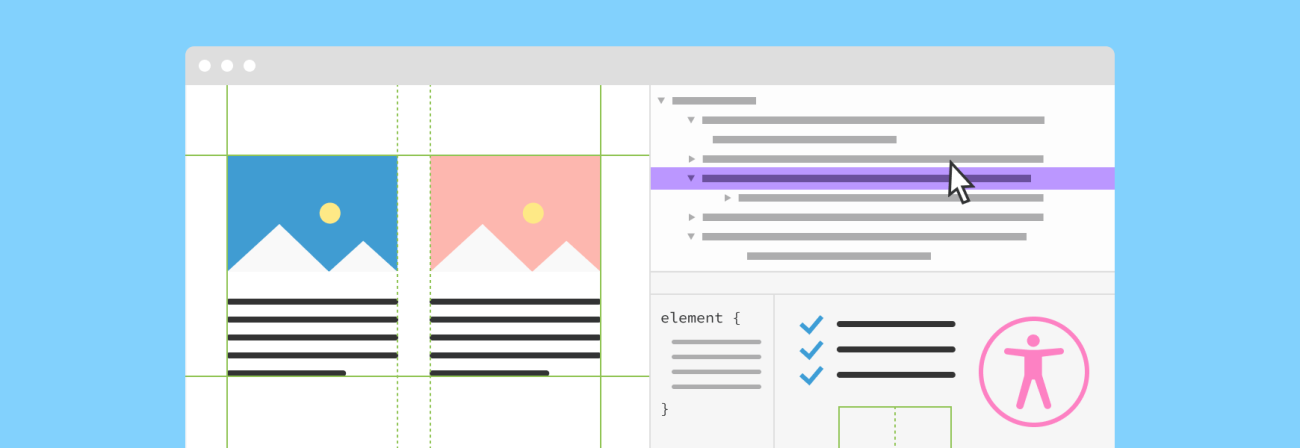
Flexbox, CSS grid, accessibility, device testing, and JavaScript performance metrics are just a few elements that are part of day-to-day front-end developer life. Front-end development is definitely more complex today than it was a few years ago. There are new frameworks, preprocessors and fast-pacing changes to the CSS specification. This means that it's harder for back-end developers to jump in and assist without knowing the tools of the trade.
Whether you are mostly a back-end developer by day with the need to help to debug front-end, an aspired full-stack unicorn, or a beginner front-end - you will find something in this guide to help update your toolbox.
Debugging advanced CSS3
CSS grid debugging
CSS grid layout is the cutting edge, most powerful, two-dimensional CSS layout system that exists today. It handles columns and rows, and its properties are applied to the parent element, specifically the grid container and its children.
Currently, the majority of modern browsers support the native unprefixed implementation of the CSS grid system. And Internet Explorer 11, while it has support, ships with the outdated implementation.
When you first start working with a grid system, it might be challenging to predict what layout you will get at the end. Browsers came up with new testing and development tools that allow for a better understanding of grid behavior.
When it comes to debugging, different browsers have different functionality. I recommend starting your grid debugging with the latest version of Firefox. Its grid inspector provides the best native debugger (without extensions) for grid layouts with various properties and options to make your life easier.
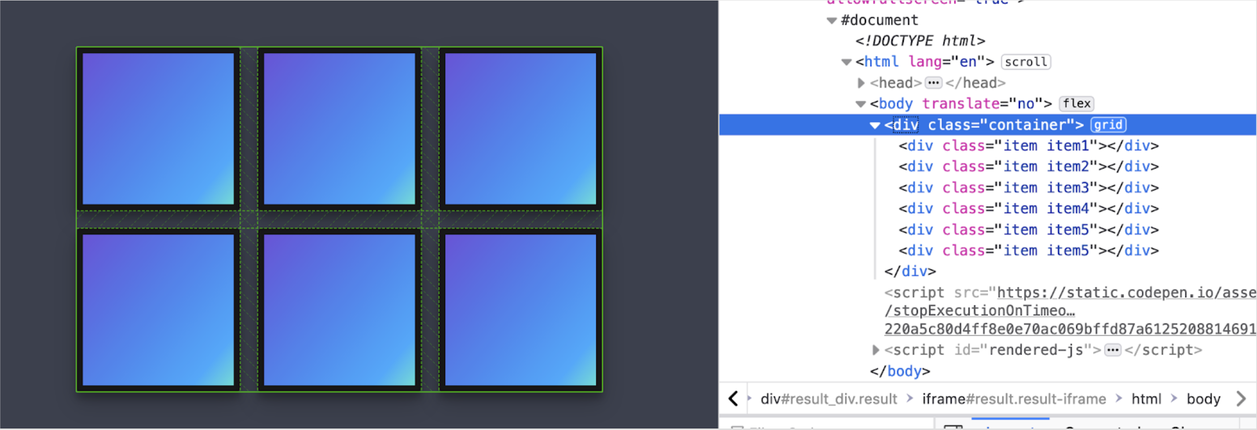
To open the grid inspector, hover over the grid element and right-click -> inspect element. In the inspector window (as shown on the right), press on the “grid” square text, and the grid inspector will open at the bottom of the panel.
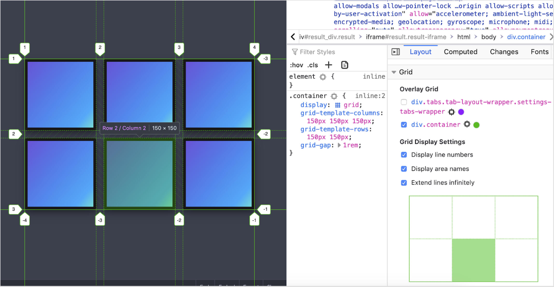
You will see a few extra options for grid display settings down in the far-right column that are turned off by default.
Grid line numbers prove to be helpful when you are debugging or building multi-row or multi-column spanned layouts. They allow us to identify the correct numbers that need to be used in the CSS definition.
.grid-item {
             grid-column: 2 / span 2;
}
The rule above will allow this grid item to start at the second column and span two columns (including the one it started at).
Display area labels are useful when building template-like layouts with grid-areas, such as header, footer, and sidebar. In this case, you don’t need to use numbers but rather declare template areas, and their names will be displayed in the inspector.
My favorite setting is to extend lines infinitely - this is very helpful for testing and checking layout items and ensuring that alignment with other elements on the page is correct.
Firefox grid debugger also allows diving deeper into the grid item layer by hovering over the item. You can see the item’s placement parameters, CSS rules, and current width and height. The inspector also does an excellent job of outlining gutters and borders of the grid layout.
If your browser of choice is Chrome, debugging options for grids are currently quite limited. It outlines the element but doesn’t provide additional information about the properties that Firefox does.

There are a few add ons in Chrome’s marketplace that can improve the situation - such as Gridman. The industry standard currently is to use Firefox for grid debugging.
Flexbox debugging
Flexbox is CSS grid’s younger brother since it provides a one-dimensional layout system - it only handles a column or a row - not both. It entered the modern front-end development scene earlier than the grid and therefore has more adoption and support across browsers.
The flexbox’s main idea is that items placed within it are generally flexible - meaning that their height and width can be altered by the container to fit specified layout rules and restrictions.
For the flexbox debugging, Firefox will also be our browser choice. It provides a robust flexbox inspector that can be triggered similarly to the grid debugger by pressing on the word “flex” in the DOM inspector panel.
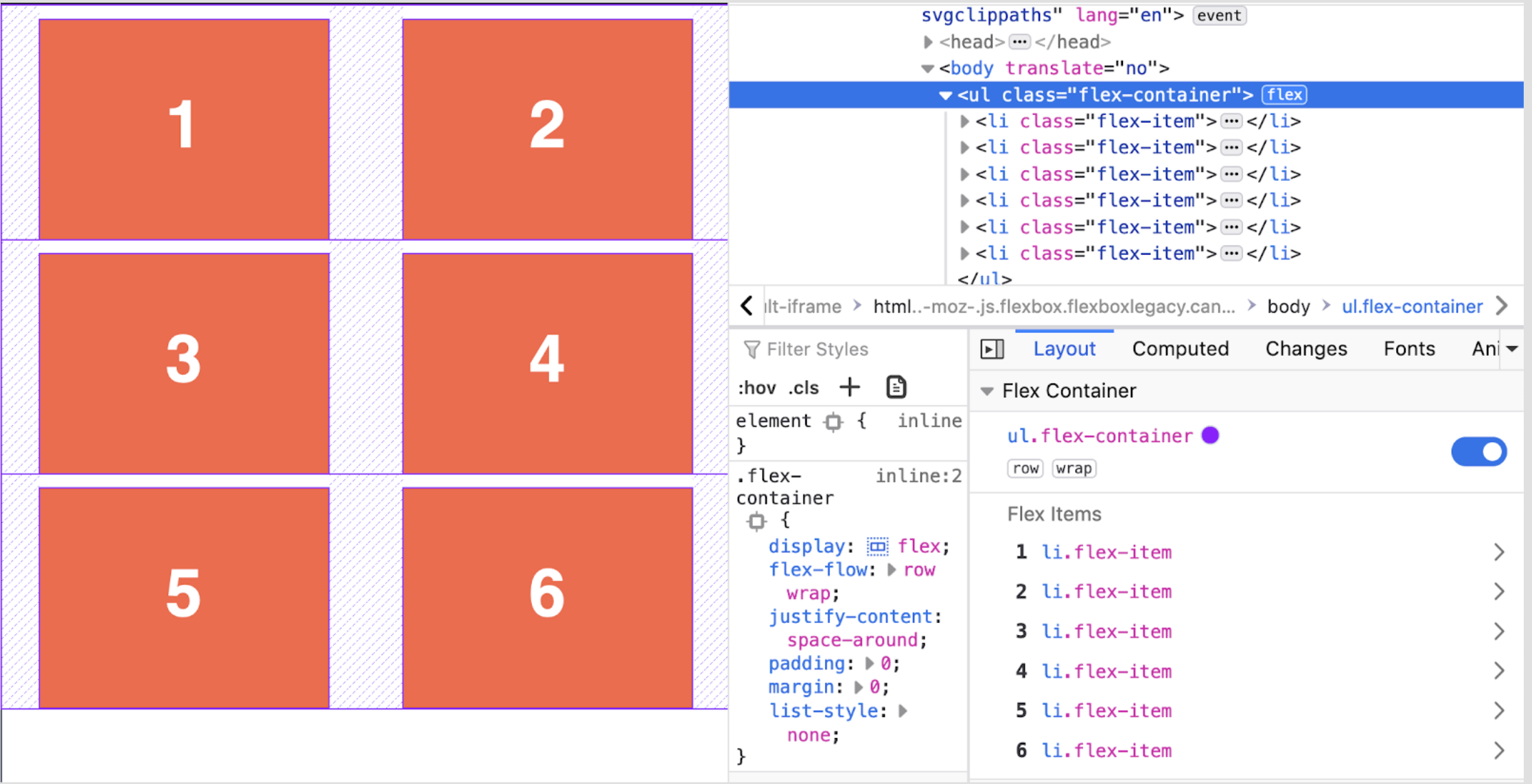
In the flexbox inspector, you will not only see CSS styles currently applied to the parent but also flexbox properties that are being used: flex-direction and flex-wrap. The words “row” “wrap” in the right-hand column are interactive, and you can trigger them on and off. You can also start the gutter outlines with the switch on the far right.
The inspector is two layers deep. If you click on one of the flex items, you will dive deep into the flex-item properties screen. This screen is very helpful since it shows you how flex rules changed the item compared to its base.
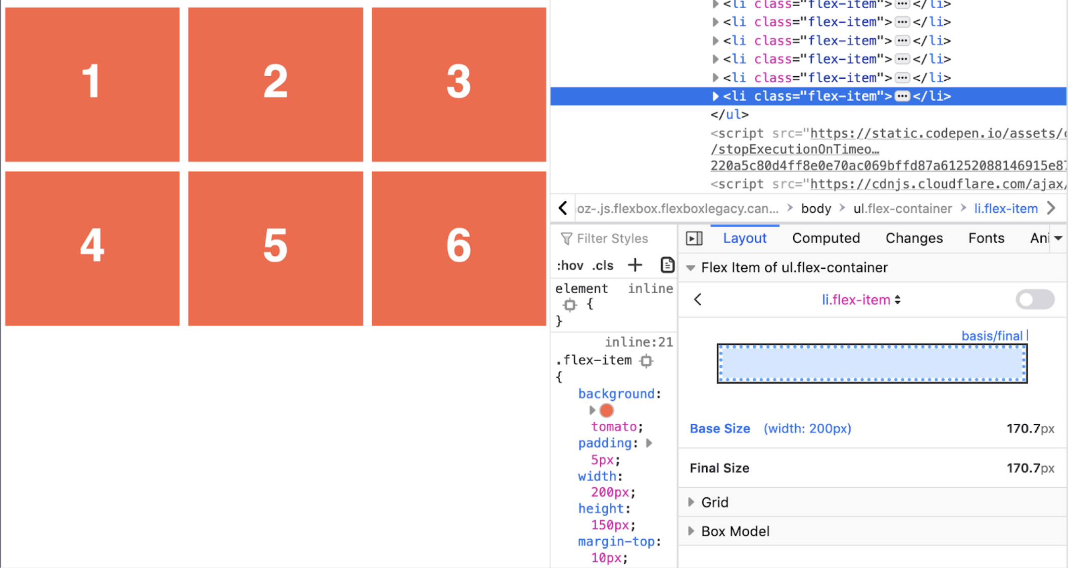
Additionally, the inspector allows for an adjustable base width and lets you see how it may affect your layout.
Accessibility testing
Historically accessibility testing heavily relied on browser extensions. While this is still the case for advanced tests - you can test basic accessibility with the tools provided by your browser.
When it comes to accessibility, Chrome is paving the way with its built-in Lighthouse audit. This audit is an automated process that analyzes the entire page, assigns an accessibility score, and provides detailed views and suggestions for their remediation.
To open and run a lighthouse audit - open the Chrome inspector and press on the arrows icon on the far right, then select Lighthouse. Lighthouse audit is a complicated ecosystem that can be used for more than just accessibility and can be a topic of its own.
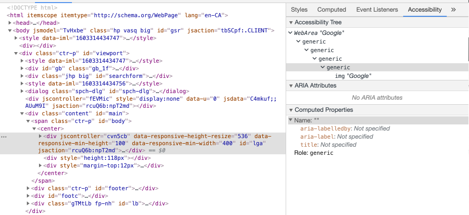
Apart from the Lighthouse audits Chrome also has a dedicated Accessibility Tab in the inspector that provides information about the accessibility tree of the page, aria attributes, and computed properties. This can be useful while you are verifying your document flow.
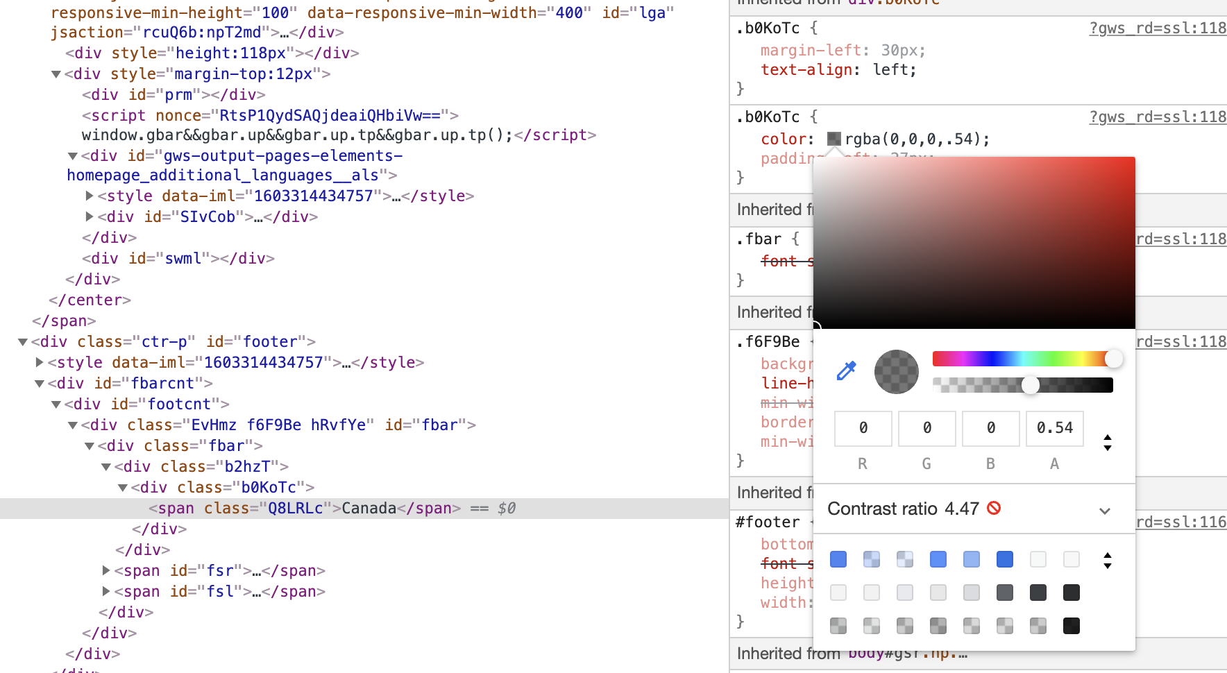
Another great hidden gem is a contrast checker. If you press on the color swatch next to the color property in the inspector you will be able to see the color picker, contrast ratios and if they are compliant with accessibility standards.
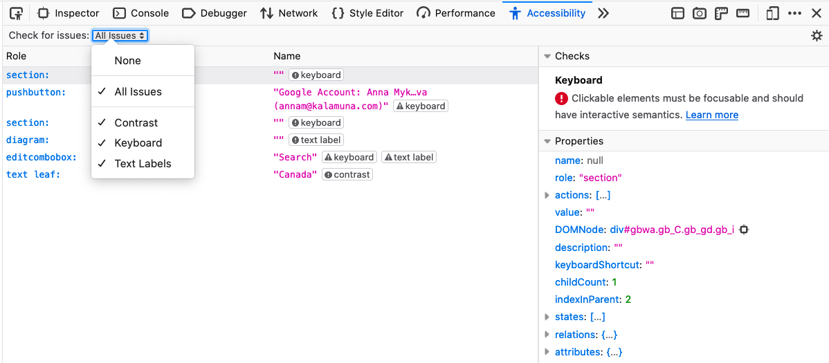
Firefox provides its own set of accessibility tools inside the Accessibility tab. This tab holds audits for contrast, keyboard navigation, and text labels.
The contrast checker gives the ability to check the contrast ratio score for the specific text on the page. In the issue tracker, you can click on the “contrast” button and it will highlight the text and display the values.
One of the hidden gems in Firefox is the color blindness simulator. To enable it you need to tune in some browser configuration settings.
In the address bar type:
about:config
and press “Return” then set this to true:
gfx.webrender.all
After that, in the Accessibility tab of your browser, you will be able to choose a simulator.
This will help you to evaluate how effective your content is without emphasis on colors and identify if you rely on the correct colors too much for key areas of your website.
Where to go next
Development tools are a big topic, and in this blog post we covered the CSS and accessibility tools available in the browser.
Modern browsers compete not only for their users' audience but also for the status of being a go-to browser for developers and designers.
Outside of the scope of this blog are more tools for JavaScript debugging, remote testing, and progressive web apps. In the next part of this series we will be exploring JavaScript debugging tools and approaches for the remote testing. Meanwhile we encourage you to play with the development tools in your browser of choice and find your own hidden gems to make your development practices easier.

Anna Mykhailova
Our expert Director of Technology, Anna, has over 10 years of web development experience with an affinity for Drupal. As an Acquia Triple Certified Drupal Expert, she is known for transforming impossible tasks into victories, her strategic thinking and full-stack prowess are formidable. Her proficiencies in all Drupal versions from 7 and beyond, Anna's thirst for knowledge keeps her at the forefront of her field, perpetually honing her development skills and expanding her technical repertoire.