3 Web Accessibility Tips for Great UX

Share
If you want to provide a great user experience for everyone who visits your website, it has to be accessible. By ensuring a site is accessible you also make it easy to use, regardless of one’s physical or mental capabilities. But as anyone who’s had to design or build a website that complies with WCAG 2.0 Level AA guidelines (the common standard for web accessibility) will tell you, it isn’t always easy, and sometimes the problems aren’t obvious. Over the years I’ve noticed a few accessibility issues that keep popping up, so I thought I would share a few of them here so you can catch these common pitfalls on your own projects.
1. Check Color Contrast Early On
We work with institutions that have very thorough and comprehensive brand guides that we need to adhere to when designing their websites. They also have strict accessibility requirements for all of their online properties, but their brand guides don’t always provide accessible color palettes to work with. Changing a website’s color scheme can be a major hassle, so it’s important that we determine very early on in the design phase of the project which on-brand colors are going to work for people with color-blindness or low-contrast vision.
So how do you do this? We can’t rely on automated tests when we’re working with design files, so it’s a bit of a manual exercise. I like to use Lea Verou’s Contrast Ratio tool because it allows me to plug in any color value (in Hexidecimal, RGB or HSLA) and easily swap foreground and background colors to see if they pass or fail. It’s also free to use and works in any browser.
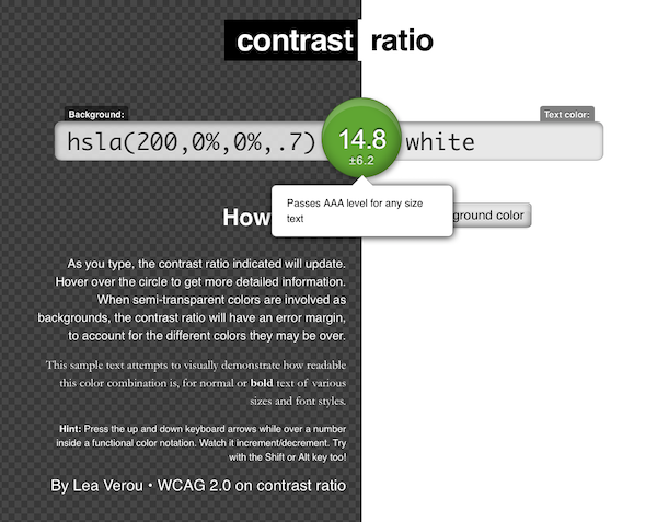
Lea Verou’s Contrast Ratio web tool lets you verify your color choices.
2. Ensure Keyboard Focus Is Always Visible
One of the most common problems I see, and catching it doesn’t take any special software or training, is a lack of visible focus when tabbing or navigating around a web page using a keyboard. This is a major issue for anyone unable to use a mouse, and a source of frustration for those who prefer to keep their hands on their keyboards while completing online forms. I won’t get into why this is such a pervasive issue because others have already covered it, but needless to say, it’s something we need to be mindful of when styling links.
How do you catch this issue? Just put your mouse down (or better yet unplug it) and try to navigate around the site using your keyboard. Can you see where your cursor is focused every time you hit the tab or arrow keys to jump to the next link of field? If you can’t, you’ve got a problem to fix. Note that depending on your browser, either the tab key or the arrow keys will work. Sometimes this is defined in the browser settings, like in the case of Mozilla’s Firefox browser.
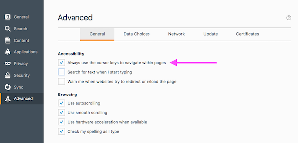
Firefox allows you to configure the keyboard’s cursor keys for in-page navigation.
3. Make Links Look Like Links
People don’t want to play guessing games when they’re on your website so don’t make it challenging for them. One of the most basic rules of web accessibility is that if something is a link, it should look like a link. We’ve had some internal discussion lately about what, exactly, should be a link when we’re displaying a promotional block that has a thumbnail, a title or chunk of text, and a button. Take a look at the following example from our own homepage and think for a second about what you would click on if you wanted to read our compelling case study:
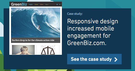
Example of a homepage tout on Kalamuna.com.
Most people will click on the small blue rectangle that looks like a button and has a clear action-oriented label that says “See the case study”. But some people might click on the title, and others might click on the thumbnail. These are all reasonable options based on common web patterns. But when it comes time to write the code, we should know what should be a link and more importantly, what we should put inside the anchor tags. If users are going to potentially click on any of the elements within this component, why not just make the whole thing one big hotspot? To get to the answer, we need to understand the accessibility considerations, in particular the importance of link recognition, and screen-reader behavior.
When a screen reader interprets a web page, it looks for semantic markup to indicate how to treat the content on the page, including how to organize it, and how to read it out to the user. Links are an especially important element because they are the primary method of navigating on the web. The most popular screen readers will list all the links on the page, and offer to read them out, one after the other. This is why links like “read more” or “click here” are inaccessible; they don’t indicate where the link goes. This is also why, as in the case of our promotional homepage tout, we want to be mindful about how we construct our links. We don’t want to make every element a link because that could be annoying to listen through, since they all go to the same place. If we wrapped all the elements together it would amount to almost the same thing. And we don’t want to wrap the whole block in a link because then we’d have to add more code to indicate to screen readers where that link goes. Plus, we’d potentially have to do additional work to style the a:hover and a:focus effects.
So as is the case in so many situations in life, the best solution here is the simplest one. Just make the button a link, and leave the rest un-linked.
Do you have any web accessibility or usability tips you’d like to share or thoughts on this post? If so I’d love to hear from you. Let’s continue the conversation on Twitter.

Crispin Bailey
When website requirements get daunting, Crispin loves to roll up his sleeves and dig in. His overarching goal is to deliver beautiful and accessible websites for our clients and their audiences. As a seasoned digital strategy expert, Crispin oversees Kalamuna’s design and strategy practice, coordinating design and technical efforts throughout the discovery and design phases on projects to build bridges between research, design, and development.