There is No ‘I’ in Rebrand
Share
For the past year at Kalamuna, we have, slowly but surely, been working on refreshing our brand. Over much discussion, internal and external collaboration with branding agency C42D, and iteration, we ended up with a guide that laid the groundwork for our new brand strategy and visual identity system. This guide, however useful, was quite limited as a PDF. While PDFs are sufficient for viewing elements in practice, we require greater control over the properties of elements to easily duplicate and modify them across different projects and use cases. So we decided to recreate and expand on it in Figma. Along the way, we visited old and new Figma concepts and features that apply not only to branding projects but design projects across the board.
Although there is an ‘i’ in Figma, its philosophy is less individualized and more focused as a collaborative tool that has been called the “Google Docs” for designers.
Figma is a cloud-based tool available as a web app and a desktop app. Like Google Docs, you and your teammates can collaborate in real-time and leave and resolve comments as well, which is particularly useful for distributed teams like ours at Kalamuna. Figma also brings the “single source of truth” principle and version history from software design to UI/UX design. In other words, no more accidentally overwriting the work of your teammates or working on incorrect or outdated project files.
For these reasons, Figma is the perfect tool for putting together a living document to define a growing and changing brand design system.
We’ve broken down these Figma concepts and features into the following categories:
- Components
- Color and Text Styles
- Layout
- Prototyping
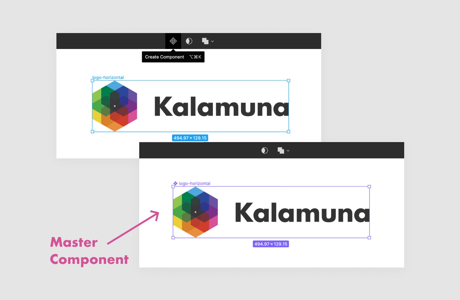
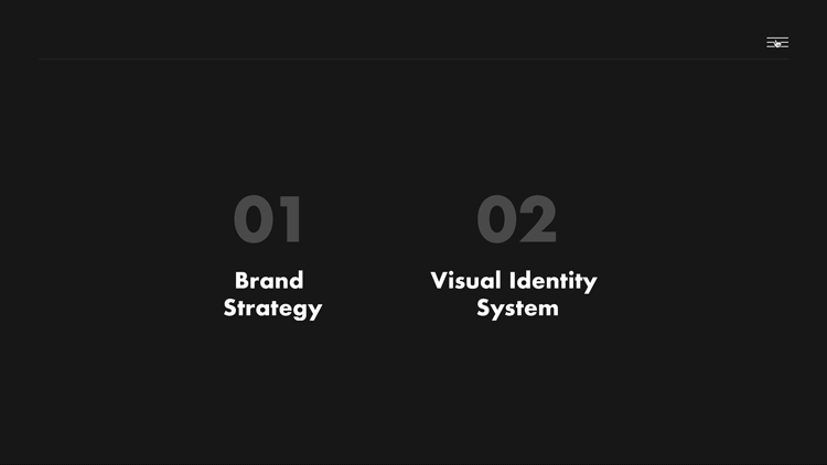
1. Creating Components
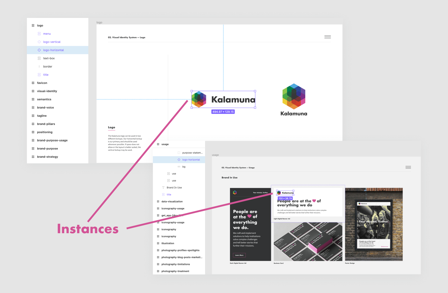
A Component in Figma can be thought of as a parent and every copy or instance, its child. The parent is called the master Component and changes to it are inherited by its children. This is very useful for commonly used elements like logos.
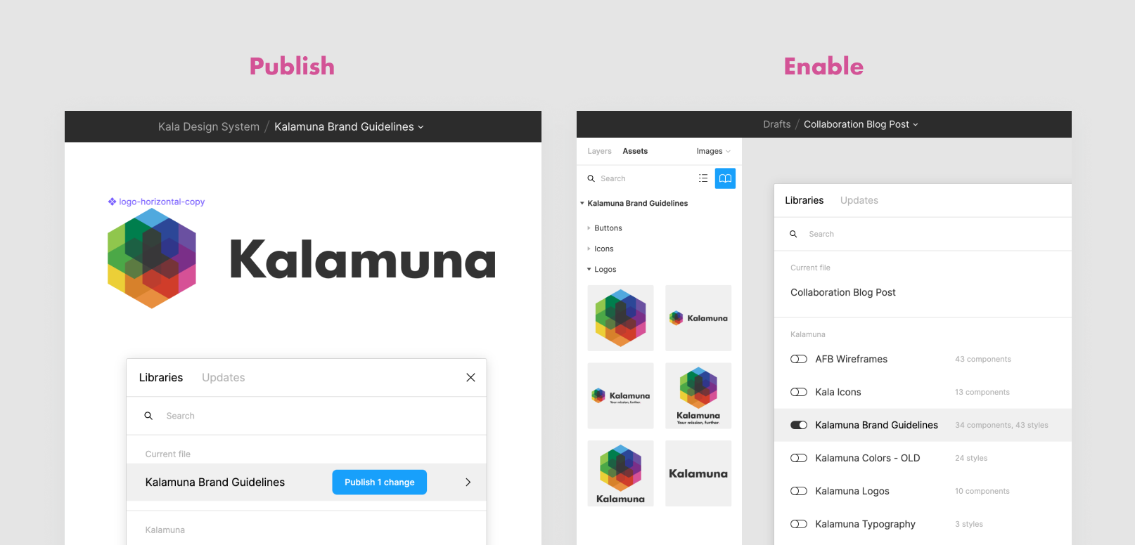
A Component is even more useful when published to your Team Library. The Team Library is globally accessible throughout all projects and includes Components, Text, and Color Styles. It’s also easy to enable on any given project. This way, all branding projects can be consistent and reference the same logo and styles. Most organizations at one point in their existence are left negotiating between several different versions of their logo. Applying the single source of truth principle here saves us time searching through numerous files and folders for the right version of our logo and saves us from potentially costly errors like print or digital ad banners with outdated versions of our logo.
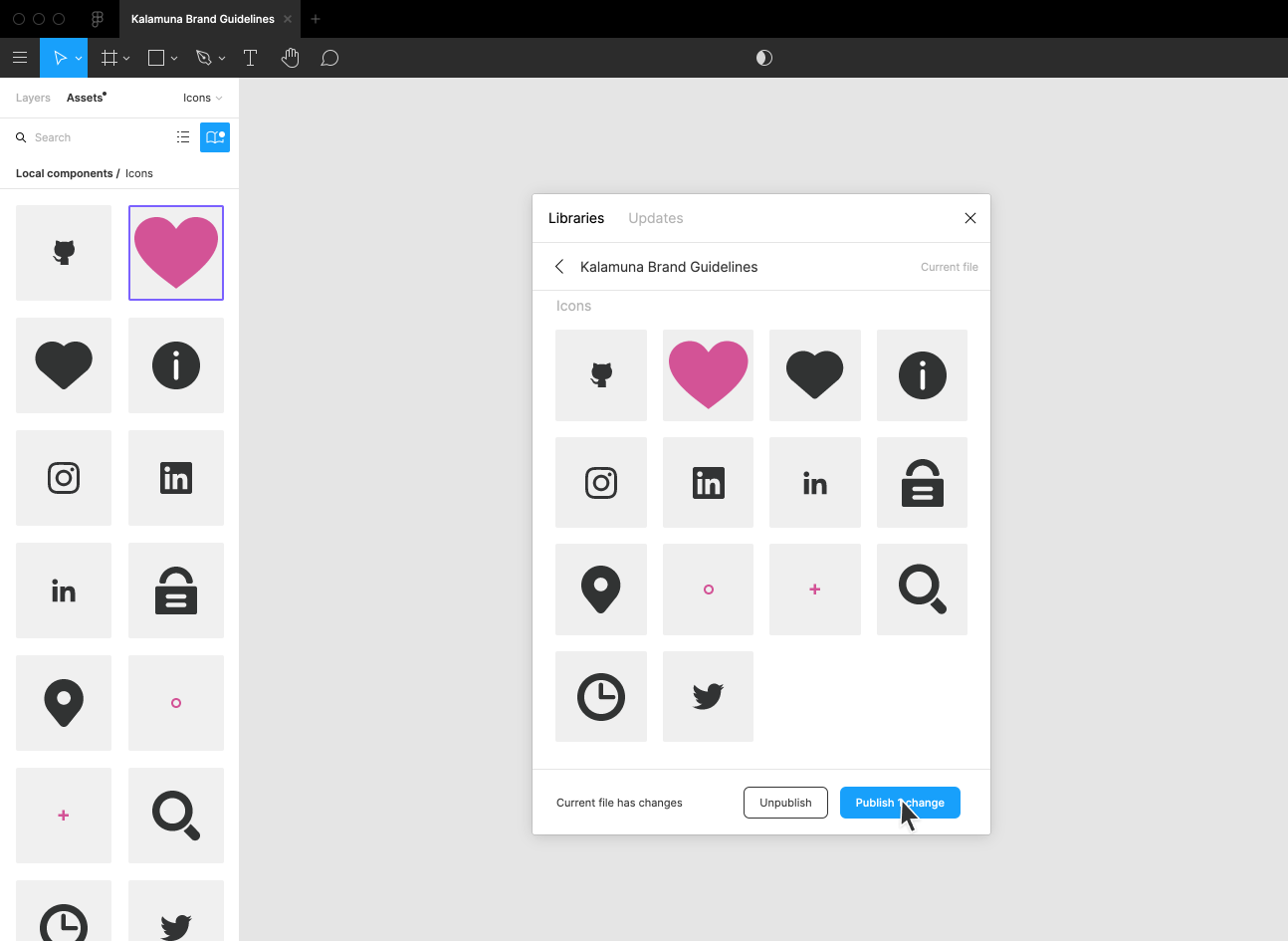
We repeated this process of creating Components and publishing to our Team Library for other icons tied to our brand like the heart icon that is part of our purpose statement, as well as the plus icon used for list item bullets.
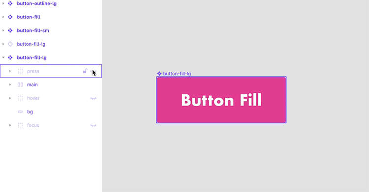
Our updated button definitions remain a work-in-progress, but storing all button states in one Component has helped us avoid maintaining several different Components – keeping our inventory tidy.
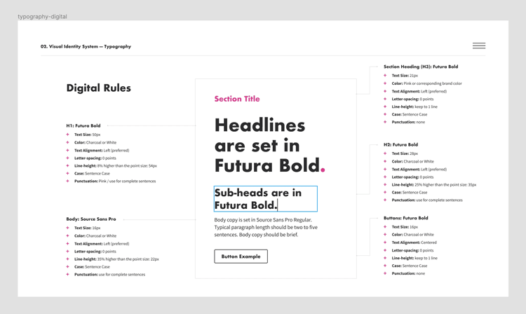
2. Color and Text Styles
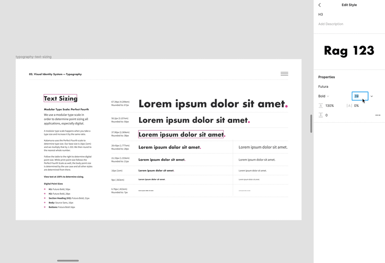
Colors and typography are key to the values and personality of a brand’s expression. Color Styles and Text Styles allow us to apply color and typographic styles consistently. You can find styles in the text, fill, and stroke panels by clicking the button with the four dots in it. This brings up a popup of already defined styles and a plus sign to add more styles.
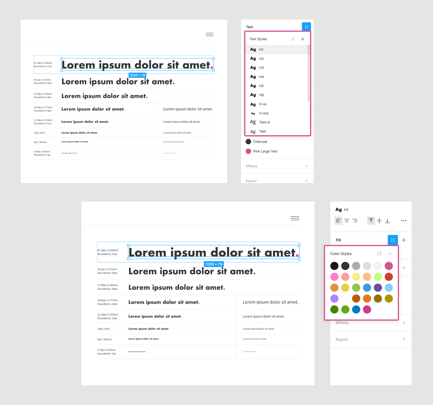
We had some previously established type rules, like our fonts (as seen on this blog) and font sizes. We used these rules to define styles for our headings, paragraphs, and general text. Once defined, any type or color updates will be reflected in all elements that use this style, as with Components. We made tweaks to established line heights and spacing and instantly saw the project file update.
To make global updates to these styles, we need to republish to the Team Library.
3. Layout
As your guide or project grows, updating content while keeping the intended space between elements can become a chore. Maybe some paragraph copy needs to be changed or a list item removed, which results in all items below it needing to be manually shifted down or up. Luckily, Figma released their new Auto Layout feature back in December, which has saved us a lot of time by automating these tasks.
Elements with Auto Layout enabled dynamically resize themselves to fit their contents. There are options to specify direction, space around and in between nested items. For anyone familiar with CSS, it resembles CSS Grid Layout and Flexbox in these respects. It would be great to extend these similarities even further with greater control over how much space an item should occupy, for example, 25% or the remaining space, but that’s a whole other topic.
Patterns of repeating elements benefit the most from this feature, like a list, or a grid of cards, or elements with defined padding like buttons.
4. Prototyping
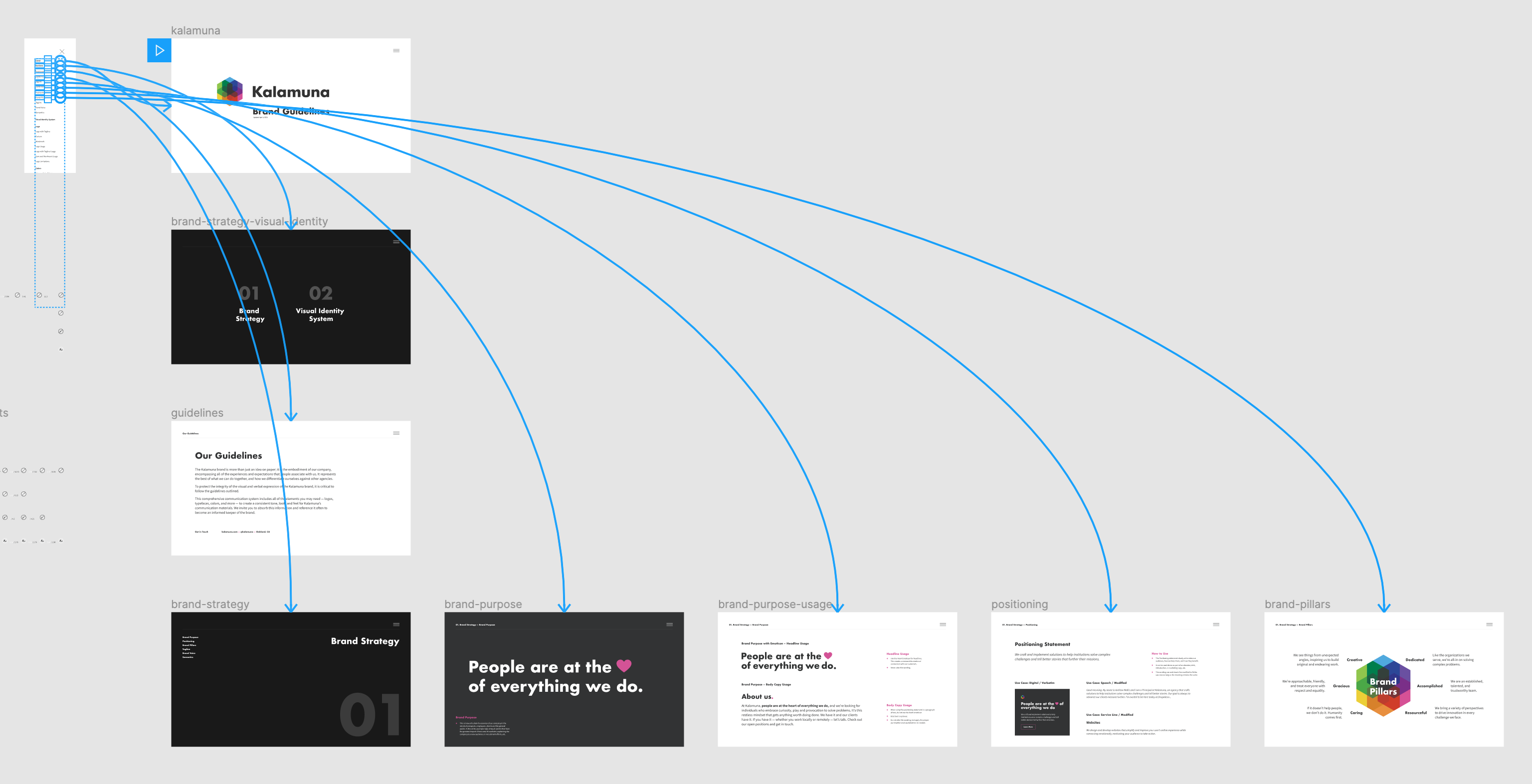
After our first iteration in Figma we realized we didn’t have an effective way to navigate the guide outside of the default next and previous navigation built into Figma’s presentation mode. Our Director of Design & UX suggested adding a fixed menu, which was a great solution. With Figma’s prototype feature, we created a scrollable frame to list clickable text labels linked to each frame in the guide. This scrollable frame opens after clicking a custom hamburger menu Component found in the top corner of each frame.
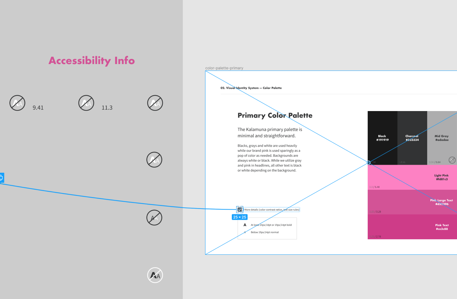
We also prototyped primary and secondary color palette frames. As an agency that strongly values accessibility, we wanted to include information like color contrast ratios and rules for text sizes based on the WCAG 2.1 guidelines. But, we wanted to do so in a seamless way that wouldn't clutter the already compact color boxes. To solve this, we made this information appear by checking a box for more details.
Wrapping up...
There’s always an ‘and’ in rebrand; it’s an ongoing process that doesn’t conclude with the creation of guidelines. A guide is really just the beginning. We see our brand guide as a living document that will continue to grow and improve along with the tools we used to build it, and of course evolve with Kalamuna itself. When creating your own guide, we hope you make use of Components, Color Styles, Text Styles, Auto Layout, and prototypes to make your rebranding journey as streamlined as possible.

Graciela Alaniz
Whether it’s her Instagrammable hand-drawn lettering or delectable handmade tortillas, Graciela creates lovely things. Oh yes, and she also designs websites. As Kalamuna’s UX/UI Designer, she translates our clients’ visions and goals into elegant and graceful designs crafted with users in mind.