Alert Banner Best Practices (Web Design for Disaster, Part 1)
Share
As the world experiences an unprecedented series of natural disasters, pandemics, and social upheaval, it is a good time to consider how well your website or application might perform in unexpected situations, and to discover new ways to ensure accessibility and improve communication during a crisis.
The team at Kalamuna has helped many organizations prepare for and respond to emergencies. In this series of posts, we share research and lessons from our previous projects and the best practices we are now recommending to our clients.
Web Design for Disaster:
Part 1 - Alert Banner Best Practices
Part 2 - Emergency Landing Page Best Practices
Part 3 - Accessibility Challenges in an Emergency
Why use alert banners?
For many organizations, it becomes imperative to communicate with your stakeholders in the event of an emergency. However, many common website components are not well-suited for presenting urgent information under adverse circumstances. Pop-ups may be blocked or dismissed accidentally, slideshows may fail to load under low-bandwidth conditions, and any text contained within images is inaccessible to screen readers used by blind and low-vision users.
Therefore, alert banners are often the best design pattern for presenting an urgent message or call to action to stakeholders who visit your website. A properly implemented alert banner can quickly and reliably catch the attention of your audience, let them know that an emergency is in progress, provide actionable instructions with the most relevant facts, and direct them to additional resources or updates as needed.
Banner design best practices
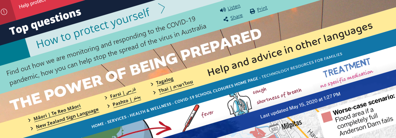
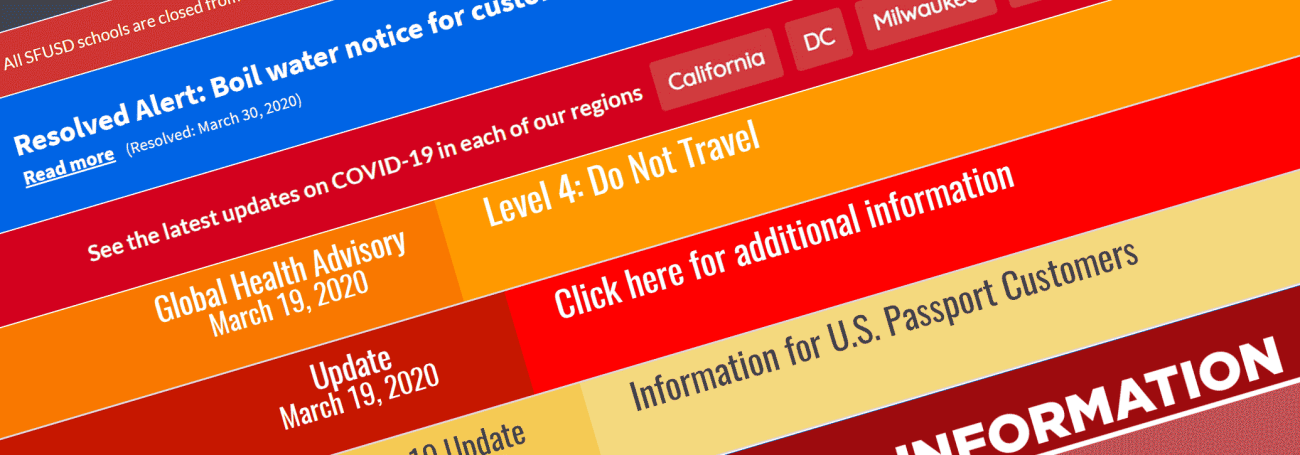
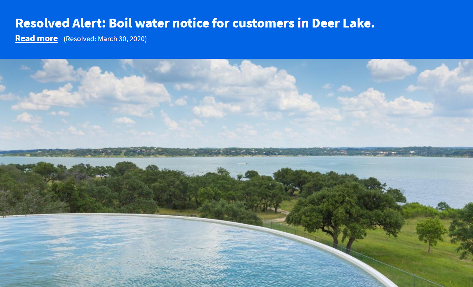
A good alert banner is positioned in a prominent location near the top of the screen and is styled in a way that is immediately noticed upon arrival. It should appear across all the pages of your site—not just on the homepage—since many visitors arrive through direct links to internal content. Persistence is important, since if a message is dismissed or otherwise disappears, the user may find it hard to locate the urgent information again.
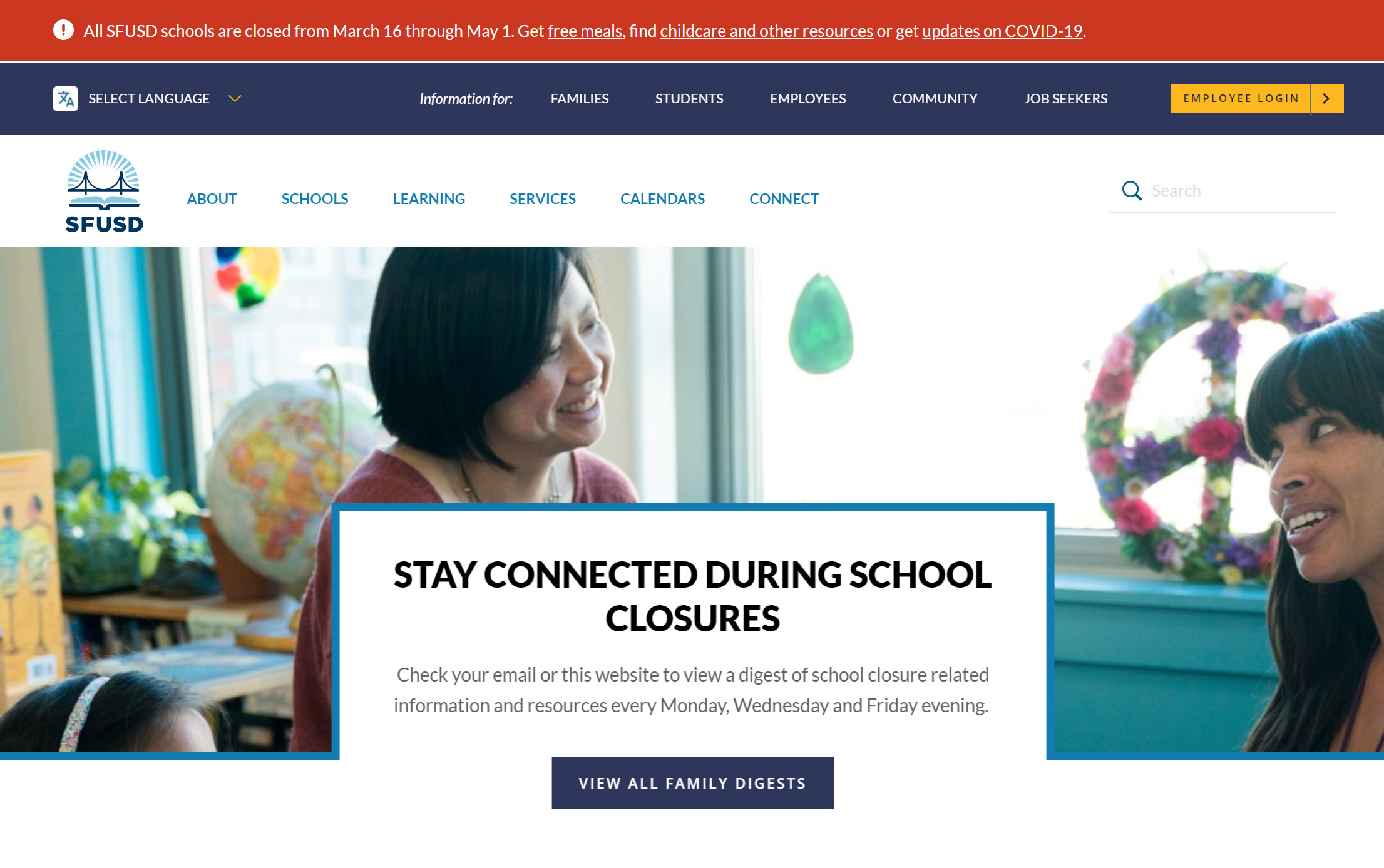
Visually, an alert banner should stand out, but must do so in a way that is accessible to all visitors. It should be large enough to capture attention and convey a message, but shouldn't take over the browser window or block users from completing other tasks. Allow the banner to scroll along with the surrounding content, since fixed positioning on the page or screen can obstruct other elements or disorient the viewer.
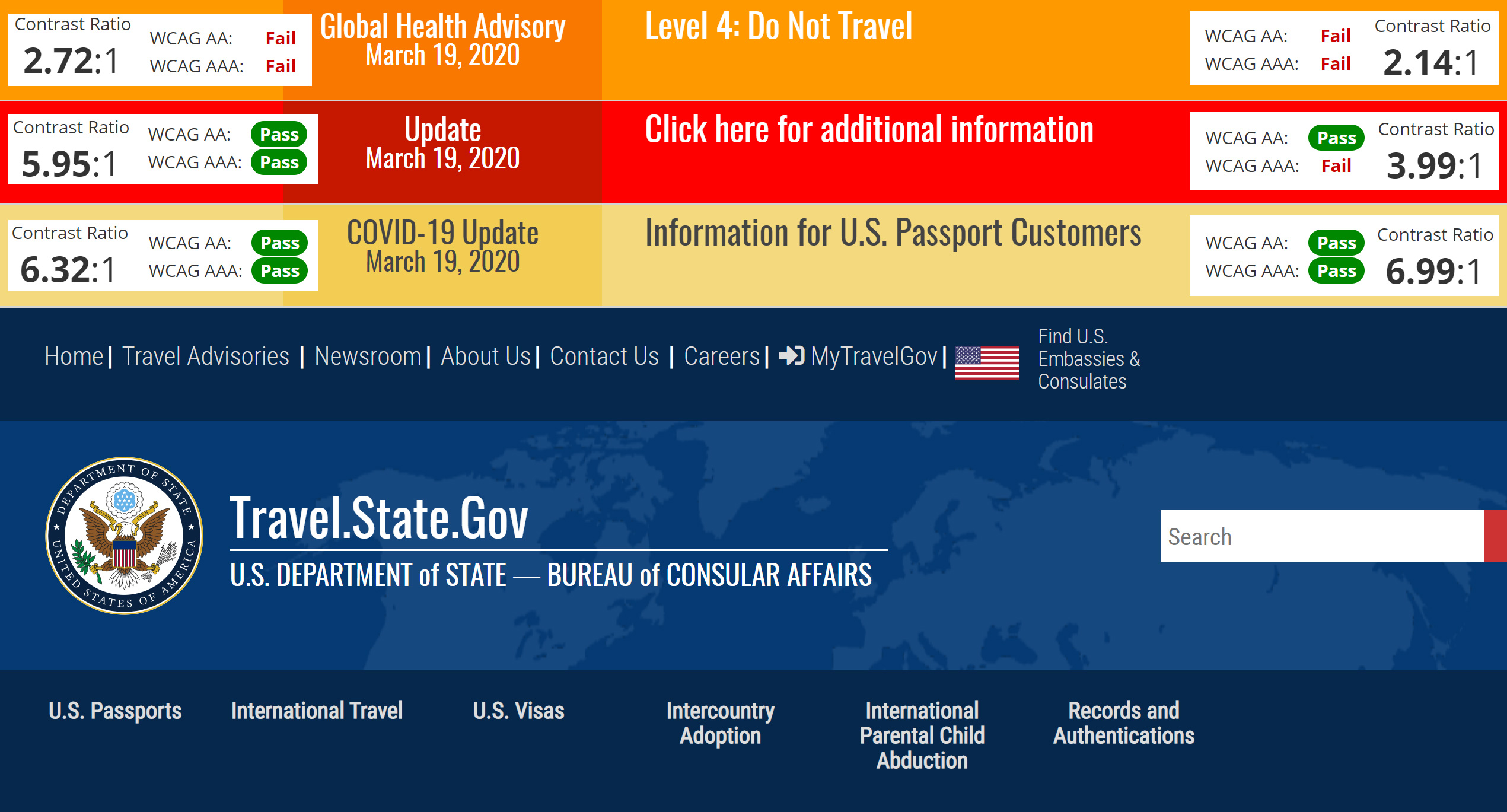
The font should be large and easy to read. Choose background, text, and link colors that have a high enough contrast ratio to meet the AA standard of the Web Content Accessibility Guidelines (WCAG), which requires a 4.5:1 contrast ratio for for normal text and 3:1 for large text, or ideally the WCAG AAA guidelines, which specify a 7:1 contrast ratio for normal text and 4.5:1 for large text. You can use this online calculator to determine if your colors meet these recommendations.
Links should be underlined or made into buttons so they can be easily identified. They should be large enough to be reliably pressed on mobile devices, have a distinct hover state to let mouse users know where they can click, and provide a focus indicator to highlight the active item as a keyboard user tabs through the page.
If presenting multiple links, make sure they are spaced far enough apart so that users can clearly identify their options and select one without accidentally pressing another. Avoid making the entire banner a link, since users may not realize it is clickable. Links to external resources should be clearly marked, both visually with an icon and with alt text for screen readers, so the user knows they are leaving your site.

Finally, consider how your banner may need to change over the course of a crisis. Including dates in the design can indicate when an alert has been issued, updated, or resolved, so visitors are assured they are getting the latest information. And after a crisis, you may want the banner to announce that the emergency is over, using cooler colors to indicate that the situation is now less urgent.
Test your emergency response before it is needed
Alert banners are functionally and visually different from any other component on your site, so it is important to test the functionality in advance of an actual emergency. You don't want to be releasing bug fixes or design changes while an emergency is underway.
When testing, use an environment that closely resembles your production platform. View the site with a variety of browsers, devices, and screen sizes in order to ensure that the banner is responsive and does not have any obvious layout issues or adverse interactions with other elements, such as popups and dropdowns which may obstruct your message. Browserstack is a handy service we use at Kalamuna to assist with this task.
Try creating multiple variations of the alert using different content. What happens to the layout when the text entered is longer or shorter than expected, or if it spans multiple paragraphs? What happens when several links are added, or if someone tries entering a full url as the text of a link? If your site is available in multiple languages, is the text being properly translated and does it display correctly for both left-to-right and right-to-left layouts?
If your banner contains images, what happens under low-bandwidth conditions when some files may not load? If a background image does not appear, is the text still legible? If a logo or decorative element doesn’t show up, does the layout appear broken? Instead of a png or jpg icon, can you include an <svg> tag in your html markup so that it loads at the same time as the content?

Just like with images, javascript files may fail to load under low-bandwidth conditions, or the execution of your code may be interrupted by errors in other scripts on the page. If javascript is not available, does your alert banner still appear on the page? Can the content still be read?
Create an activation plan
When the time comes to deploy the emergency banner, it should be clear who has the ability and responsibility to post the message. Designate backups for this critical role, since the primary person may be unavailable or even affected by the emergency itself.
Like a fire extinguisher, the mechanism used to activate an alert message should be clearly marked and easy to find in the event of an emergency. Since this interface is infrequently accessed, users may not have advance knowledge of its location, or may have forgotten it over time.
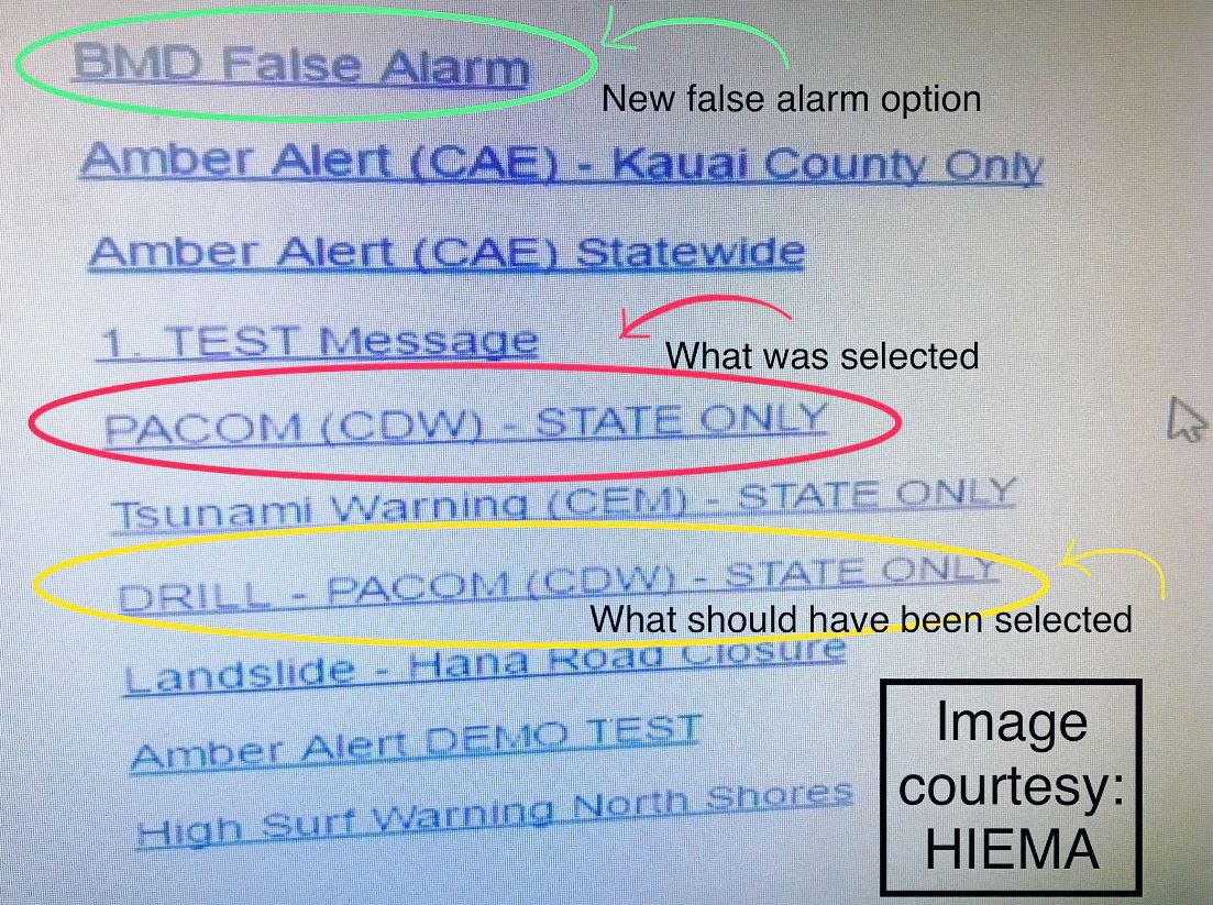
And, just like with a fire extinguisher, safeguards need to be put in place to avoid accidentally creating an alert. Consider implementing the virtual equivalent of breaking glass and pulling a pin in order to activate the system, such as clear text describing what will happen and a confirmation step to ensure the user definitely intends to proceed.
Hopefully these tips will help you create and deploy effective alert banners, or to improve ones you already have in place on your website. If you have found this post helpful, please check out out the additional installments of our Designing for Disaster series:
Emergency Landing Page Best Practices (Web Design for Disaster, Part 2) - A dedicated emergency landing page may be the best way to ensure that your visitors will find the important information they need, while minimizing any unwanted distractions.
Accessibility Challenges in an Emergency (Web Design for Disaster, Part 3) - During a natural disaster or public emergency, conditions may change dramatically for your users, while it could be more important than ever for your system to remain accessible.

Mike McCaffrey
The Internet of the future could be made of stardust or the usual cats, but either way it will work simply and powerfully because Mike will have made it. Whether he’s thinking strategically about business requirements, tracking and prioritizing user stories, solving complicated design problems, analyzing metrics or releasing new features, he finds the most straightforward and efficient means to pave our path into the 4th dimension.