The Importance of Mobile First Wireframing

Share
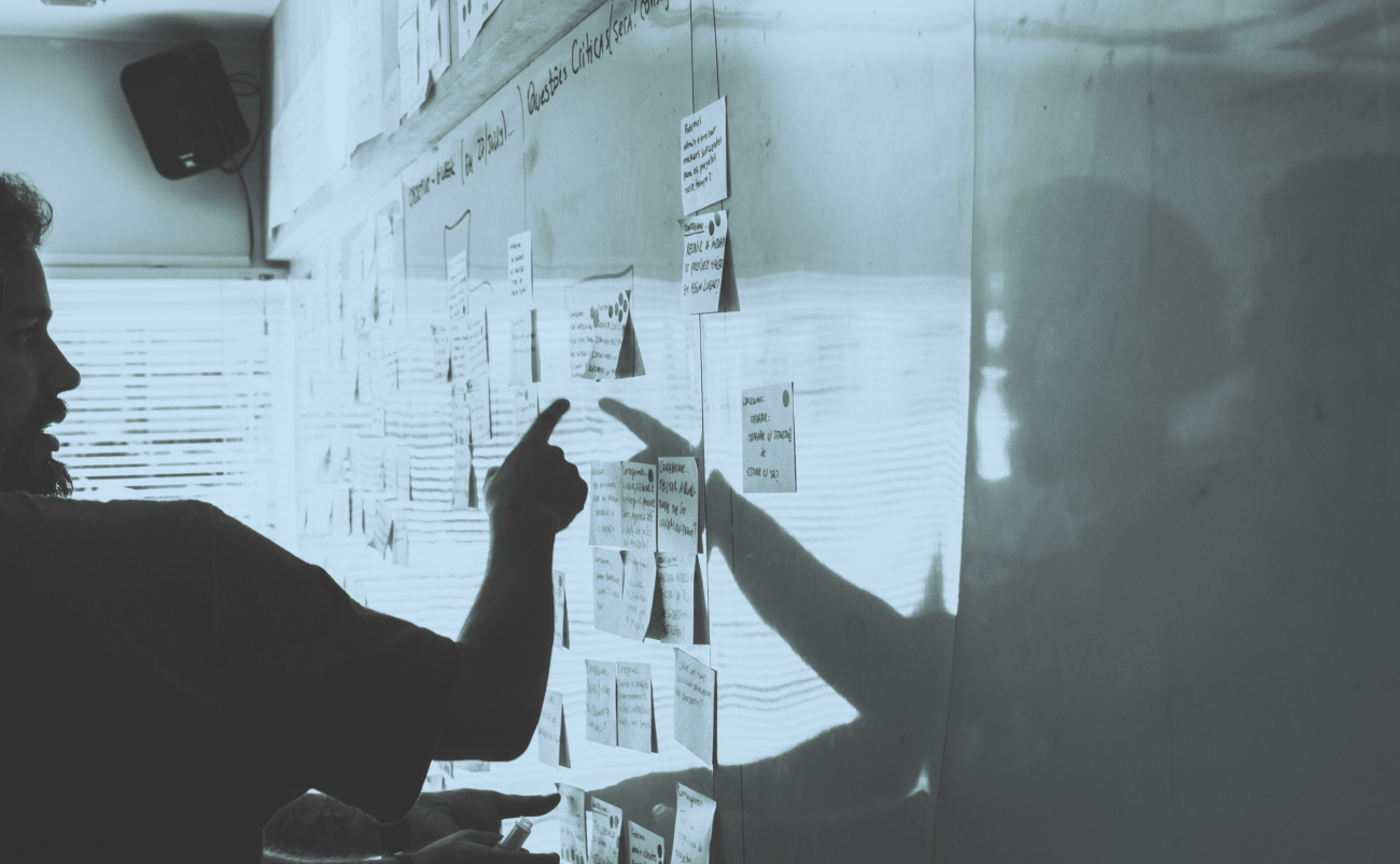
My last post focused on the Information Architecture phase and our method for establishing the client goals, website metaphor and site elements through investigation and science(!!!). It is with this information that we will construct the website wireframes for the client's review. If you are unfamiliar with wireframes, they can be generally described as stripped-down "sketches" of what the site will look like before beginning the more formal design and development phases.
Before we delve into our process for creating a wireframe, let's talk about responsive design and planning for the mobile experience. More and more people these days are utilizing mobile devices instead of their (antiquated) desktops for accessing websites. There's a lot of talk out there about the context of a mobile user's visit to the website, and some suggest paring down content or limiting access to the site on the assumption that a mobile user's purpose for being online is different than that of a desktop user.

Let's take look at this picture of this gentleman that I found on Google. He's relaxed and happy on his couch, and spending many hours in comfort while surfing the net on his mobile phone. This experience sure beats that of being hunched over in a cold office chair, doesn't it? Should we assume that his needs and purpose for visiting the site is different because his screen is smaller?
Well, we here at Kalamuna don't believe in making assumptions. In fact, we think it's a wise decision to think about wireframing for this man's needs before that of a desktop user. Like we said, there are more and more people opting for the "mobile" experience than the "office" burden, so plan accordingly.
Wireframing for mobile devices first helps us prioritize site elements while putting us in a good mindset for thinking about what content is most relevant to the site visitor. (Also, it's always easier to add extraneous elements to the desktop than it is for us to think about how we strip them away for mobile). So let's look back at the client's goals, user stories and the content inventory and then arrange the content by its importance. This list will clarify which elements will take precedence for both mobile and desktop versions.
The picture below illustrates the importance of certain site elements over others. If the site is dependent on authenticated users (logged in users) then signing in will need to be higher up on the mobile version of the site. Perhaps this organization relies on emails for donations and a donation link makes more sense to be on the "footer" on the mobile and only visible after a few scrolls. You'll notice that looking at the desktop version there seems to be much more "fluff" than mobile, and flashbacks to cluttered Myspace and Geocities should come to mind. Afterall, the streamlined mobile experience is the future!
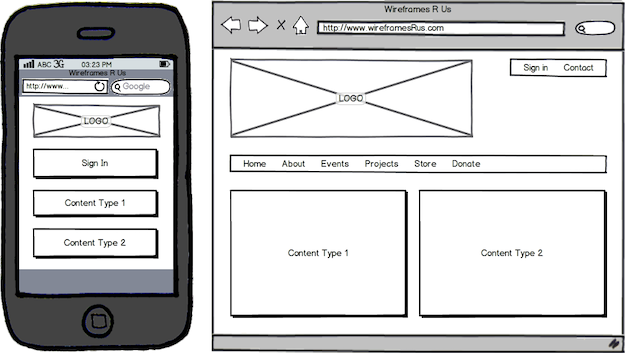
As you can see, wireframes do not typically contain color. This is the case because we and need to stay focused on the arrangement and relationship between the various elements. Yes, color plays a major role in distinguishing elements on a page, but this distinguishment needs to be accomplished with the grayscale for now. The designer, who should at the very least be kept in the loop of the wireframing process, will translate the client's mood and mission statement into color once we've established the blue prints. This color-after-sketch process means that we do not worry too much about nailing down the exact placement of our elements until the actual design phase, when the Photoshop Document (PSD) is created with color considerations in mind. We use Balsamiq Mockups because it's quick enough to replace napkin sketches and we feel the style keeps the client from being too particular about the precision of the layout.
The site metaphor that was established during the information architecture phase is very helpful in determining the general layout and navigation of the site. If a site is for an entrepreneur and supposed to feel like a business card, then don't be afraid to use something like a flashy slider. If the site is for a restaurant and has a menu feel, then by all means rely on your primary navigation and multiple columns in the content area. Whatever the metaphor is, you do want to not cram the site elements together, especially on the mobile. Also, don't feel the need to cram everything above the fold - site visitors are not adverse to scrolling (think Facebook and Twitter)!
Wireframing is not an exact science (blasphemy!) and many times you will need to go through several revisions with the client to agree on a layout that both parties feel comfortable with. Adding distinguishable notes that explain the logic behind the layout of the wireframe will save a lot of headaches and time for the client and the rest of the development team. Once your team and the client have signed off on the wireframes you can now proceed to design and development. Happy wireframing!

Andrew Ward
Andrew's introduction to Drupal came through his activist work in the Beltway, and he's been delivering amazing websites to clients ever since. Fueled by raw milk and unprocessed foods, Andrew is driven to liberate you from rotten correspondence. He applies his Belichick-like attention to detail to each project to ensure success and happiness.